Lapa Inspiration #15 - New Trend Alert: Serif Fonts for Landing Page Luxury 🌟
Hey awesome Lapa ninjas! 👋 Ready to dive into the wonderful world of typography? This week, we're exploring a trend that's making a serious comeback: serif fonts! 🎉 Yep, those little feet at the bottom of letters are adding a touch of elegance and sophistication to landing pages everywhere. Think classic, think timeless, think chic! ✨
Serif fonts aren't just for dusty old books anymore. They're bringing a fresh new vibe to the digital world, and we've got some stunning examples to show you. Ready to see some real-life inspiration? 👇
Our Sponsor This Week
💡
Webflow - Build with the power of code — without writing any. Take control of HTML, CSS, and JavaScript in a visual canvas. Webflow generates clean, semantic code that’s ready to publish or hand to developers. You design, we generate the code — for everything from fully custom layouts to complex animations.
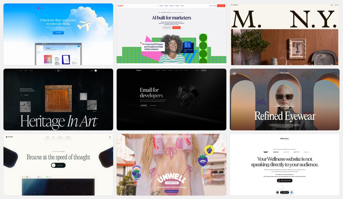
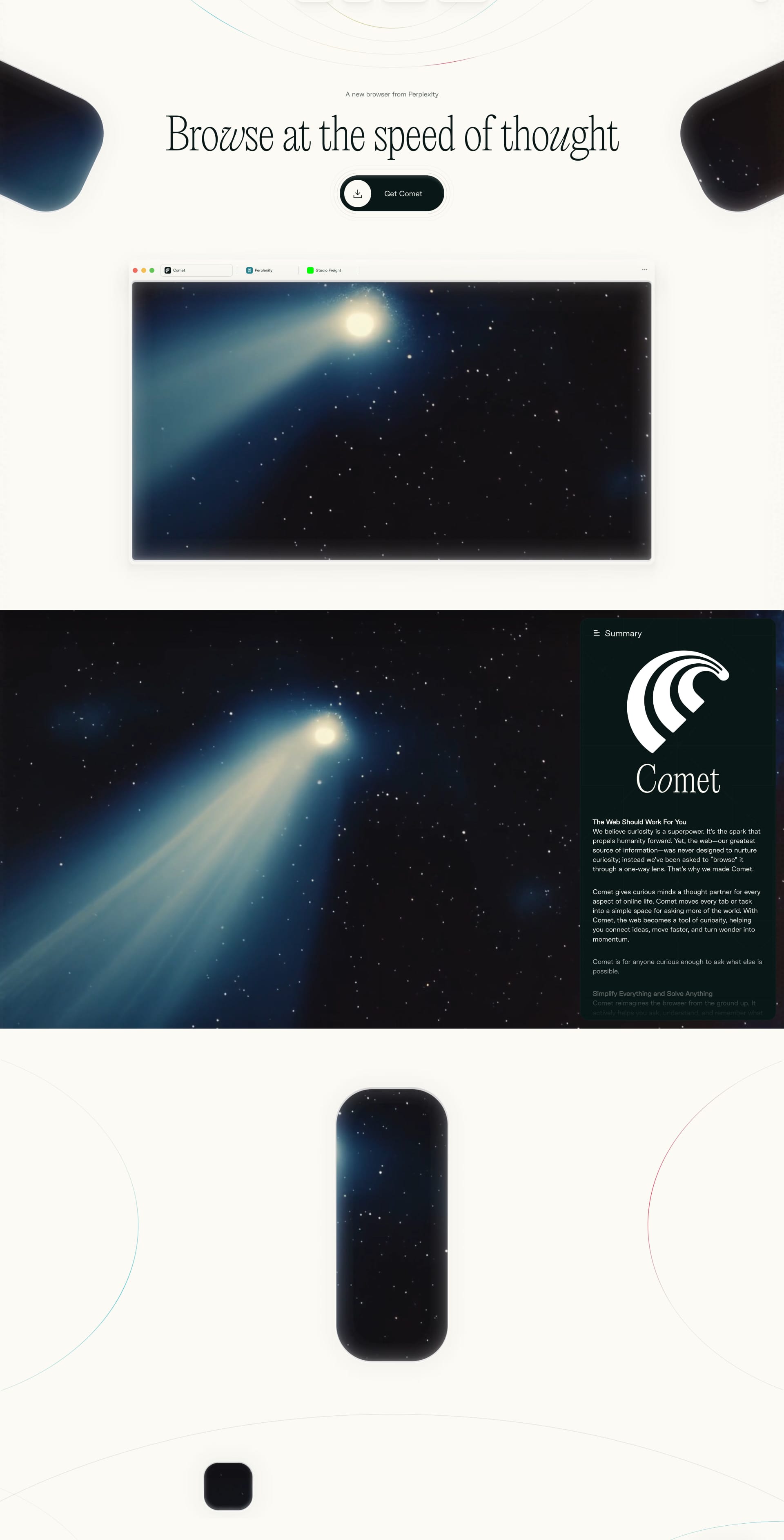
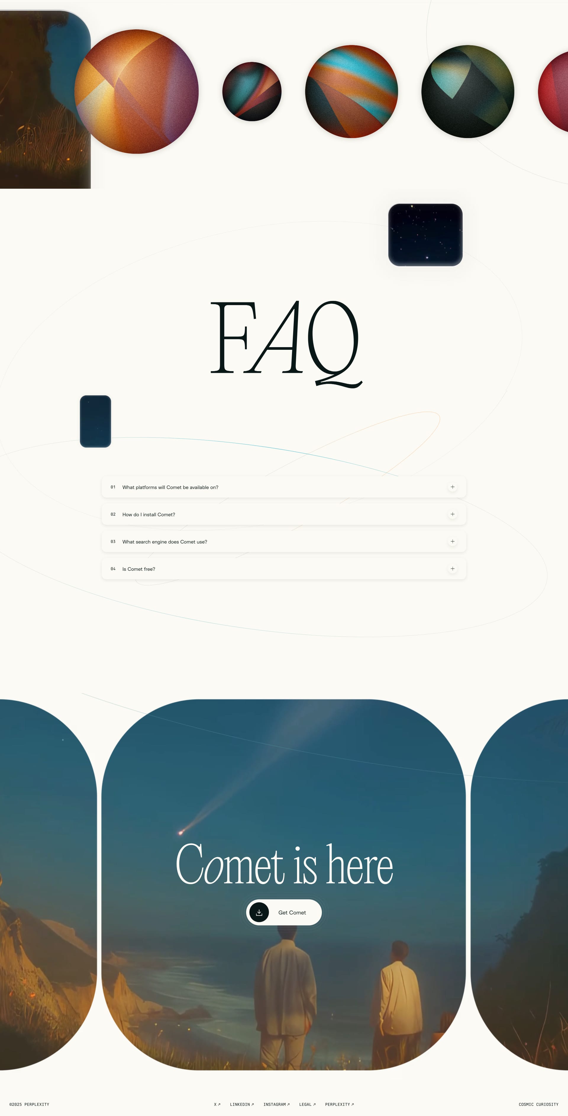
Browse at the speed of thought. A new browser from Perplexity.
Lapa's Review: Picture a clean white canvas with pops of electric blue, a bold hero shot of the new Comet browser, and ultra-modern serif headlines. The serif typeface (PP Editorial New) takes center stage, soothing yet powerful, conveying trust in its AI-driven browsing experience. That serif choice feels like premium tech.
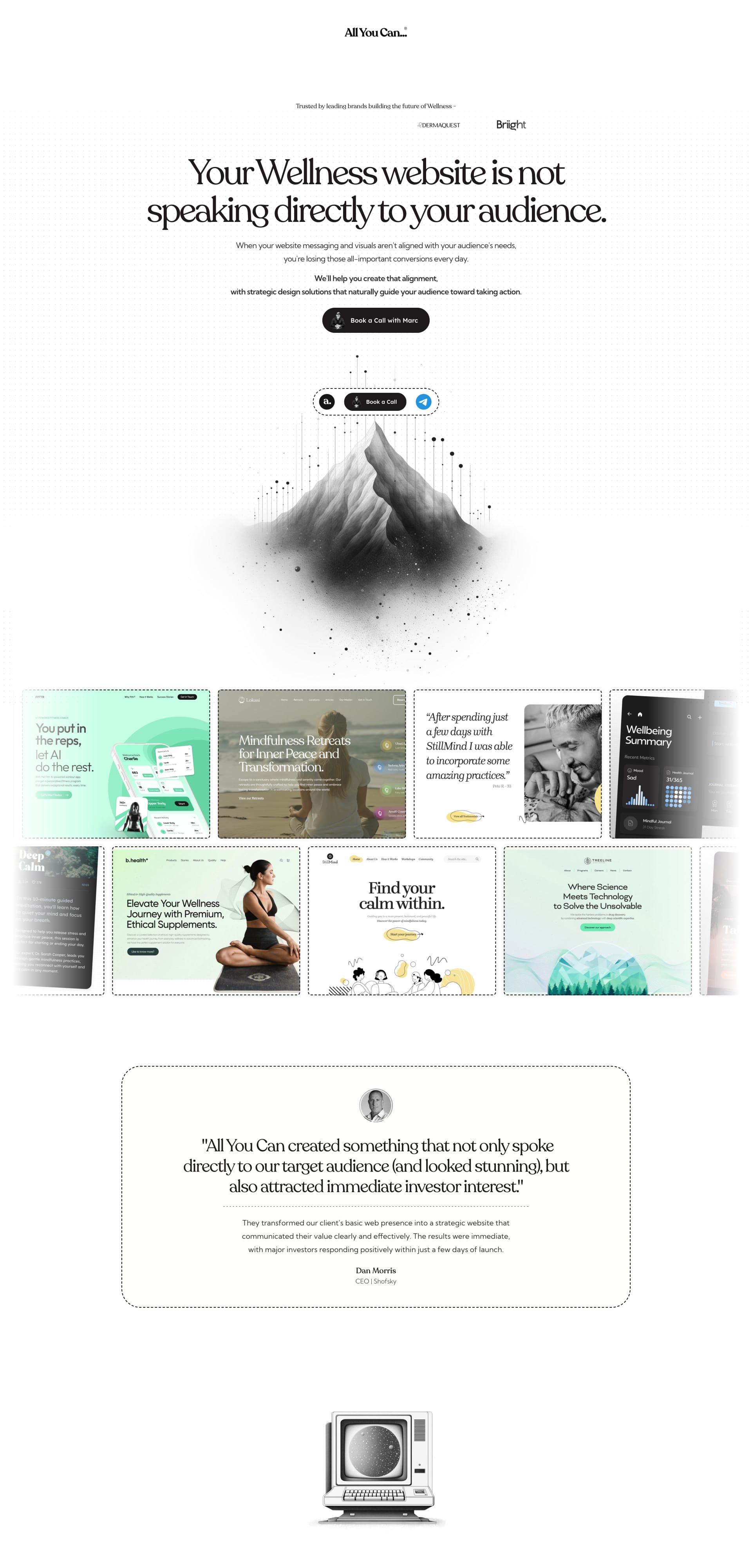
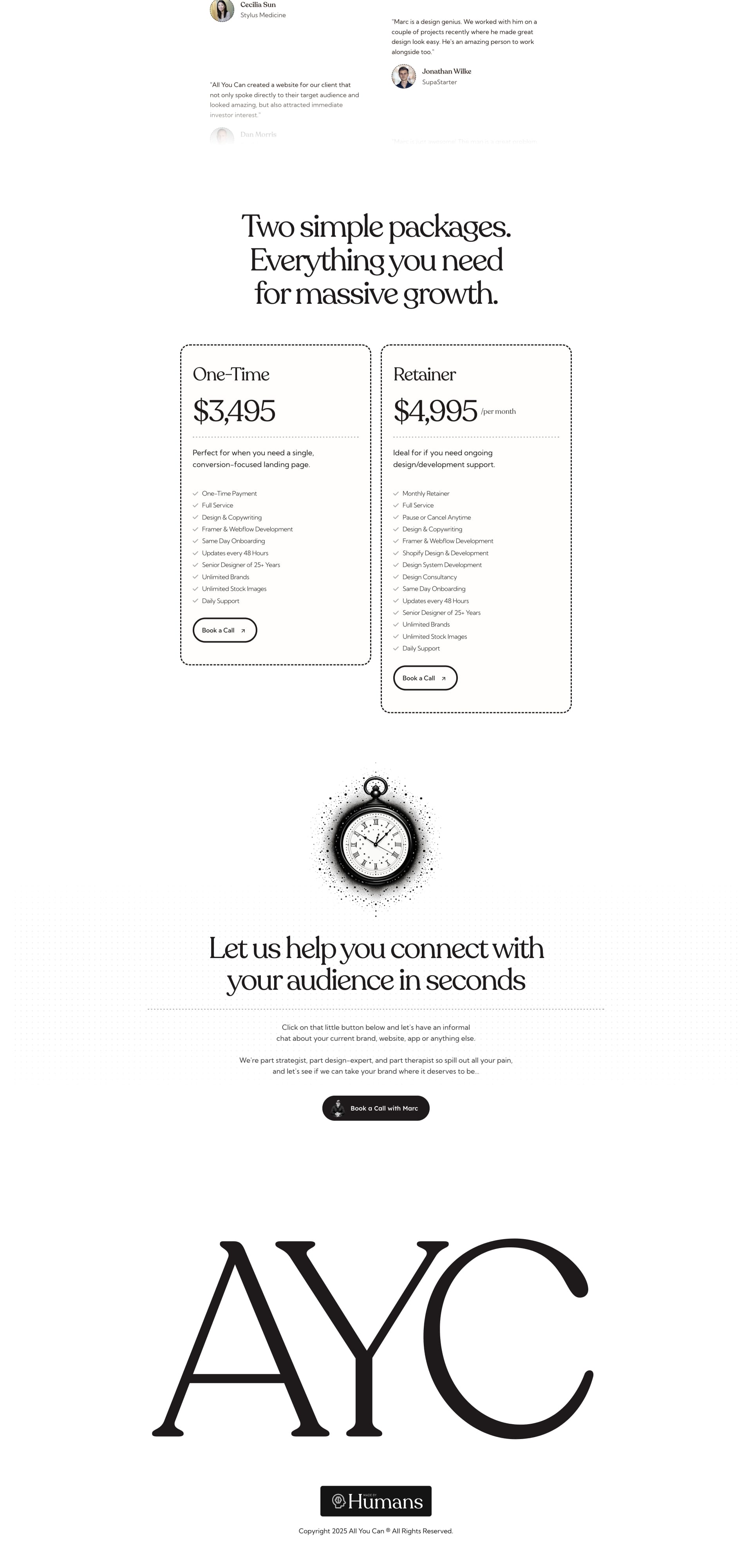
Your Wellness website is not speaking directly to your audience. When your website messaging and visuals aren't aligned with your audience's needs, you're losing those all-important conversions every day. We'll help you create that alignment, with strategic design solutions that naturally guide your audience toward taking action.
Lapa's Review: Think soft gray-white backdrop, a calming hero image, and elegant serif headlines (Recoleta) that whisper luxury and care. The serifs give a warm, personal touch, like a spa invitation, while the clean sans body copy keeps things smooth and modern.
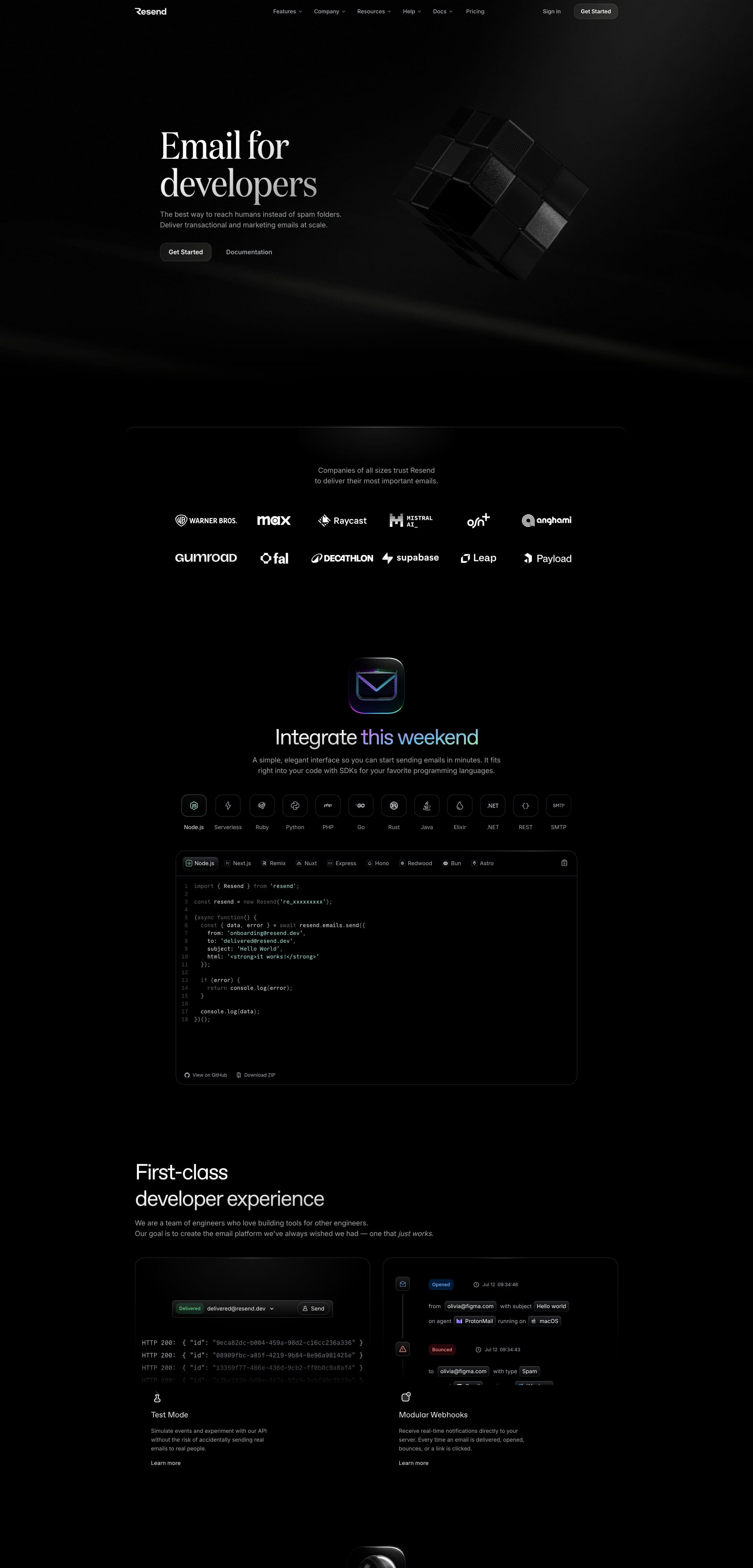
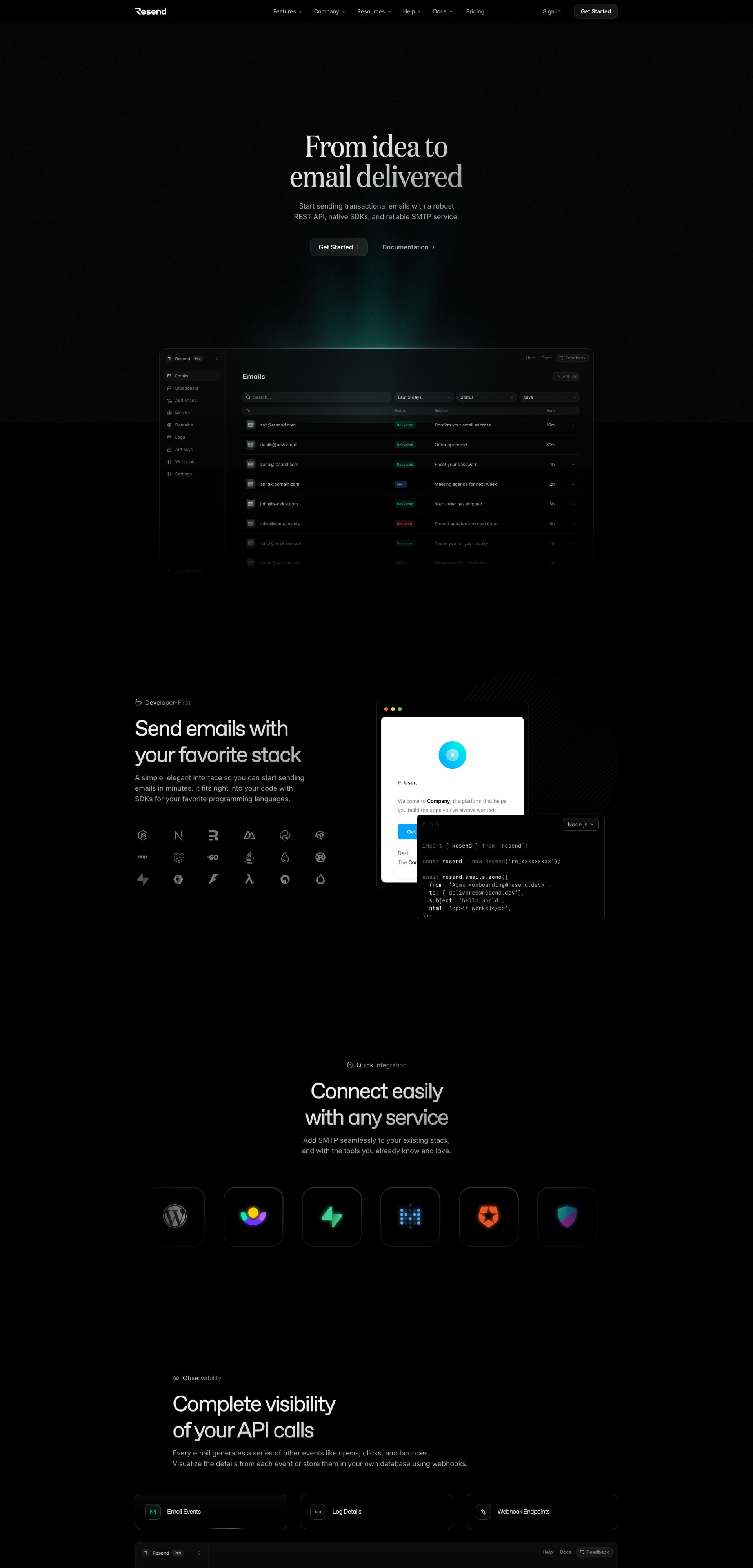
Email for developers. The best way to reach humans instead of spam folders. Deliver transactional and marketing emails at scale.
Lapa's Review: Dark, sleek, and seriously polished, Resend’s landing page wraps you in a cinematic black backdrop with smooth gradients and glowing UI previews. The serif headlines (like “Email for developers”) feel ultra-premium, almost editorial, adding a surprising touch of elegance to a dev-heavy tool. It’s like luxury packaging for backend power. 💌⚙️
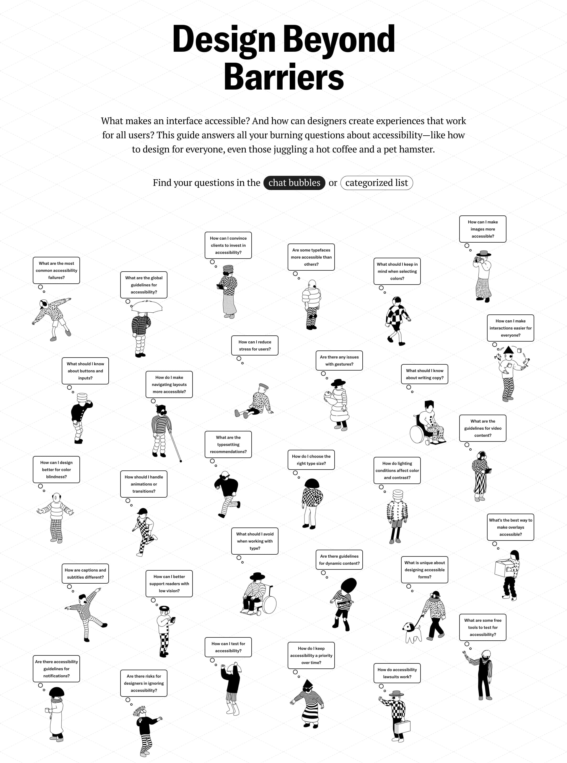
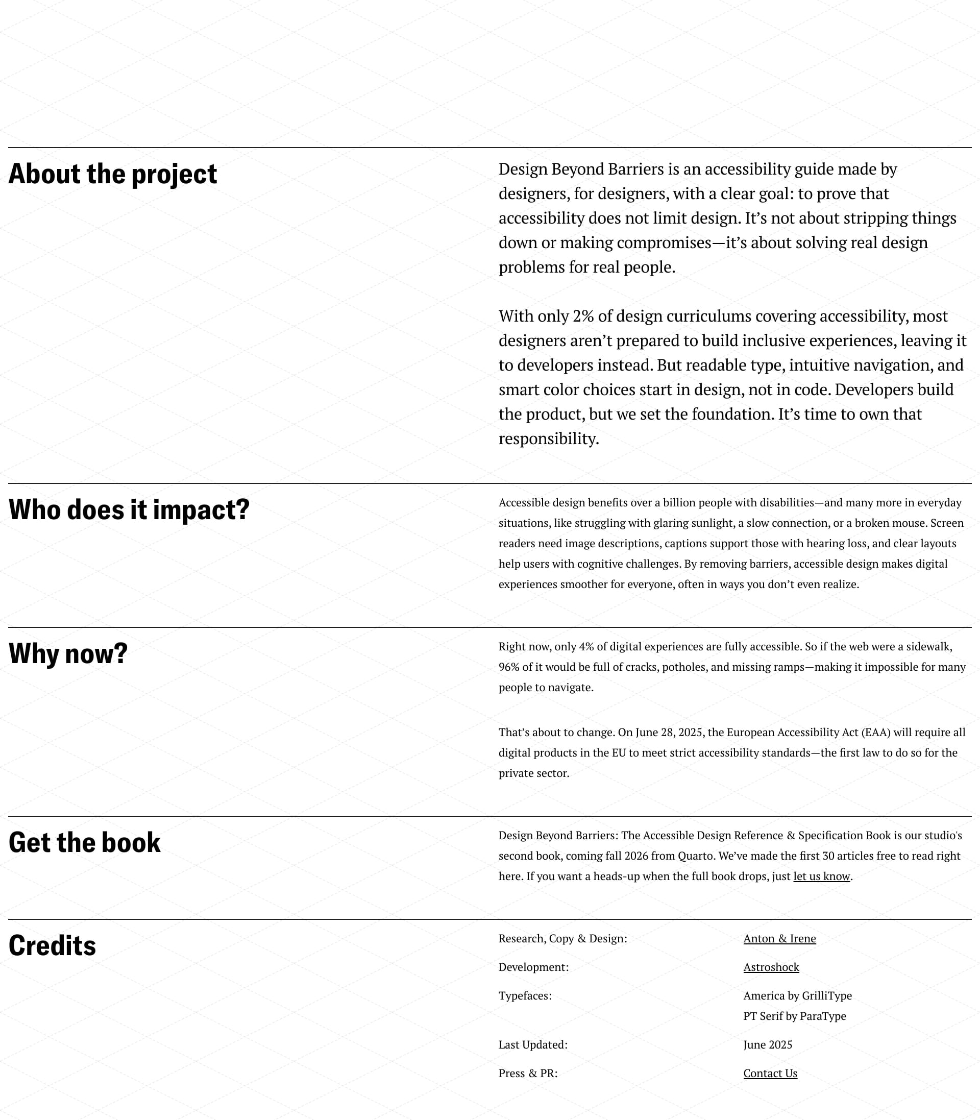
What makes an interface accessible? And how can designers create experiences that work for all users? This guide answers all your burning questions about accessibility—like how to design for everyone, even those juggling a hot coffee and a pet hamster.
Lapa's Review: A soft grid background, charming black-and-white characters, and big bold serif headlines set a thoughtful tone. The use of Playfair Display adds a layer of classic elegance, while the layout stays playful and human-first. It feels like a design textbook doodled with heart, welcoming, informative, and refreshingly inclusive 💬❤️
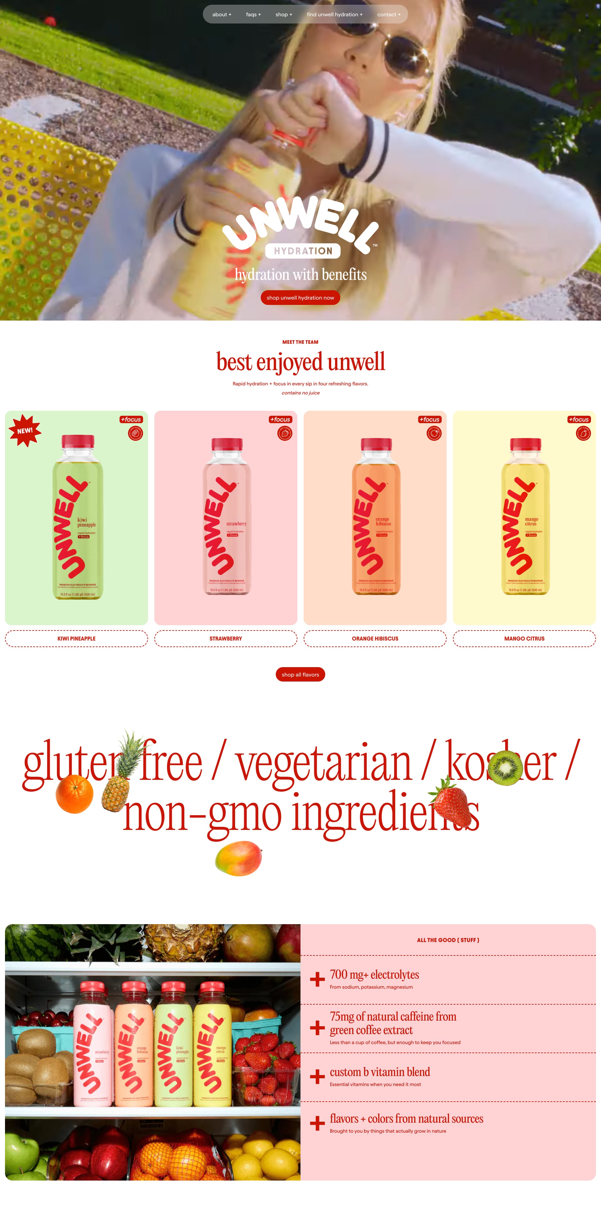
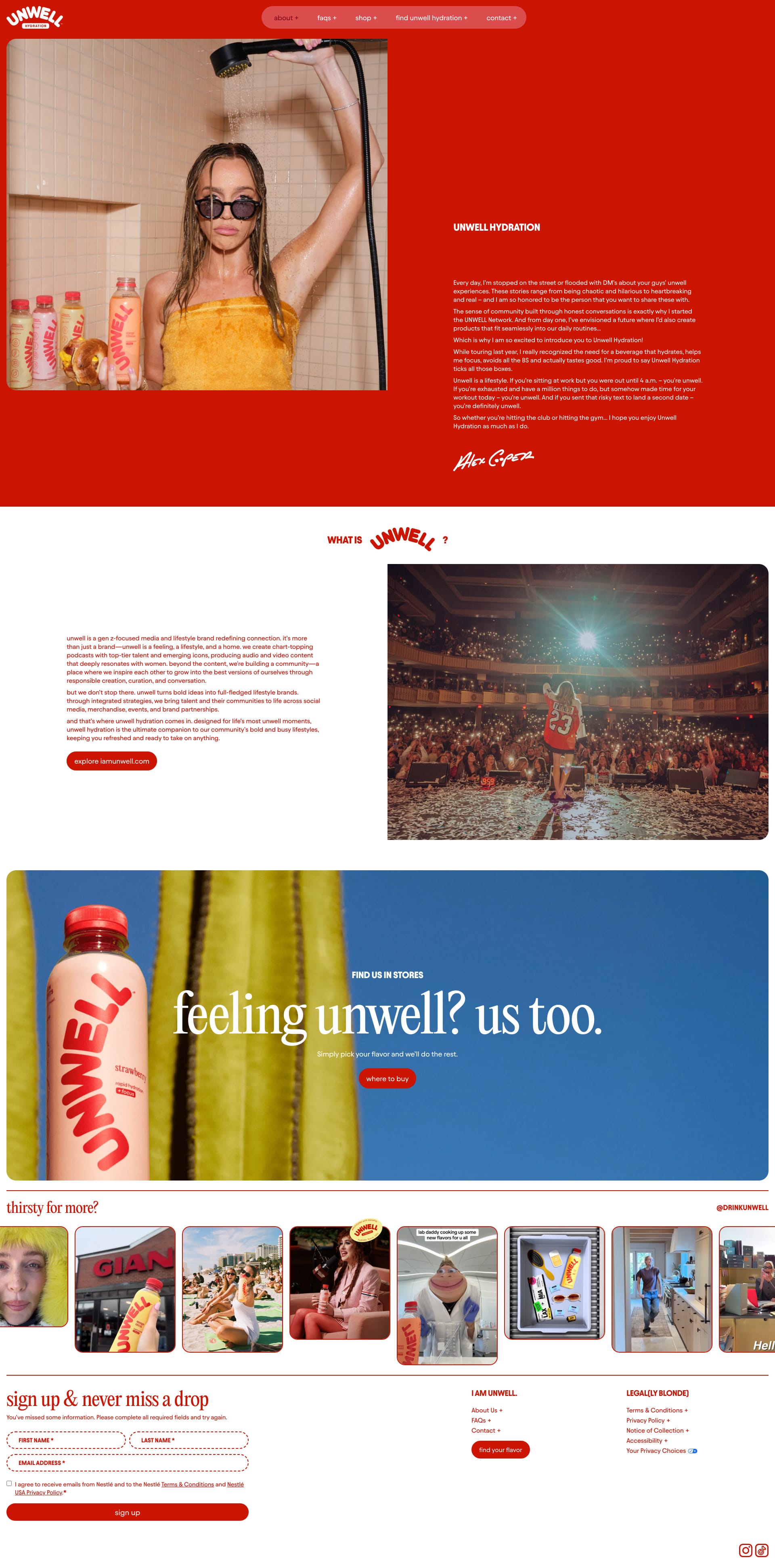
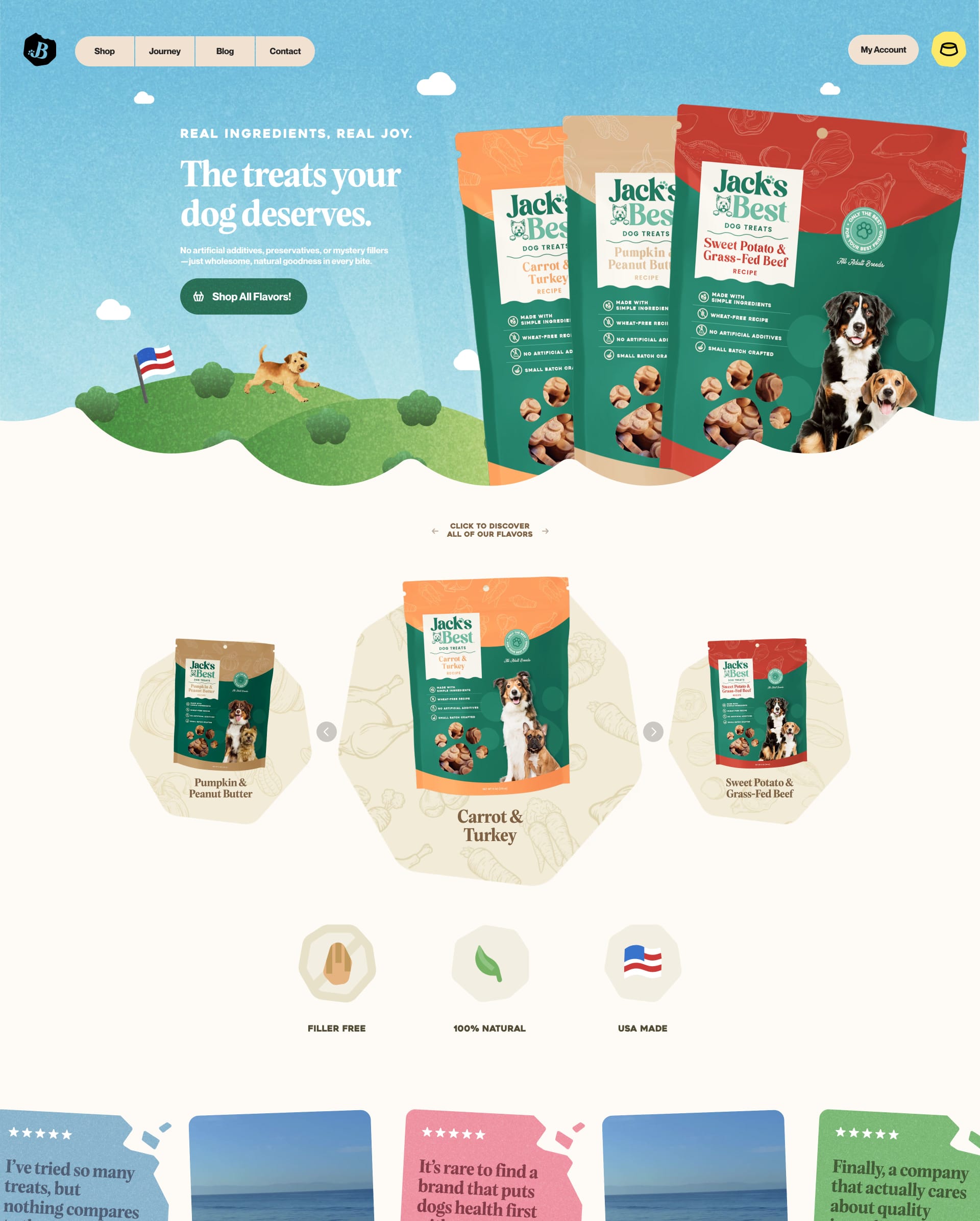
Best enjoyed unwell. Rapid hydration + focus in every sip in four refreshing flavors.
Lapa's Review: This site is a pure flavor explosion! Bold serif fonts (like Canela and Freight Big) bring punchy elegance to the sass-filled, Gen Z energy. The type dances across juicy product shots and wild red backgrounds—like a fashion mag met a fruit cart at Coachella. It’s maximalist, cheeky, and totally unforgettable 🍒💥
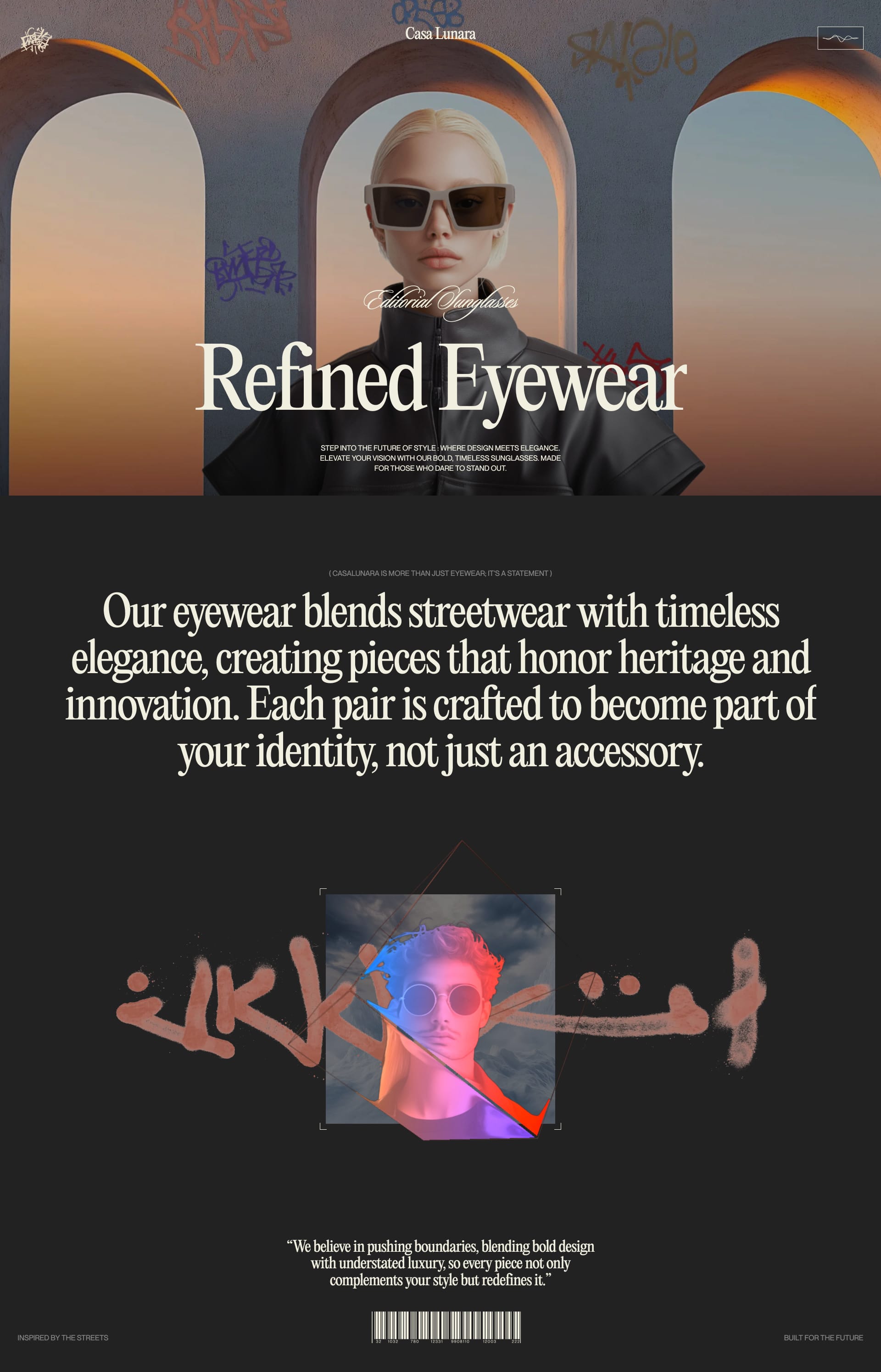
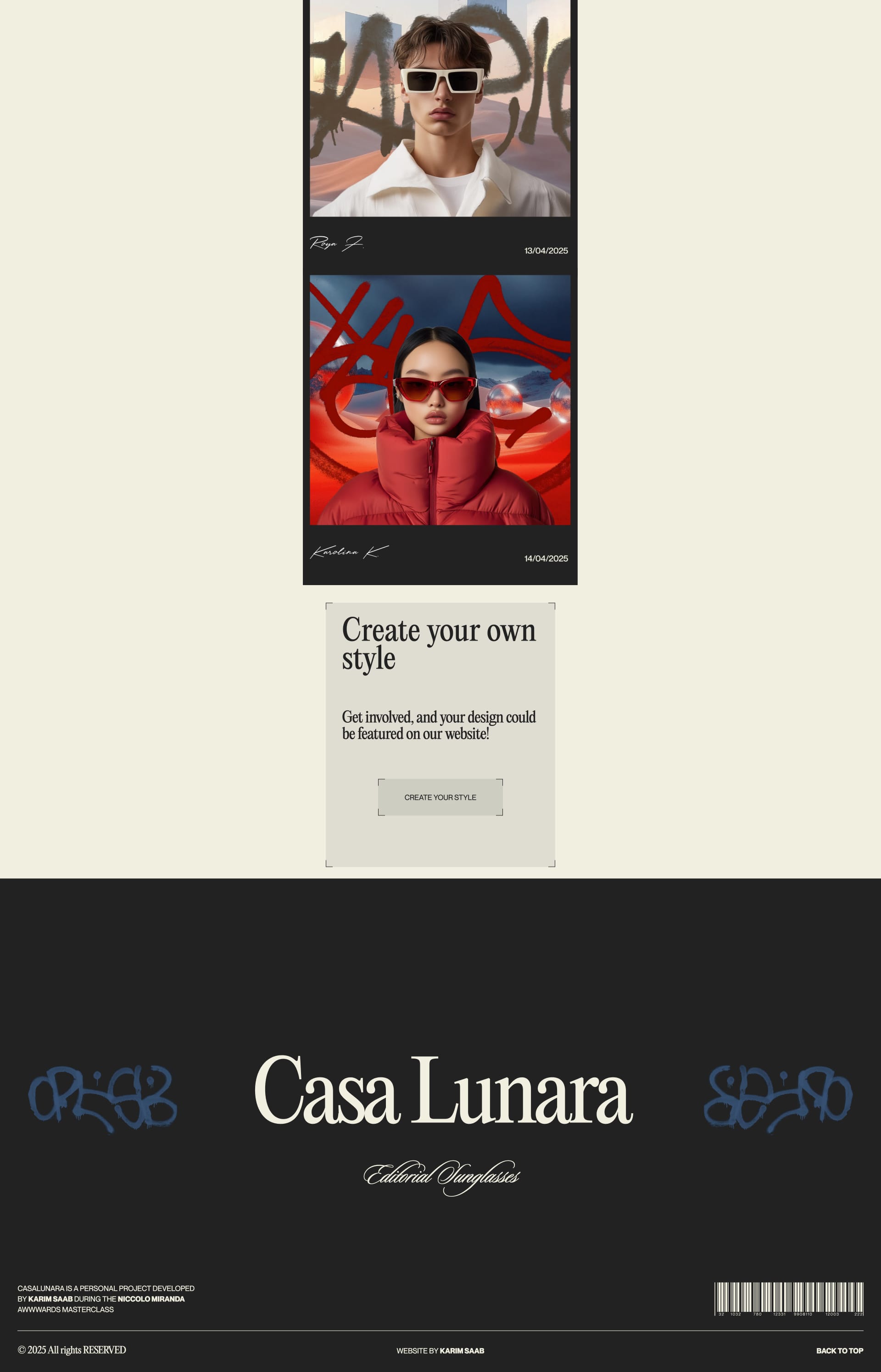
Casa Lunara is a fresh eyewear brand mixing bold, editorial vibes with streetwear style. It features standout sunglasses and lets the community help shape what comes next.
Lapa's Review: Imagine a sleek basic background, a single, powerful image, and bam! – elegant serif fonts take center stage. Casa Lunara uses serifs to create a feeling of luxury and craftsmanship.
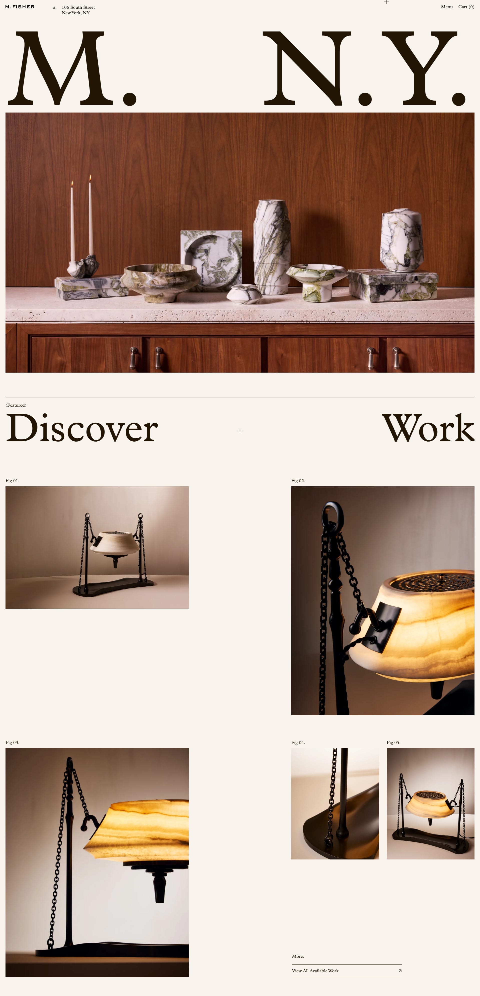
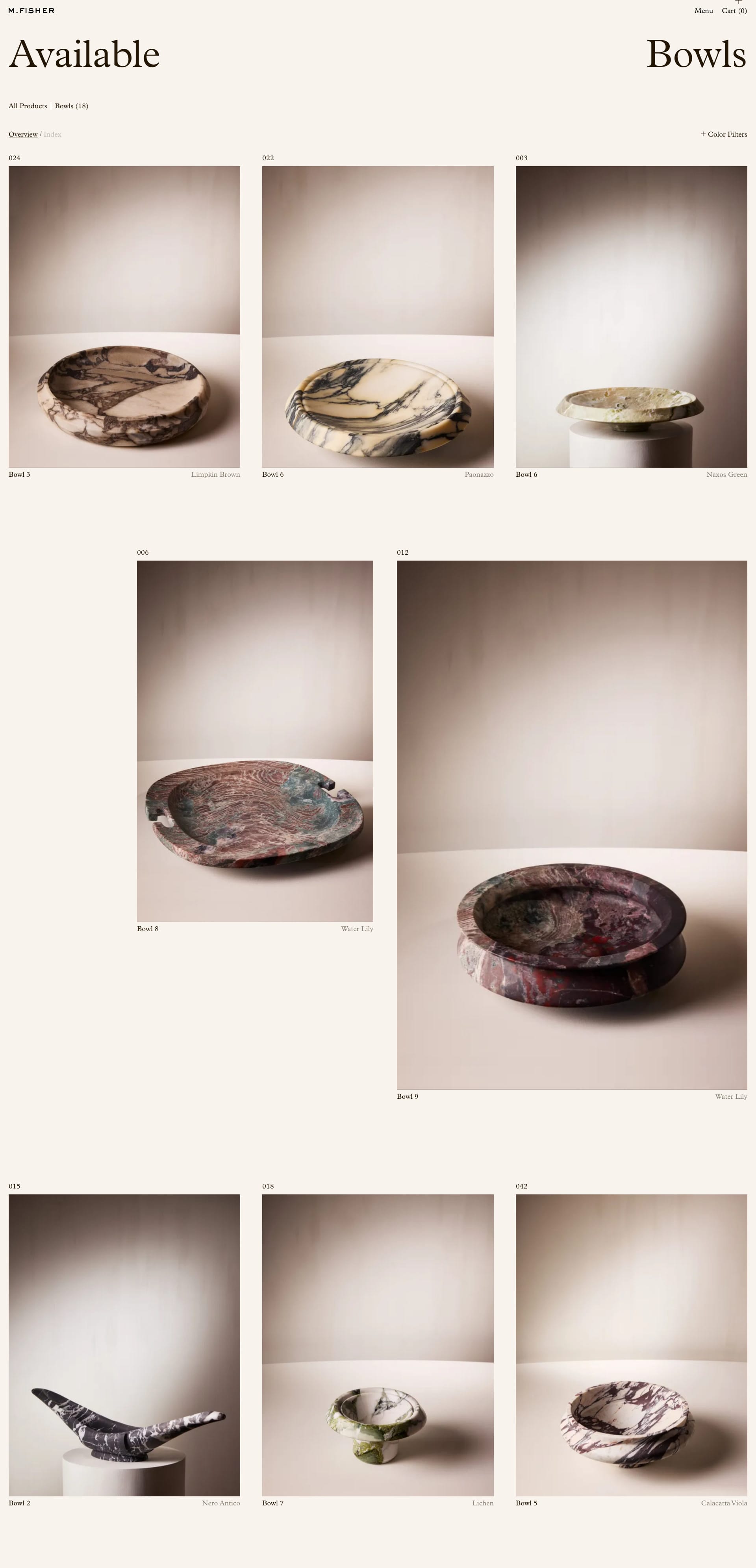
Matthew Fisher’s practice is marked by a fascination with objects and their relationships with people.
Lapa's Review: Bold serifs meet minimalist design in this landing page. The contrast is striking and creates a memorable experience. It’s proof that serifs can be modern and edgy too! 😎
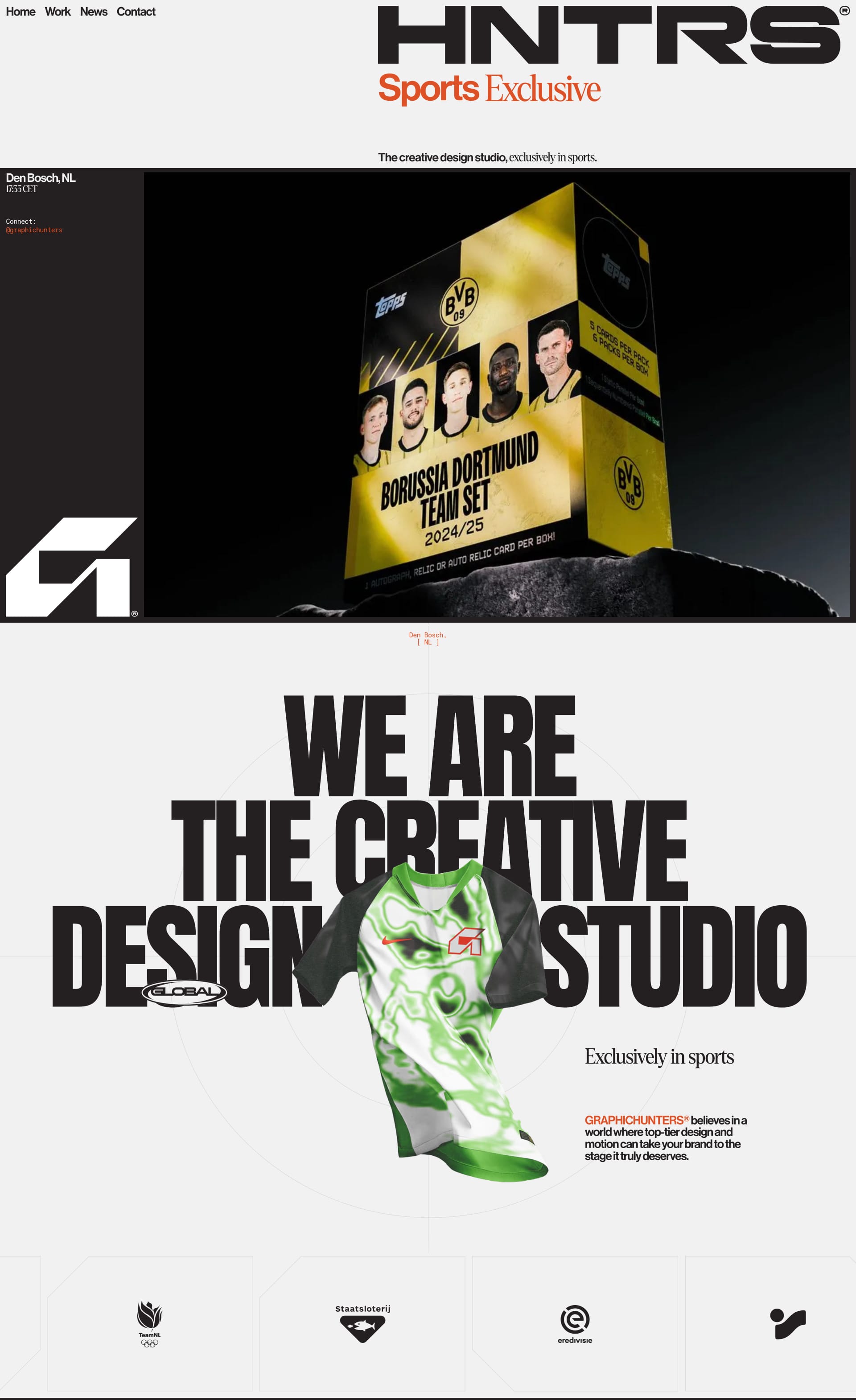
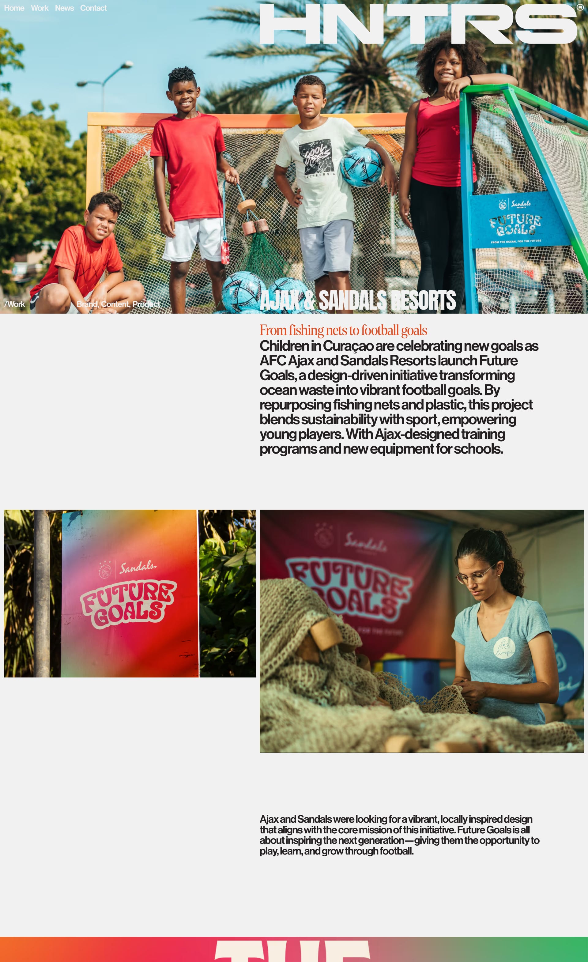
The creative design studio based in 's-Hertogenbosch. We breathe life into brands and campaigns through impactful creation, exclusively collaborating with sports brands.
Lapa's Review: This site showcases how serifs can bring a touch of personality and playfulness to a design. The font choice feels friendly and approachable, almost like a warm hug! 🤗
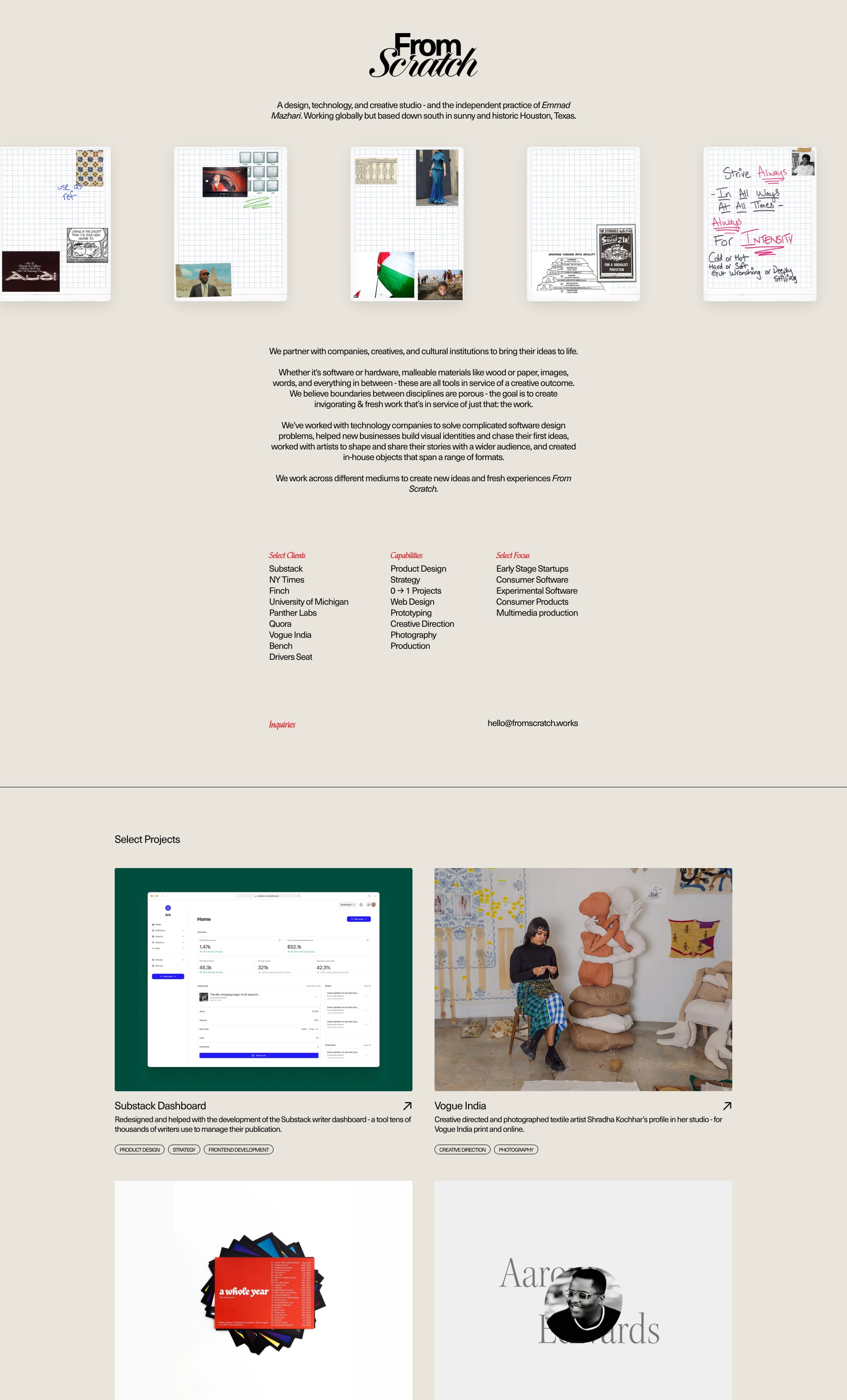
A design, technology, and creative studio - and the independent practice of Emmad Mazhari. Working globally but based down south in sunny and historic Houston, Texas.
Lapa's Review: Clean lines, simple layout, and a carefully chosen serif font create a sense of timeless elegance. It's like stepping into a perfectly curated museum exhibit 🖼️
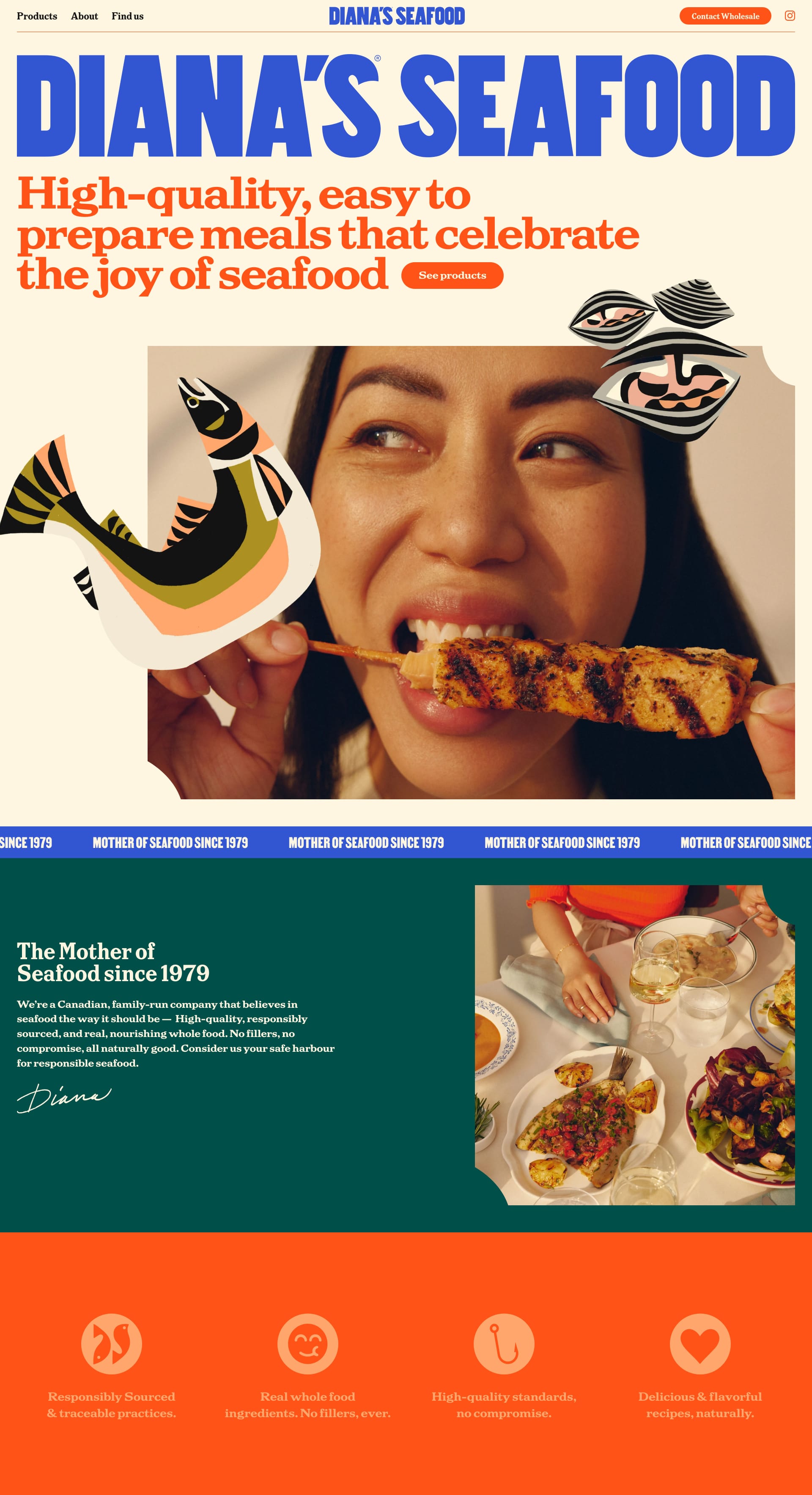
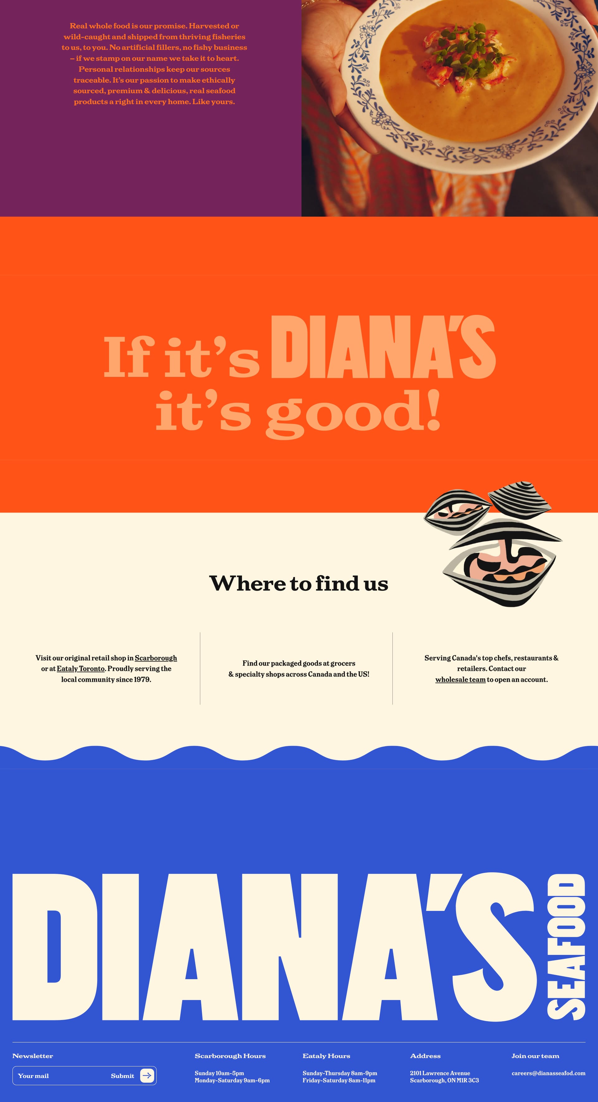
High-quality, easy to prepare meals that celebrate the joy of seafood. Goodness made the Diana’s way – with the best, most beautiful, real ingredients.
Lapa's Review: This landing page uses serifs to create a sense of traditional, homemade goodness. It makes you crave fresh seafood and a cozy atmosphere 🎣
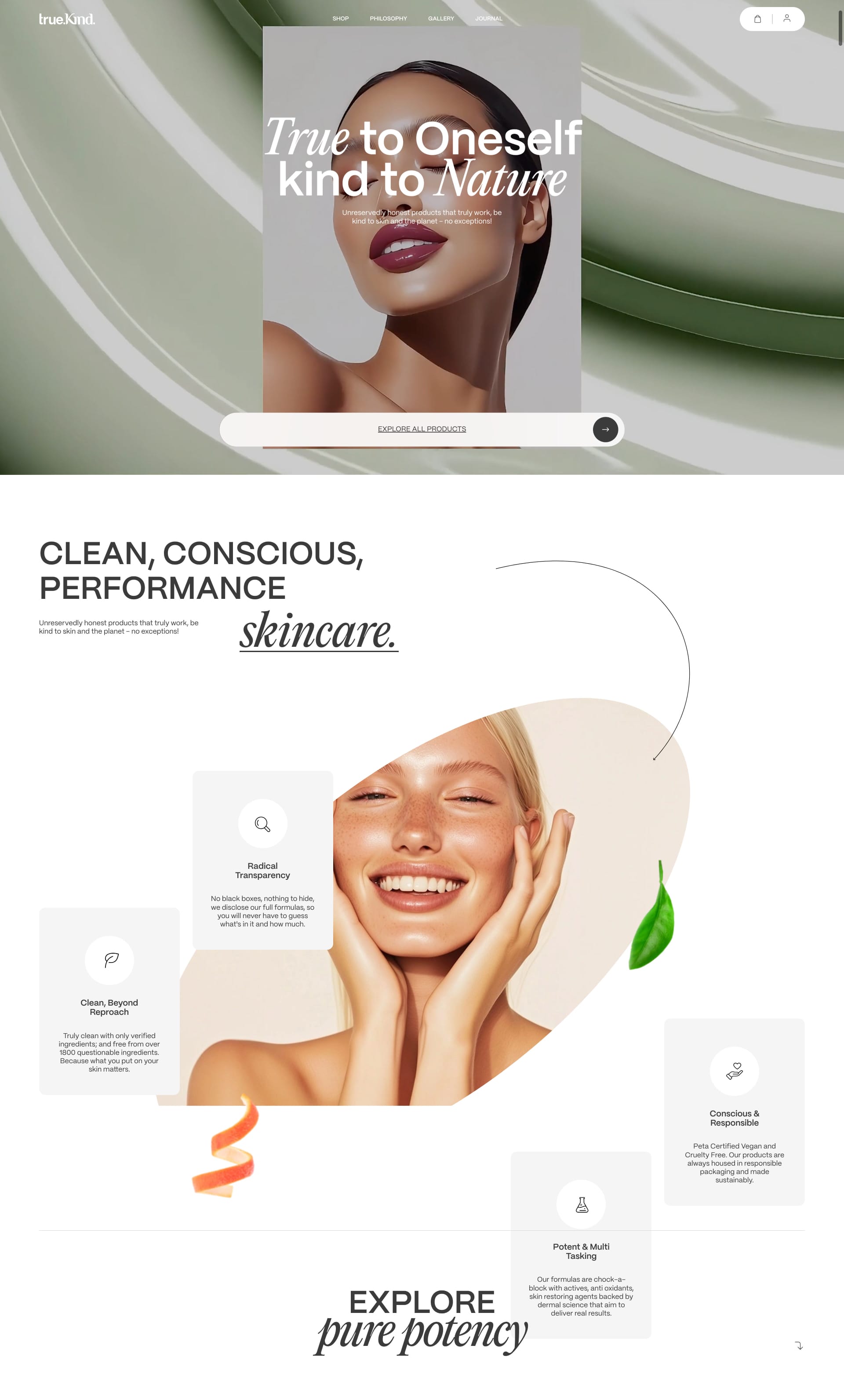
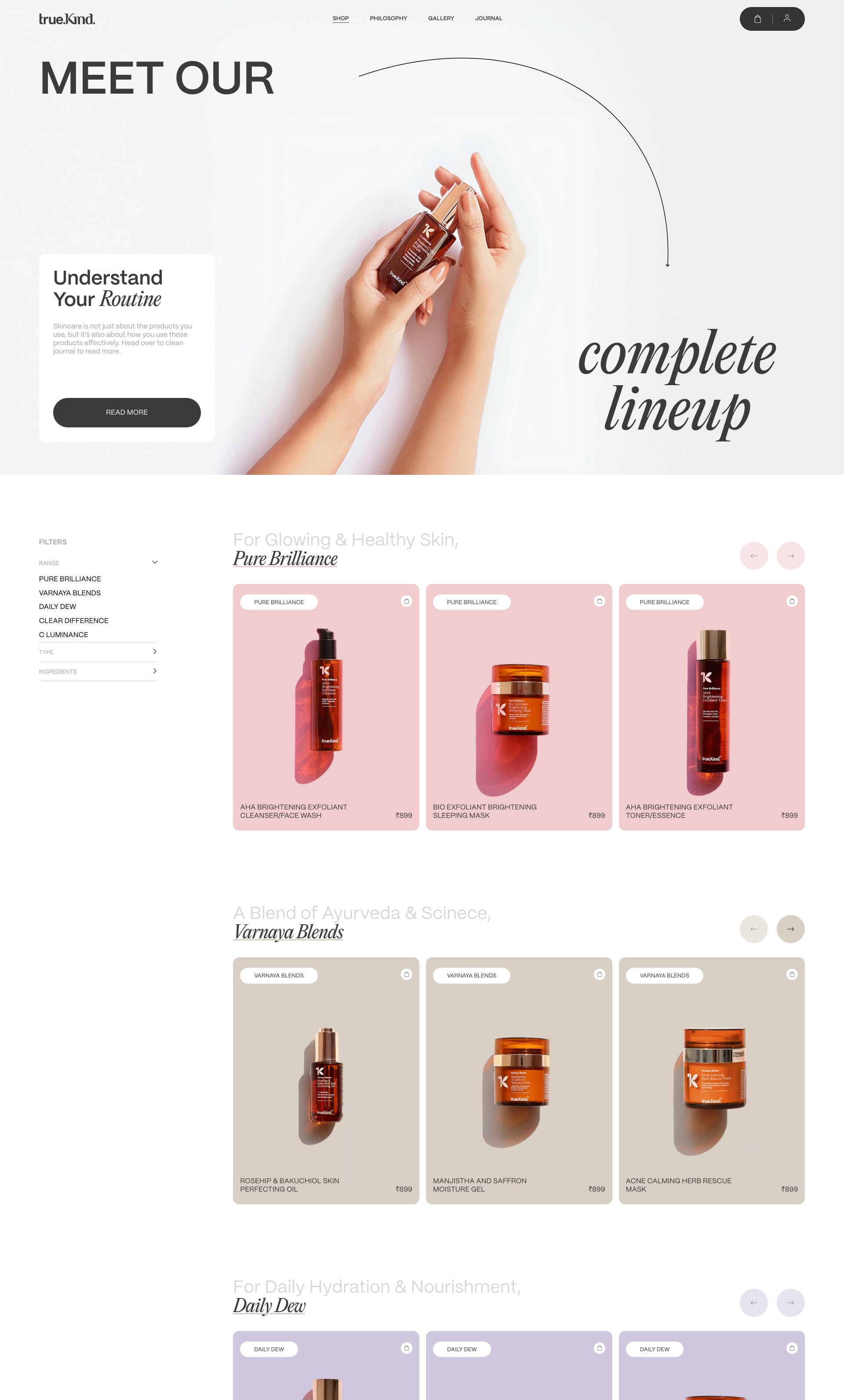
Unreservedly honest products that truly work, be kind to skin and the planet – no exceptions! Clean, conscious, clinical skincare! Honest products that truly work.
Lapa's Review: Serifs add a touch of trustworthiness and authority to this skincare landing page. It's like having a friendly dermatologist recommend their favorite products 👩⚕️
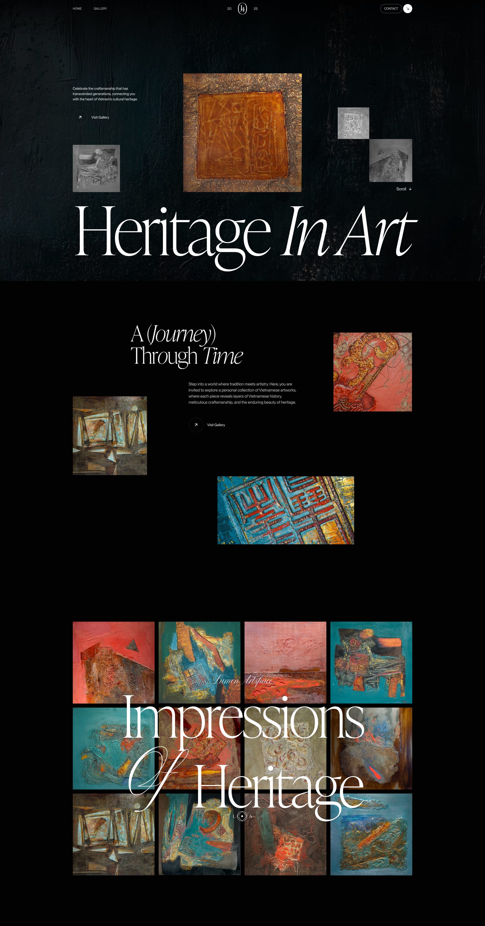
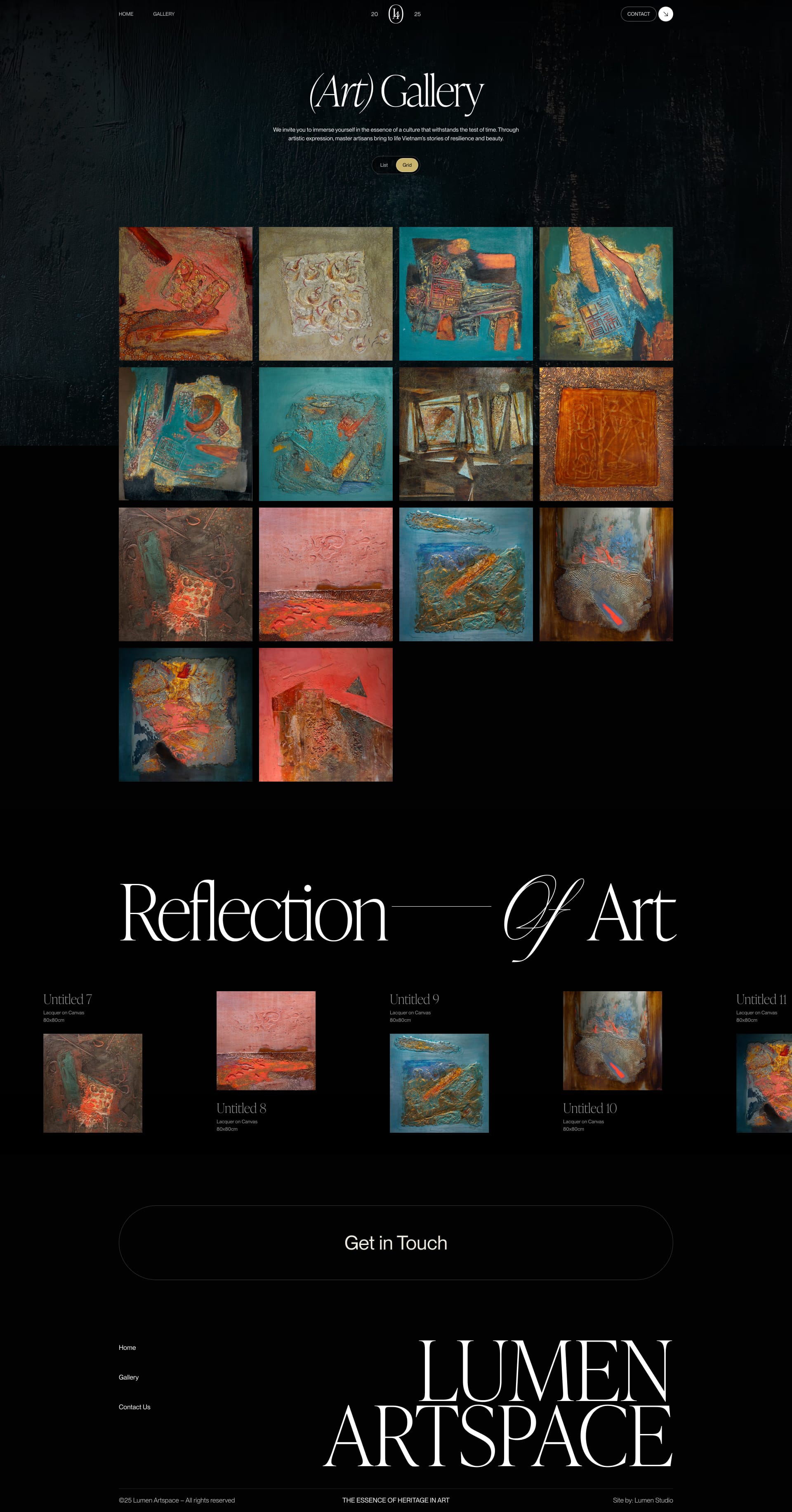
Celebrate the craftsmanship that has transcended generations, connecting you with the heart of Vietnam’s cultural heritage.
Lapa's Review: This landing page is a masterclass in using serifs to create a sense of artistic sophistication. It’s like strolling through an art gallery! 🎨
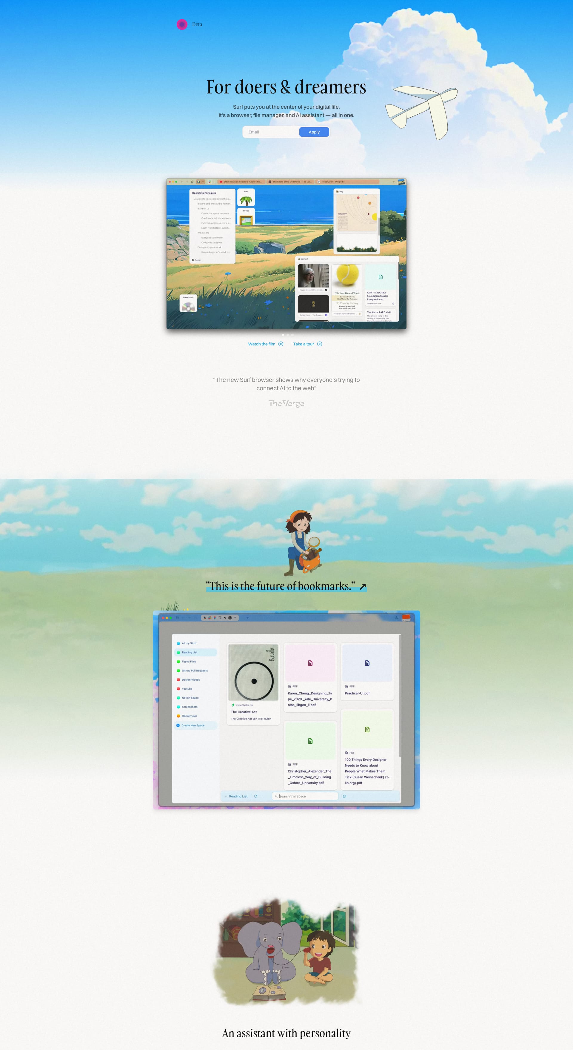
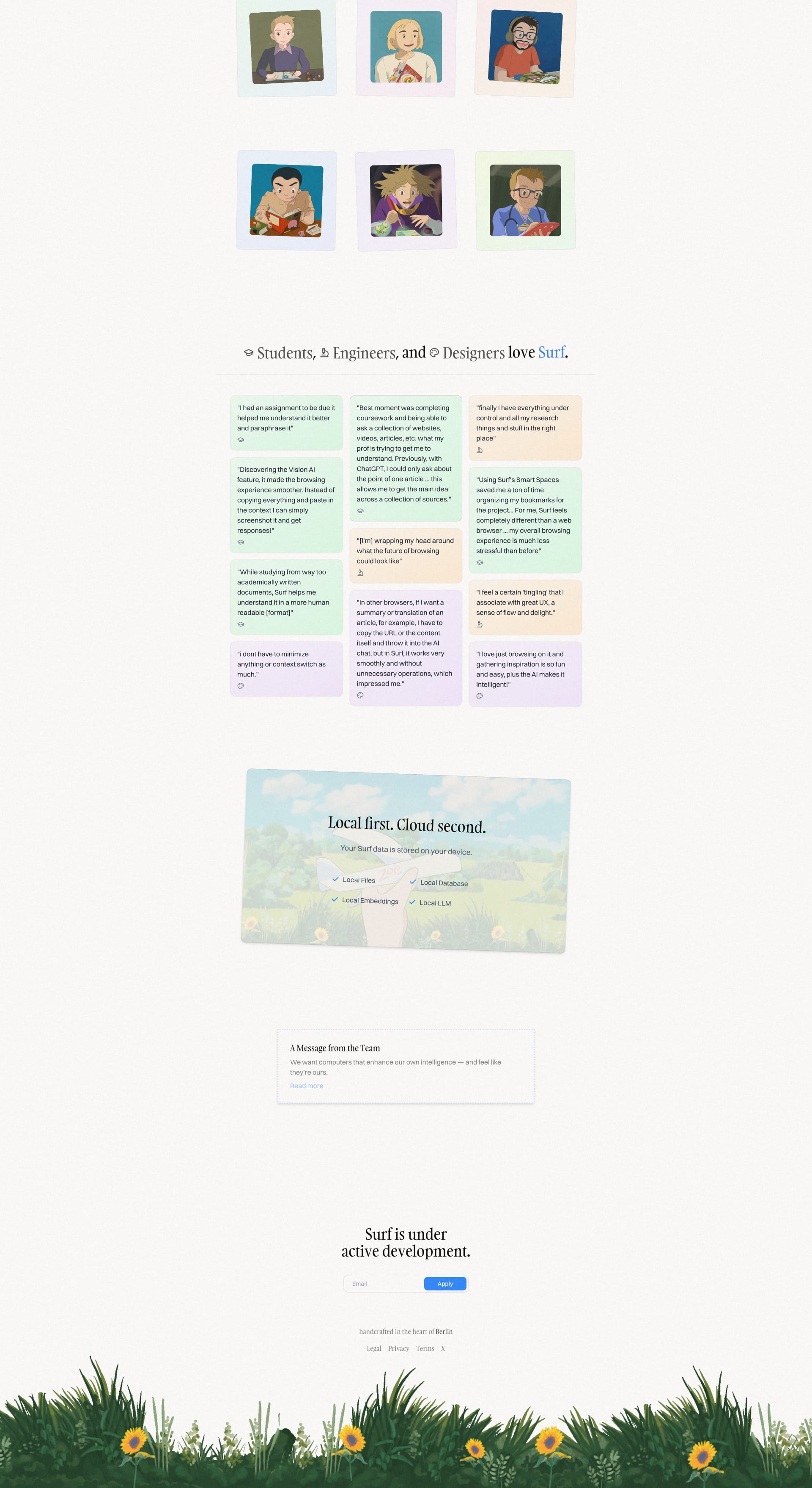
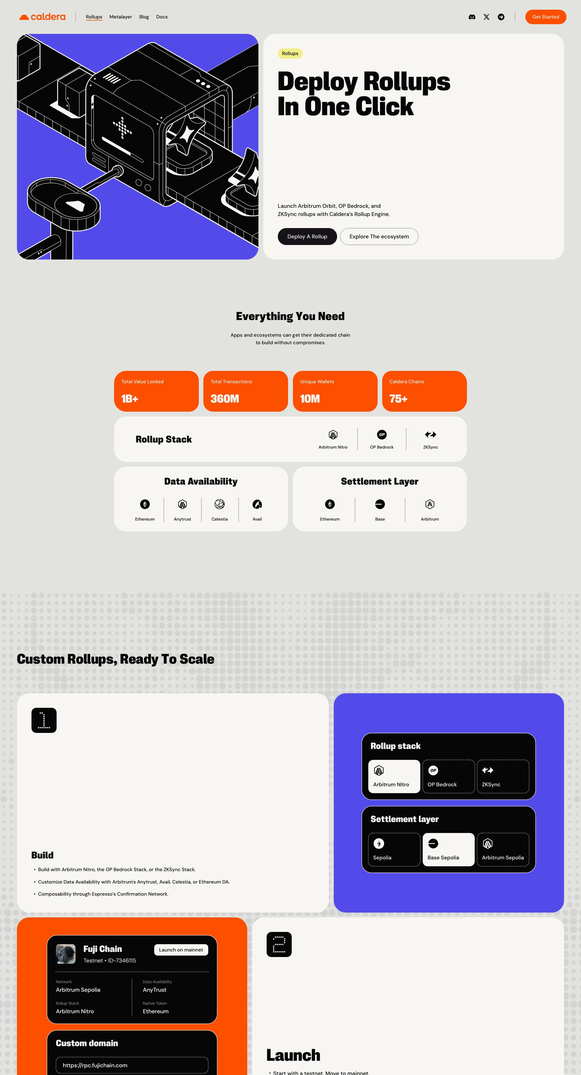
Surf puts you at the center of your digital life. It's a browser, file manager, and AI assistant — all in one.
Lapa's Review: Deta's landing page uses serifs to create a professional, trustworthy image. Think clean, modern, and reliable. It's like having a dependable sidekick for your tech needs 🦸♂️
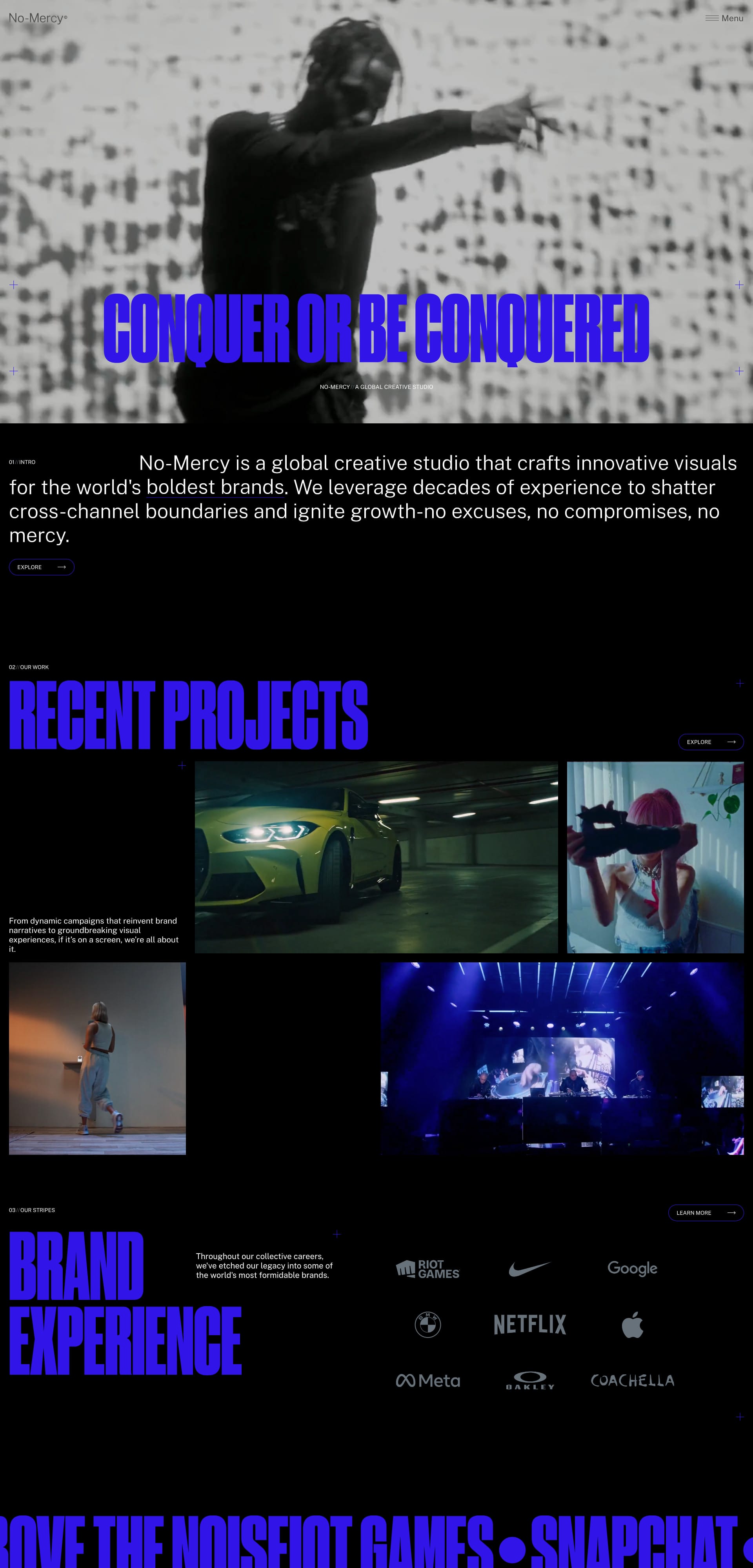
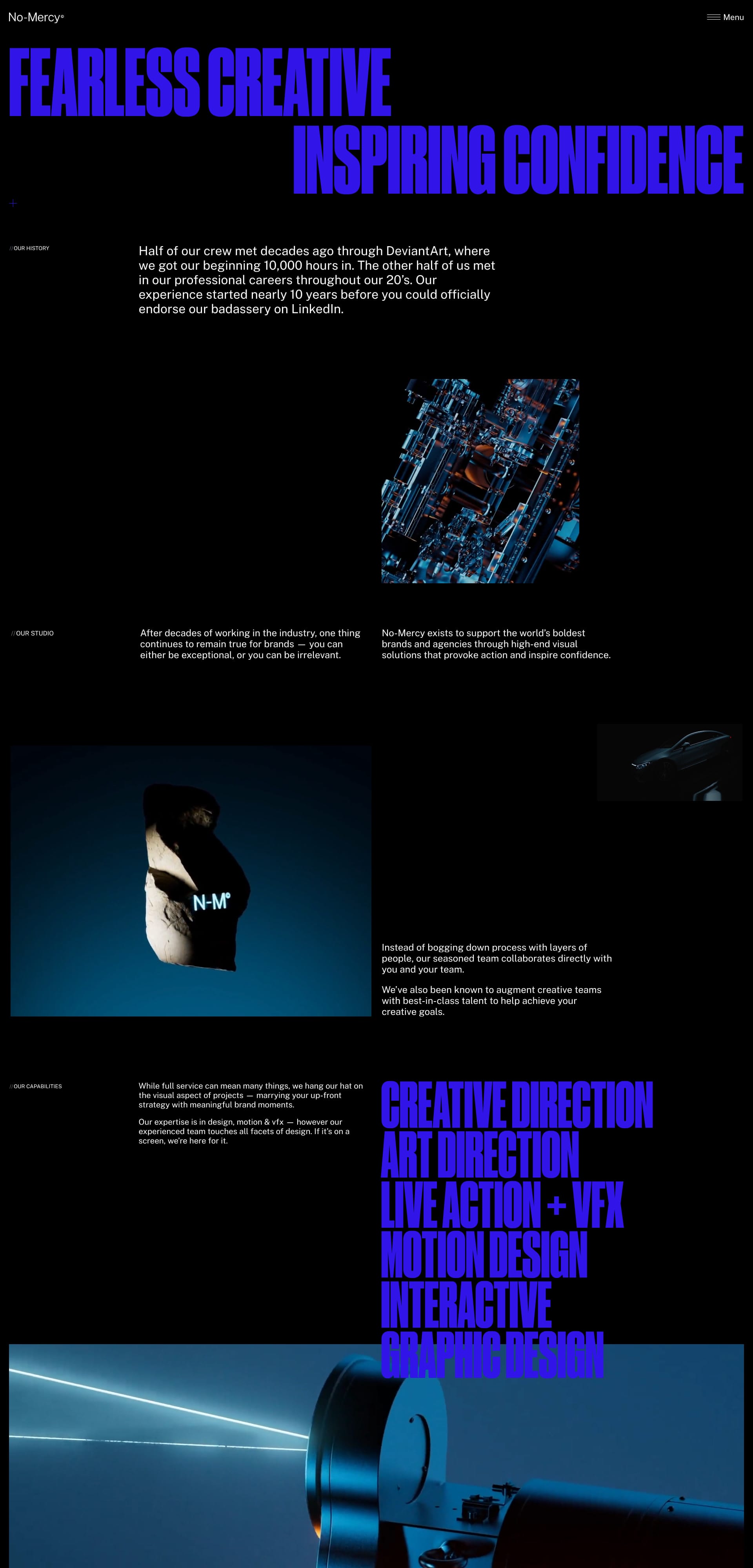
We are a creative studio based in San Francisco, Los Angeles, Minneapolis, Spain. No-Mercy exists to support the world’s boldest brands and agencies through high-end visual solutions that provoke action and inspire confidence.
Lapa's Review: All-black canvas. Gritty glitch textures. And boom, huge electric serif fonts in punchy purple (shoutout to “CONQUER OR BE CONQUERED”). This site is pure attitude. The sharp, condensed serifs feel like a creative war cry - intense, cinematic, and unapologetically confident. No mercy, indeed. ⚔️📽️
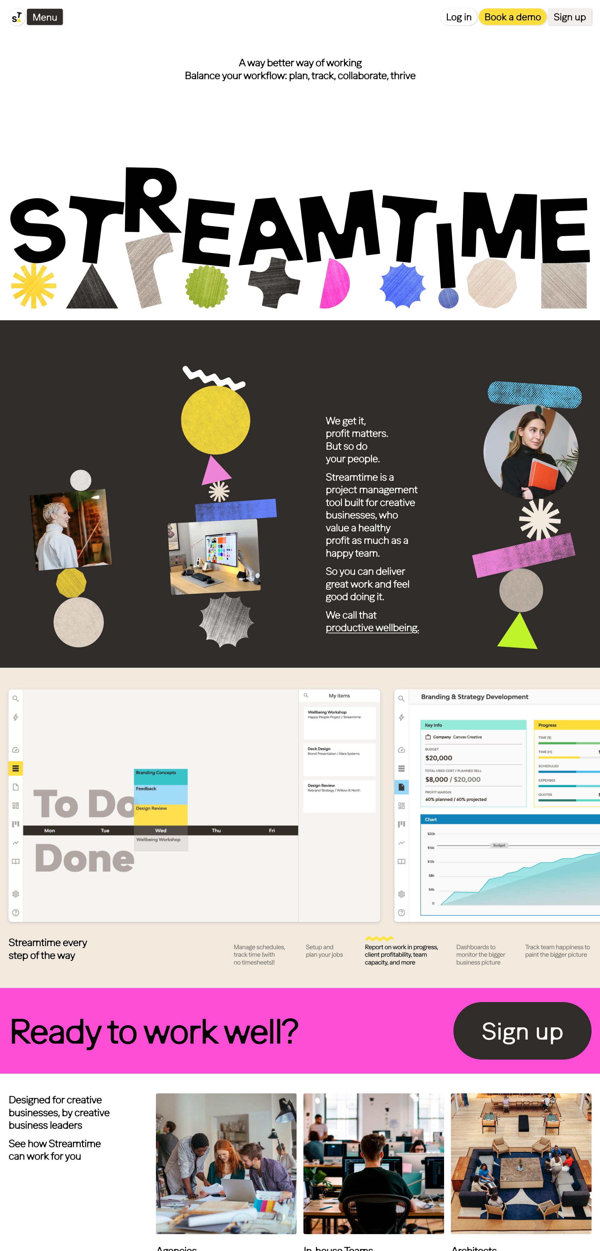
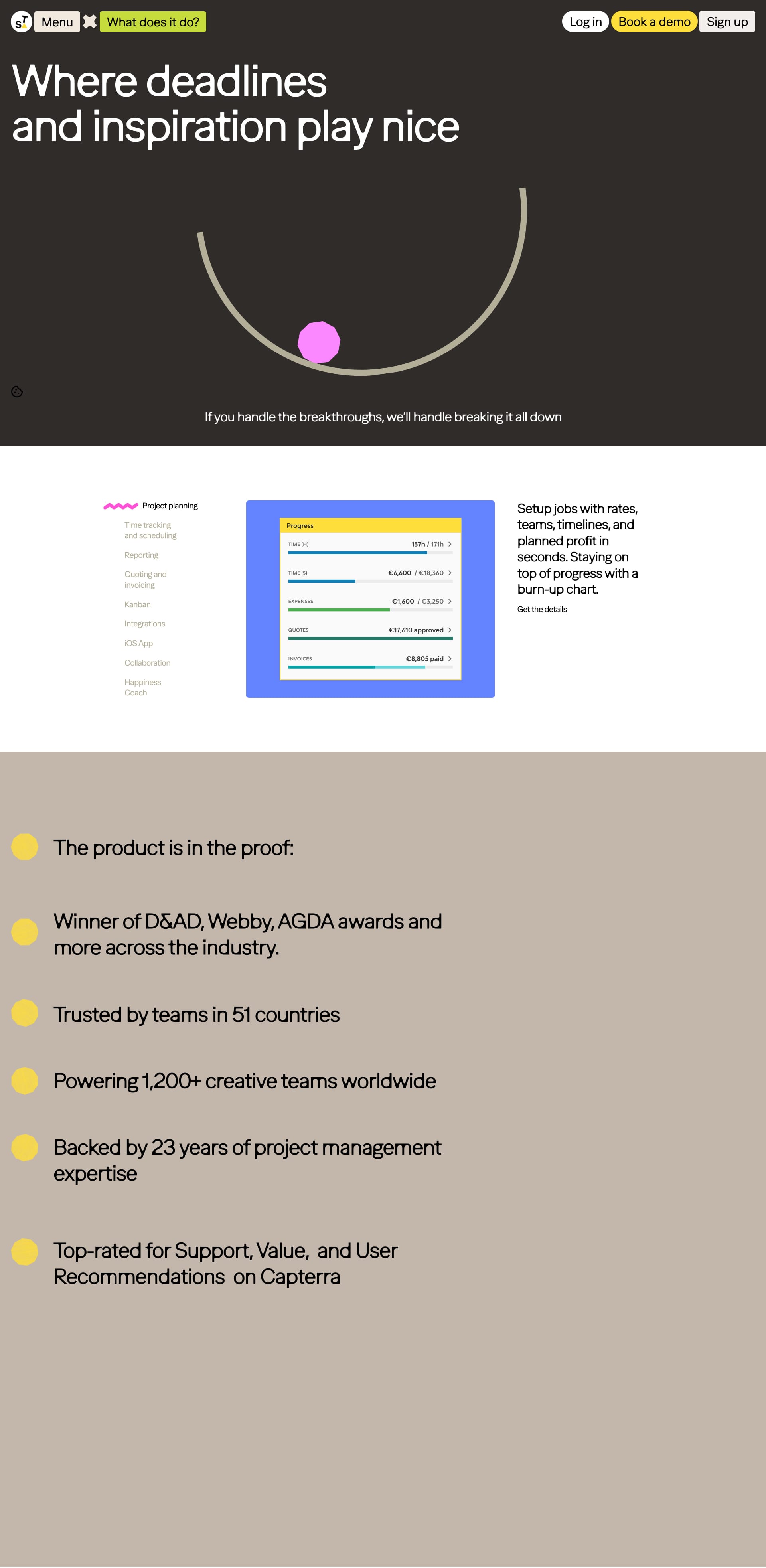
Project management software for creative teams, design studios and businesses. Plan jobs, track time, schedule your teams, quote and invoice and report on client and project profitability.
Lapa's Review: From chunky, playful serif letters in the logo to wiggly shapes and pastel cutouts, Streamtime feels like a creative studio’s dream board. The serif headlines (like “Where deadlines and inspiration play nice”) add charm and clarity, grounding the quirky layout with just the right touch of structure. It’s Asana meets art school 🎨📅
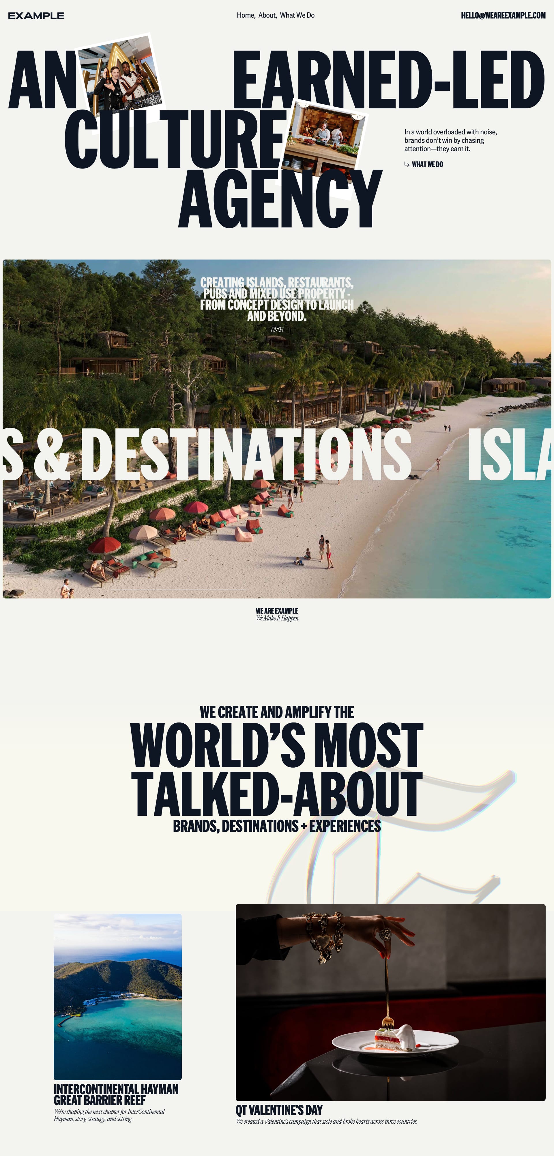
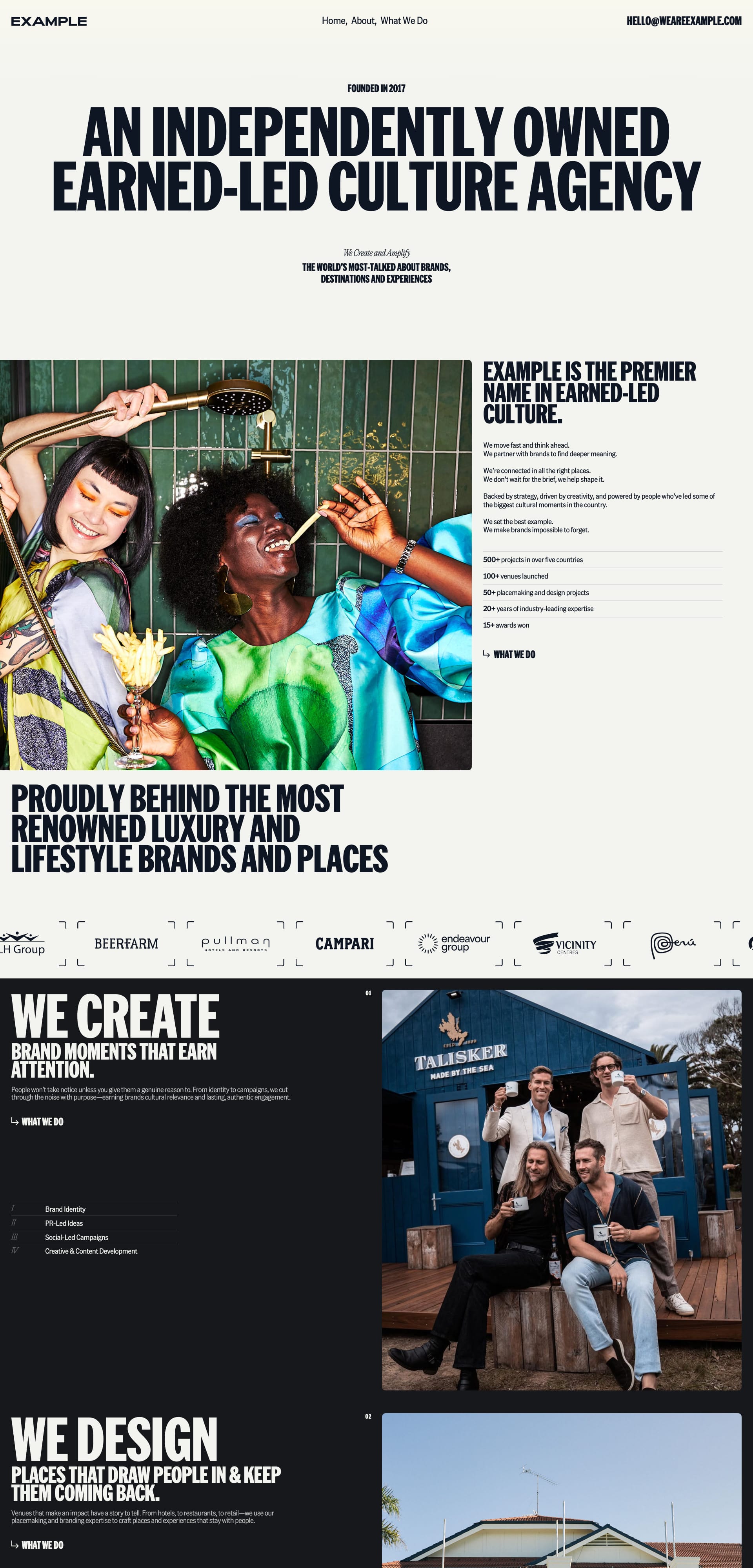
Example is Australia's leading PR, placemaking, and hospitality marketing agency, creating and amplifying world's most talked-about brands, destinations and experiences.
Lapa's Review: Huge condensed serif headlines dominate the layout like magazine cover lines—think Vogue meets marketing agency. With layered images, sharp contrasts, and oversized type, it screams confidence. The serif choice (probably something like GT Super or similar) gives the whole site a luxe, global-agency edge. This one doesn’t whisper—it shouts 🗣️🌍
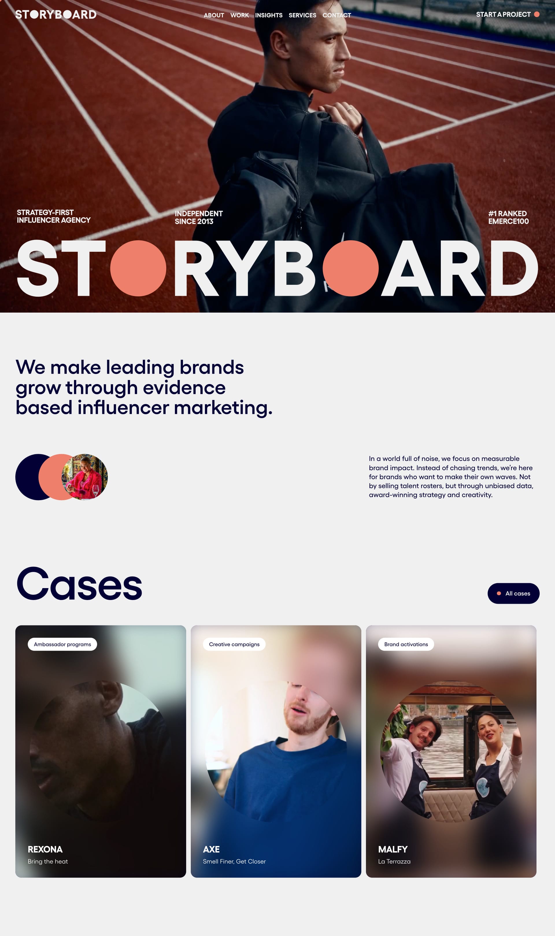
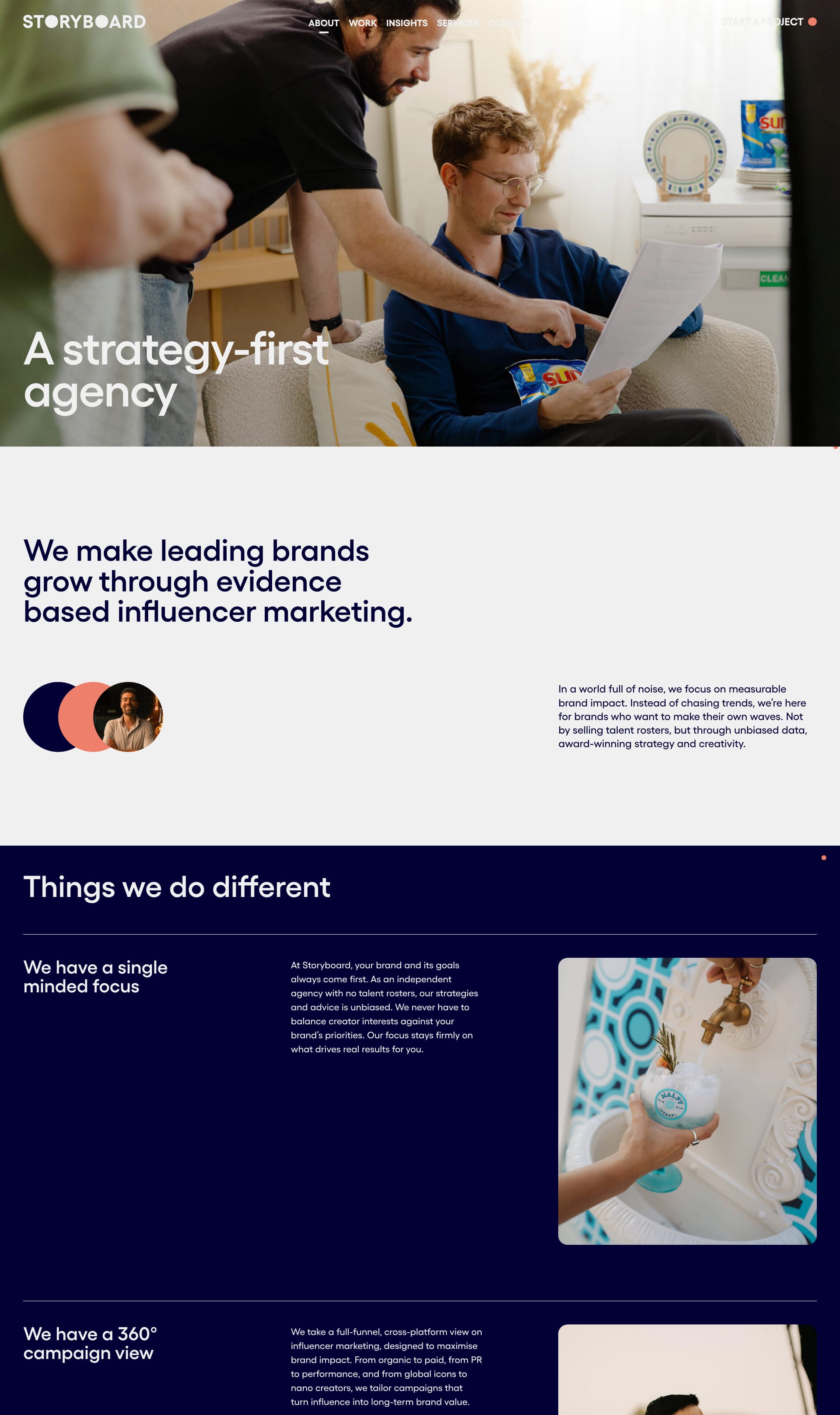
We are a strategy-first agency. We make leading brands grow through next-level influencer marketing.
Lapa's Review: Muted tones meet bold, geometric serif headlines in a layout that balances polish with personality. The custom type treatment in “STORYBOARD” (with that cheeky circle ‘O’) grabs attention, while the rest of the serif fonts stay modern and editorial. It’s like reading a strategy deck designed by a trend-savvy art director 📊🧃
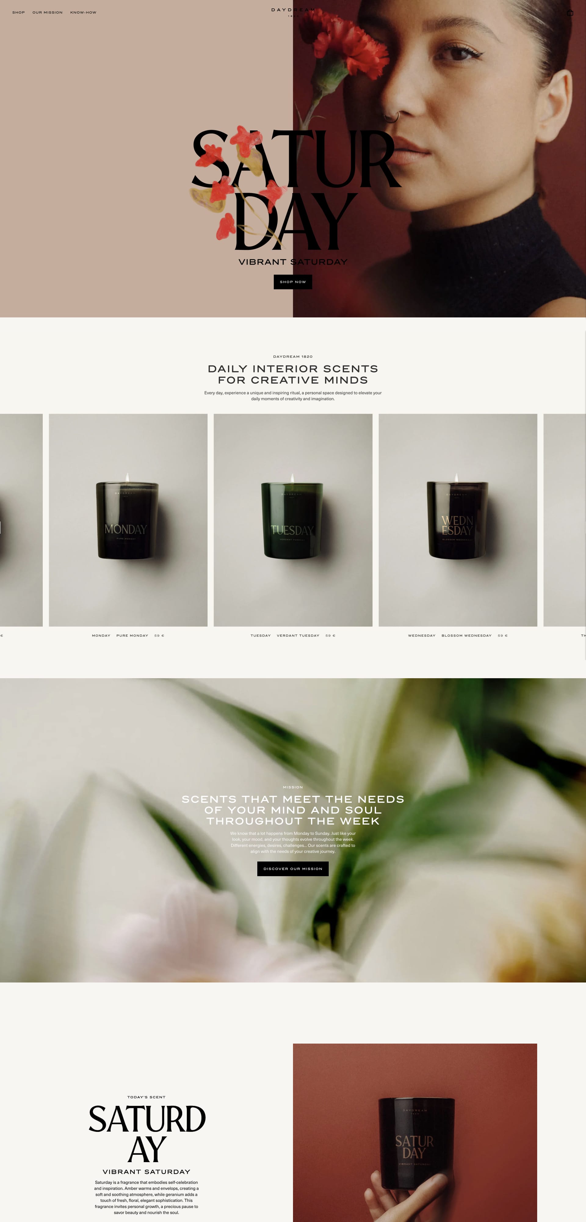
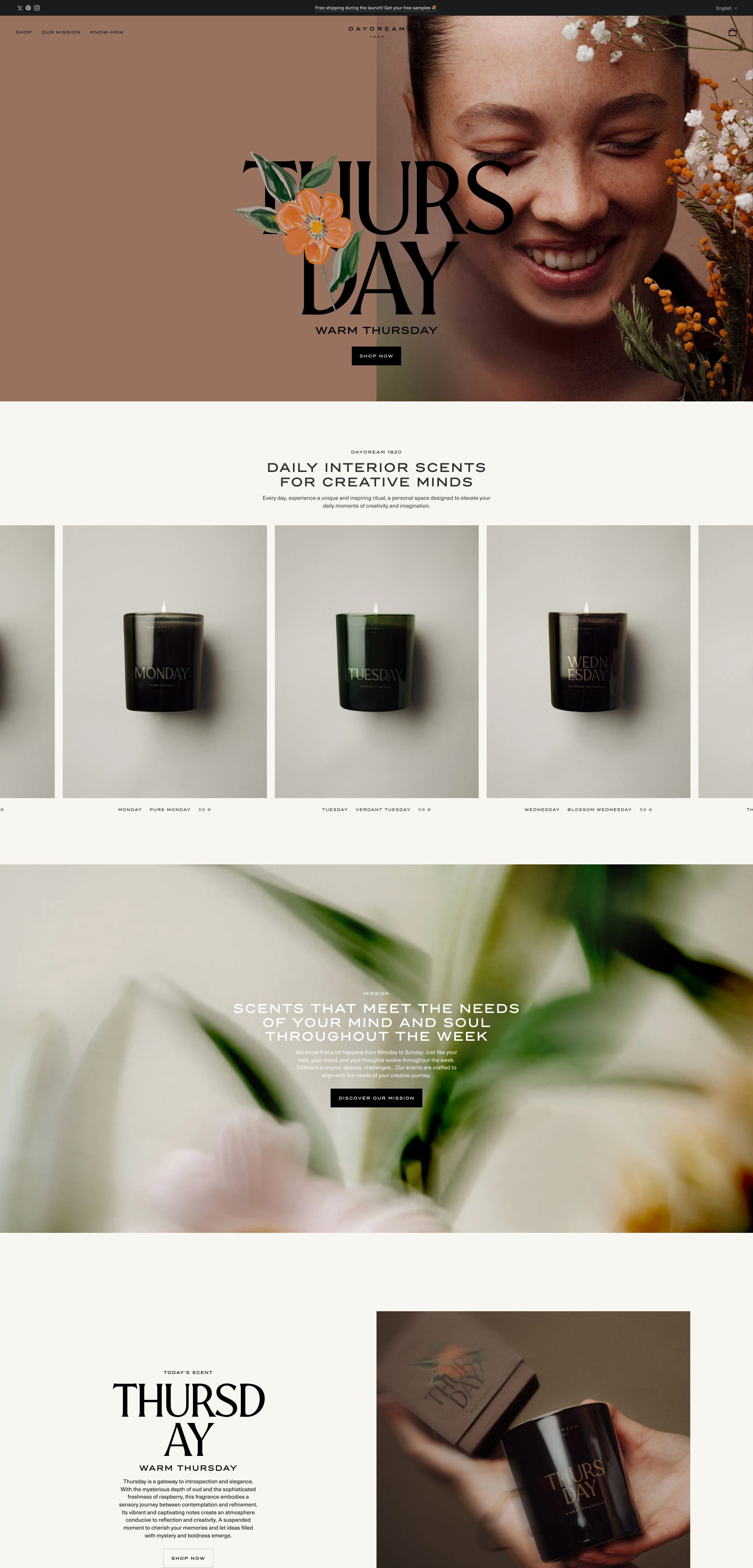
Daily interior scents for creative minds. Every day, experience a unique and inspiring ritual, a personal space designed to elevate your daily moments of creativity and imagination.
Lapa's Review: Delicate serif typography floats across soft blush backgrounds and moody candle shots, like a magazine spread scented with poetry. The custom type treatment of weekdays feels personal and elegant, paired with dreamy portraits and floral overlays. It's luxury meets lifestyle, all wrapped in a peaceful visual rhythm 🌸🖋️
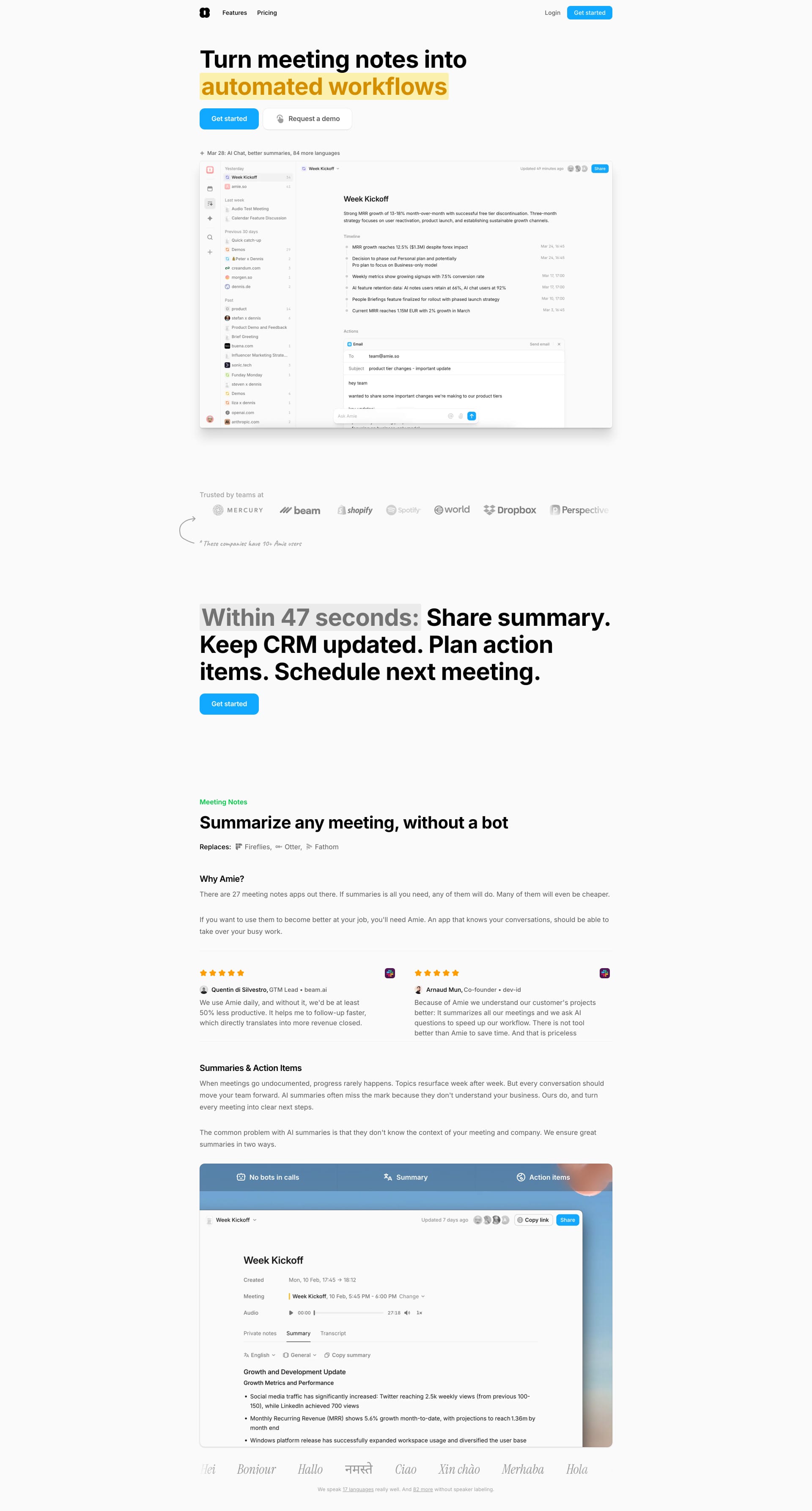
Turn meeting notes into automated workflows. Handle meetings, summaries, todos and emails (soon) with your AI personal assistant.
Lapa's Review: Sleek and modern, Amie's landing page is a masterclass in minimalist design. ✨ The clean layout and subtle animations create a seamless user experience, making it super easy to navigate and find the information you need. It's like a perfectly organized toolbox – everything is right where you expect it to be.
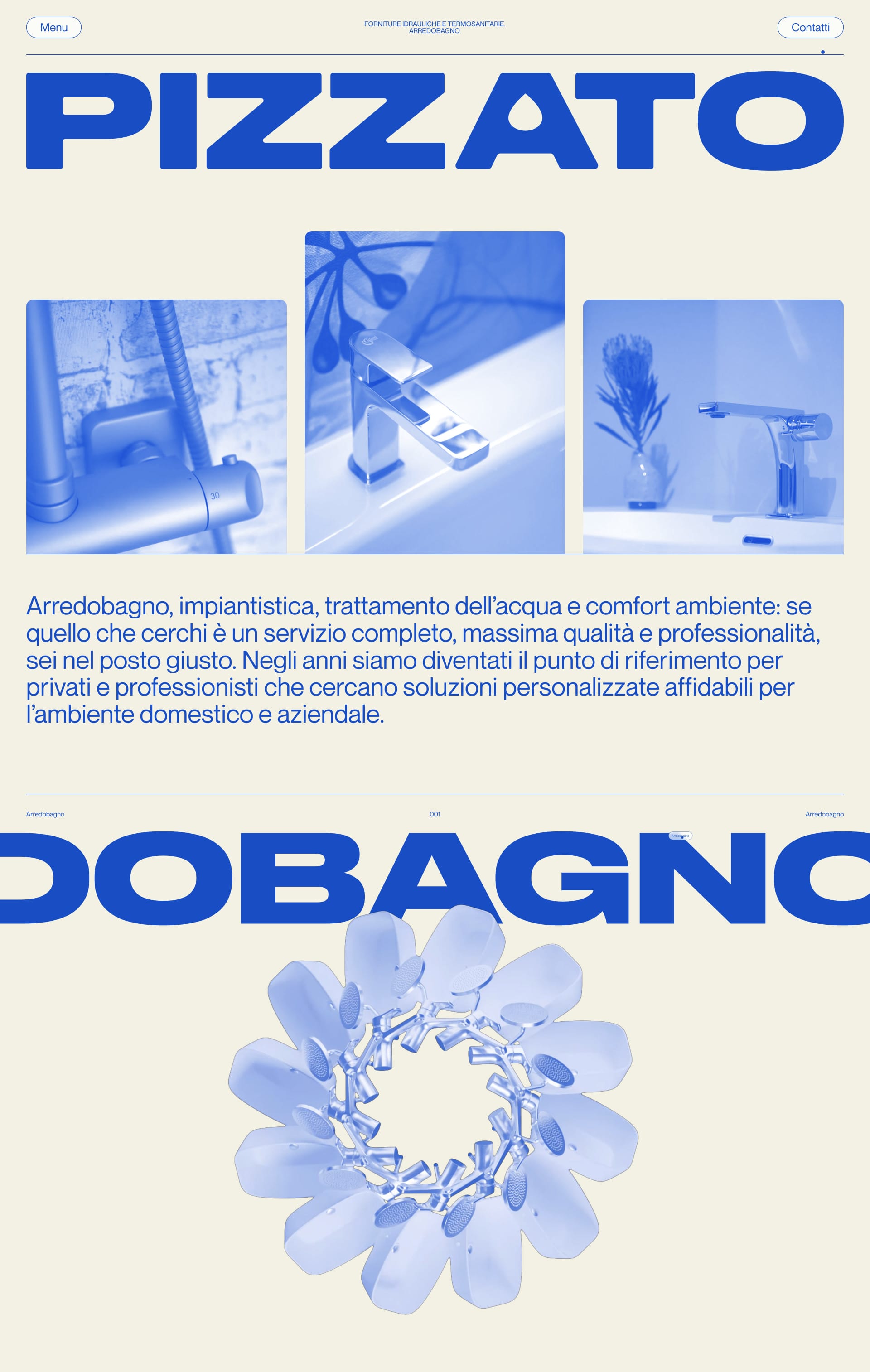
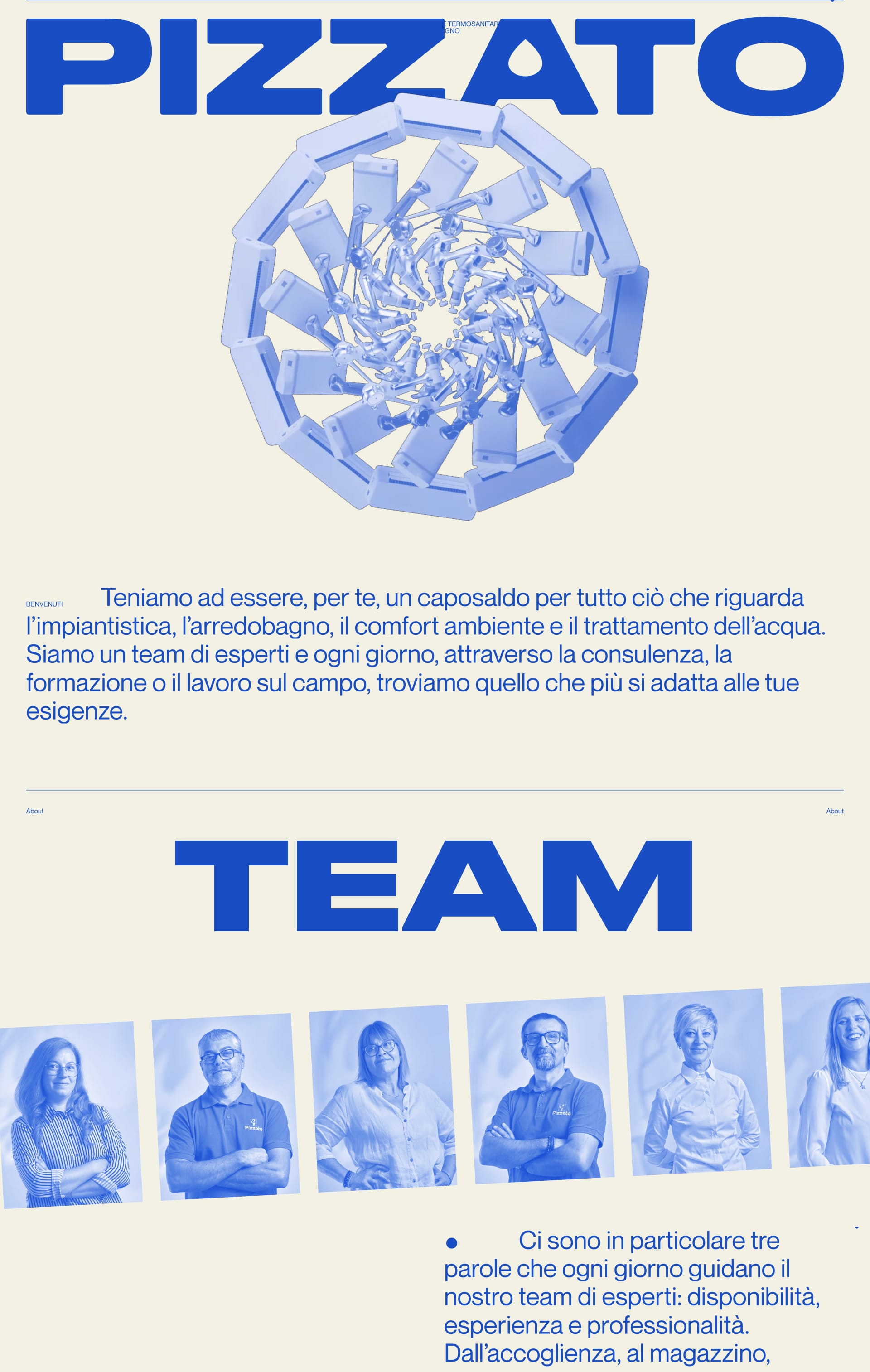
Offriamo soluzioni all'avanguardia per il comfort ambientale, combinando tecnologia e sostenibilità per creare ambienti accoglienti ed efficienti. Inoltre, ci occupiamo del trattamento dell'acqua, fornendo sistemi affidabili per acqua pulita e sicura.
Lapa's Review: A clean and modern design with well-structured layouts, elegant typography, and a subtle focus on high-quality imagery.
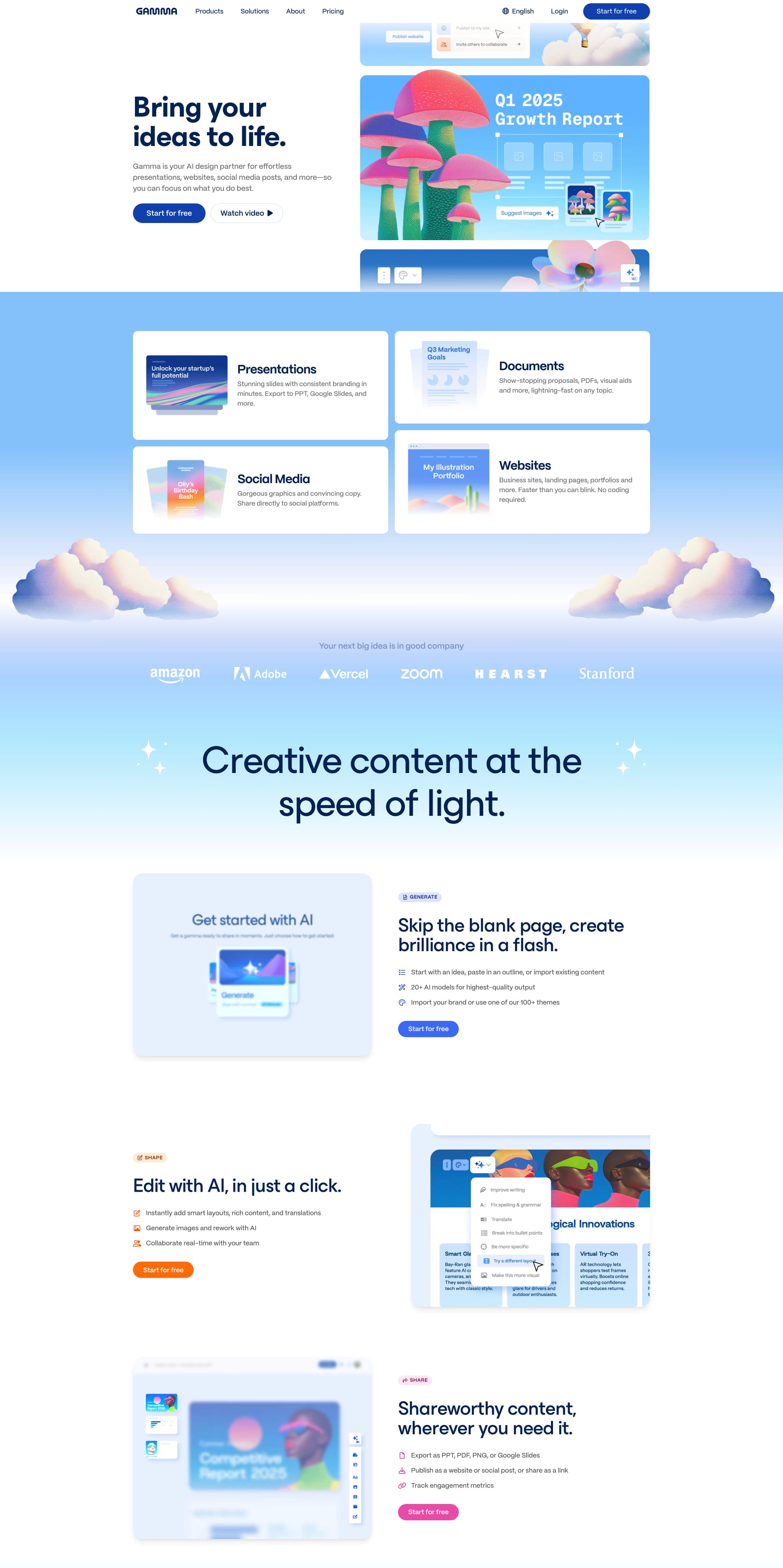
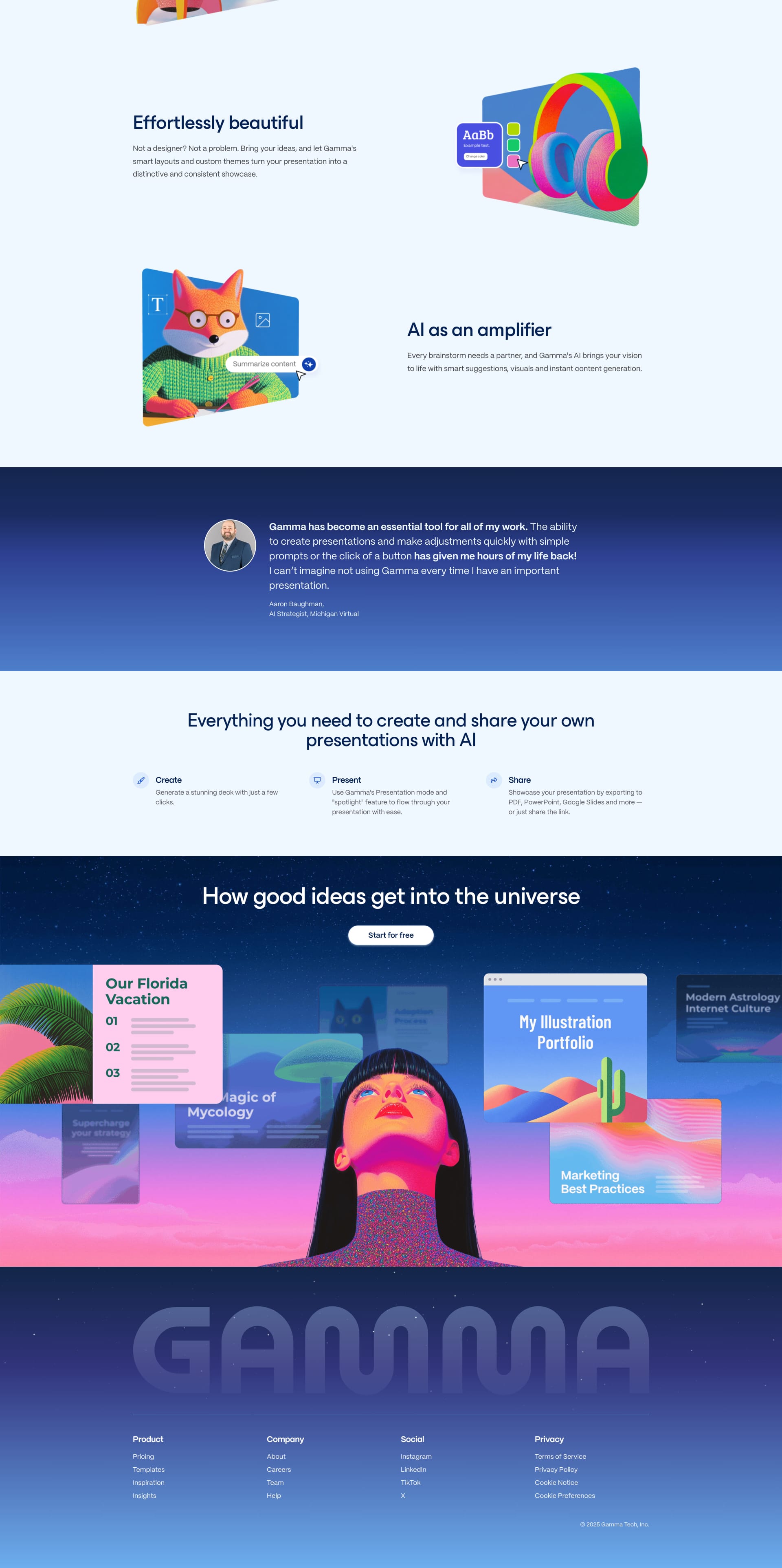
Gamma is your free-to-use AI design partner for creating effortless presentations, websites, and more. No coding or design skills required.
Lapa's Review: This landing page is all about showcasing the product's power and versatility. 💪 The bold imagery and strong typography create a sense of confidence and innovation.
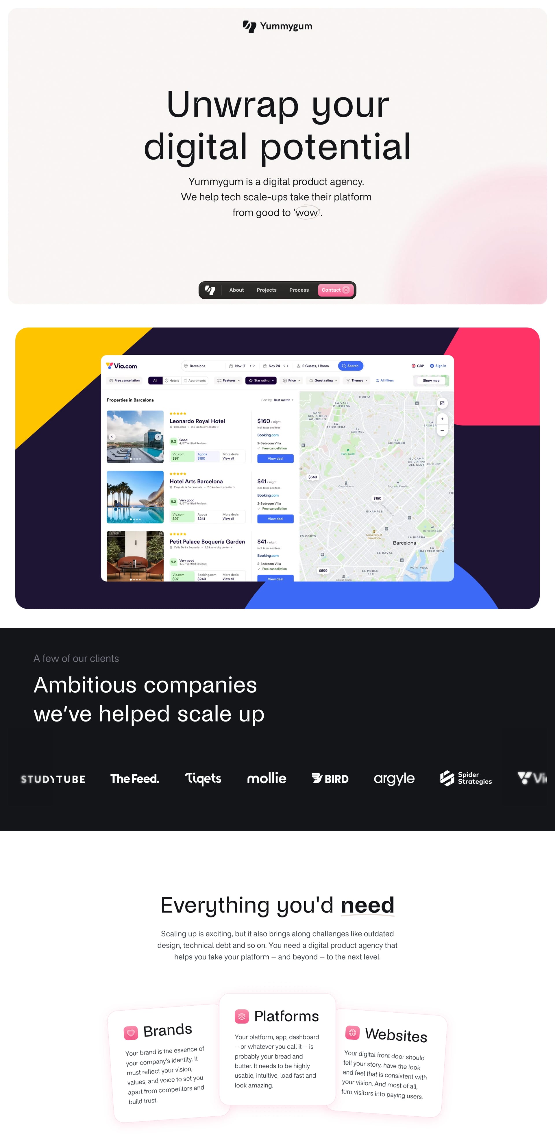
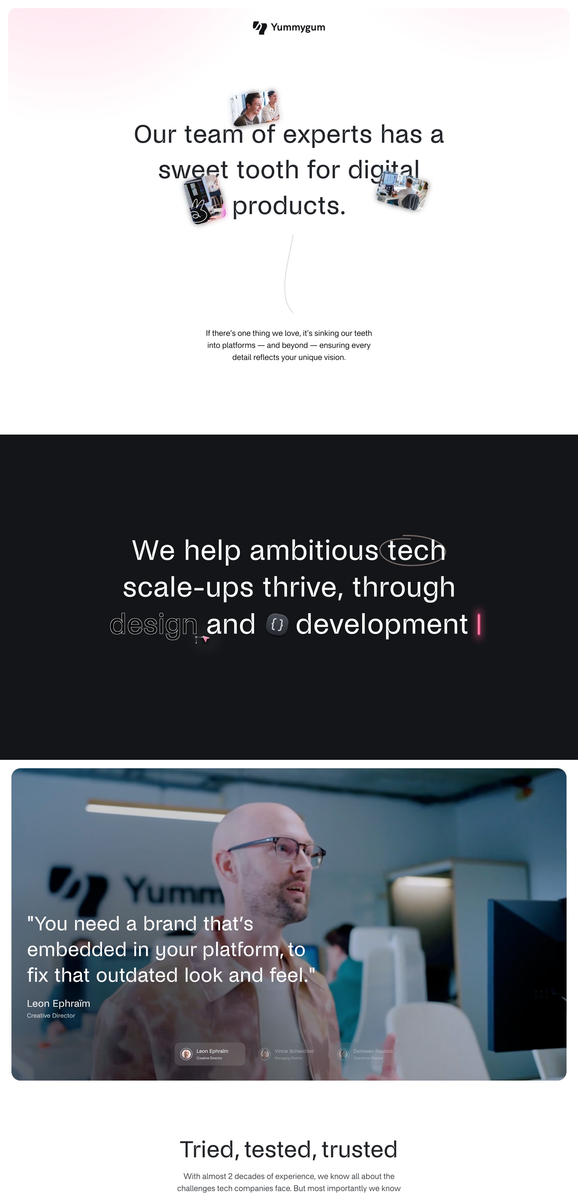
Yummygum is a digital product agency. We help tech scale-ups take their platform from good to “wow” through design and development.
Lapa's Review: This landing page is bursting with personality! 🎉 From the vibrant colors to the quirky animations, Yummygum isn't afraid to stand out from the crowd.
Enjoyed This Issue?
Share it with a friend! Don't forget to subscribe to our Newsletter!
If you have websites that you want to appear on Lapa Ninja, do not hesitate to email the team at 💌 hi@lapa.ninja.