Lapa Inspiration #7 - Black & White Minimalist Landing Page Designs You Need to See
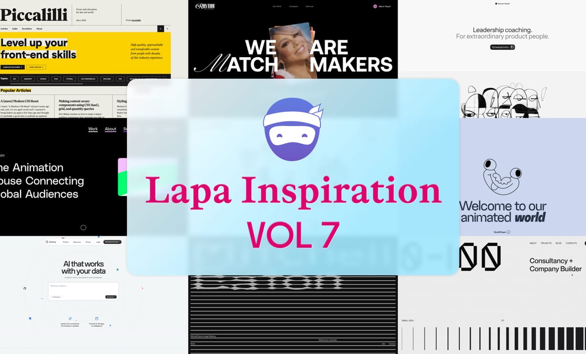
Hey awesome Lapa ninjas! 👋 Jen here from Lapa.Ninja, and guys, do I have a treat for your eyeballs! December might be frosty ☃️, but these black and white minimalist landing pages are HOT 🔥! Think chic sophistication meets conversion power. Ready to get inspired? Let’s go!
Lapa.Ninja currently features 6723 landing page designs. We've added incredible new content for you to explore Get inspired by real landing page examples with full website screenshots. Check out the latest amazing websites below.
Our Sponsor

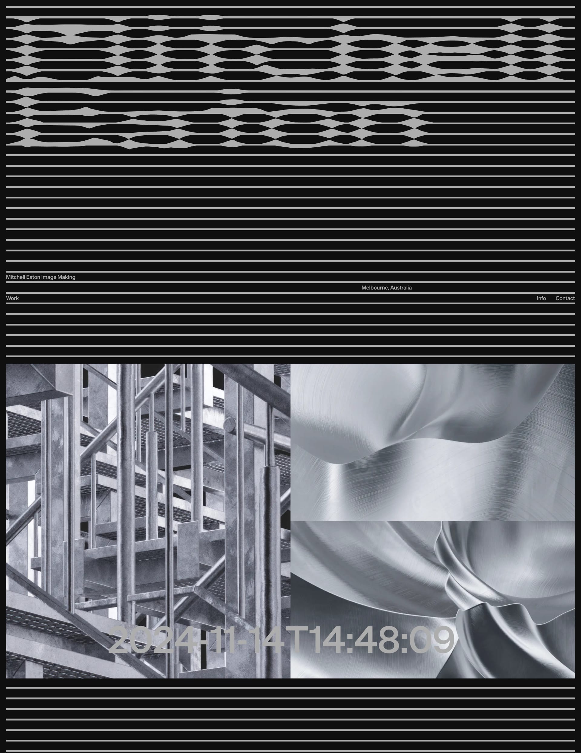
Mitchell Eaton
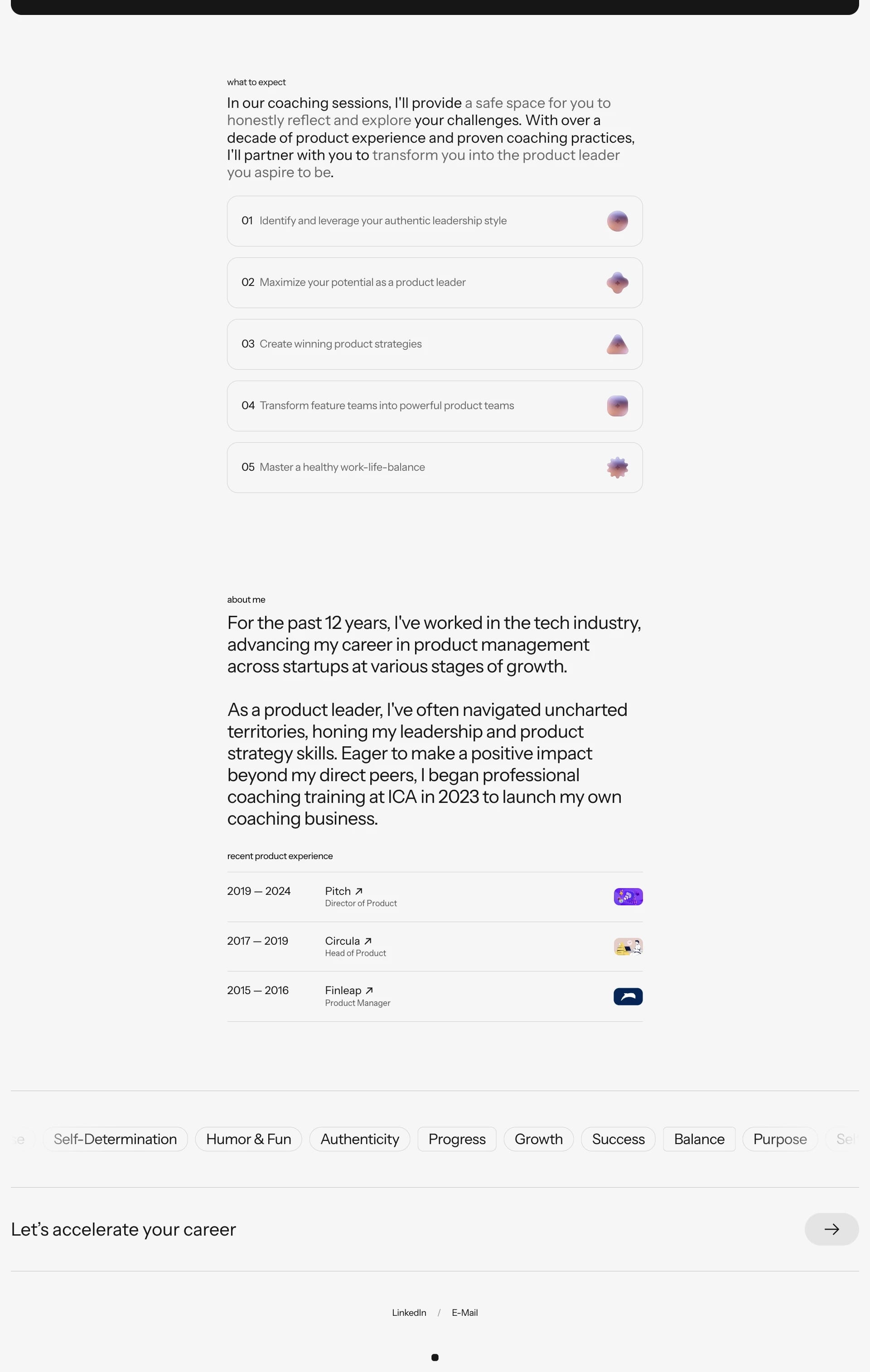
Bold typography that screams "Look at me!" (but in a good way). Proof that simplicity can be powerful.
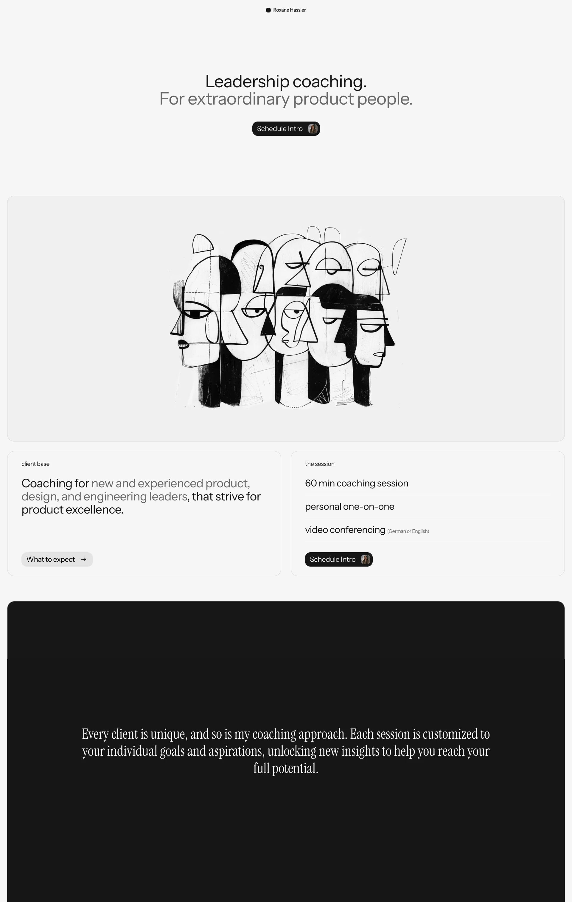
Roxane Hassler
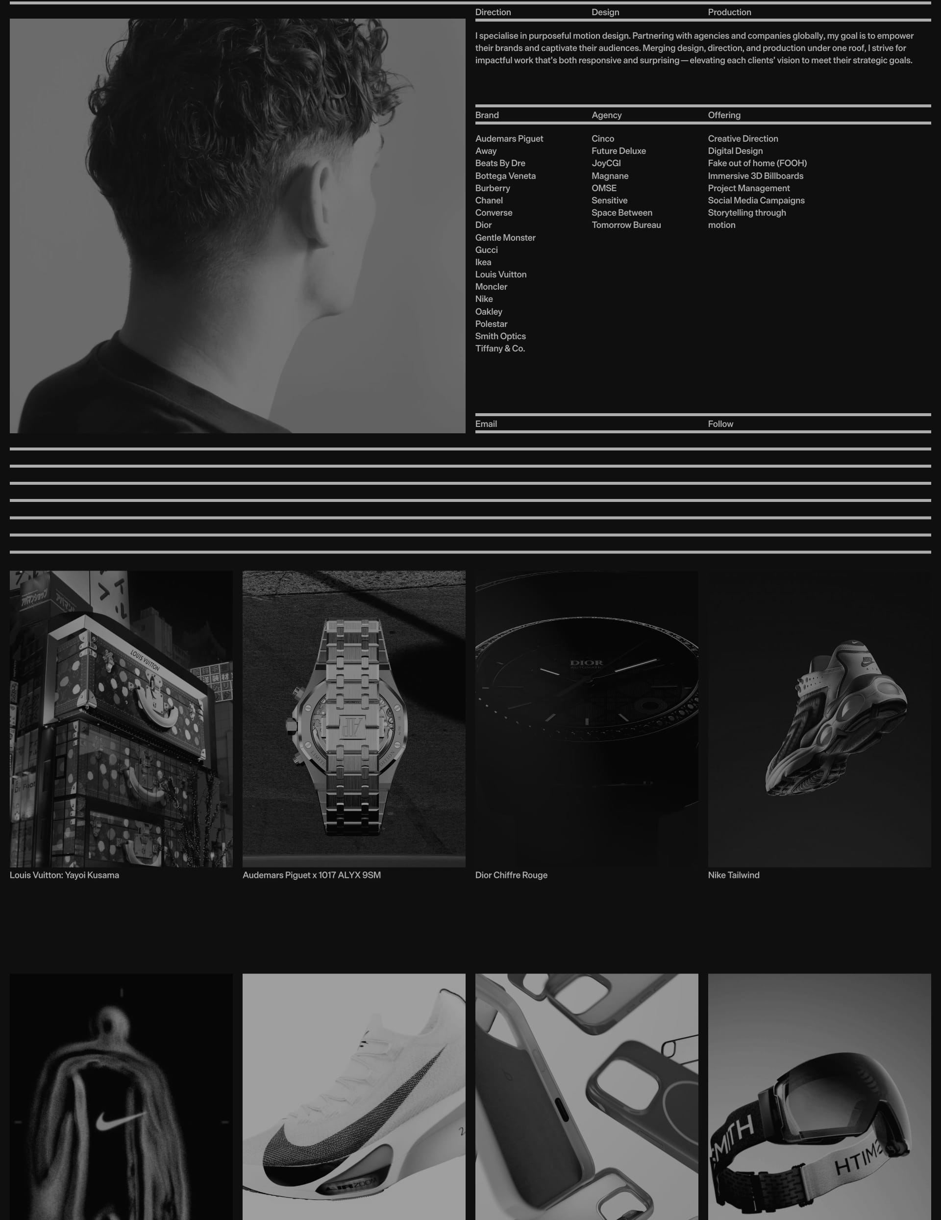
Photography takes center stage here, and the black-and-white treatment makes it pop!
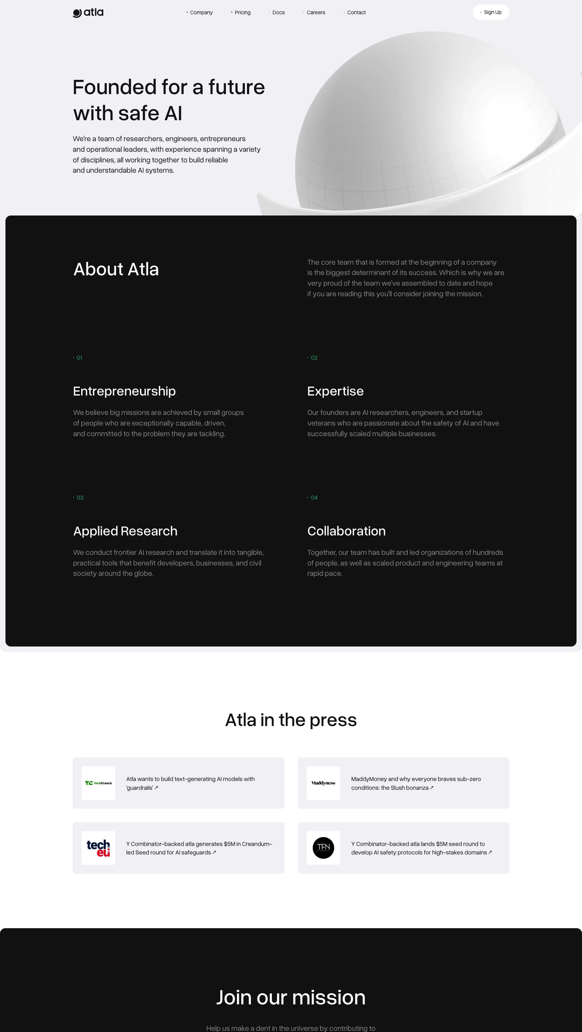
Atla AI
Clean, professional, and modern. It gets straight to the point and makes a strong impression.
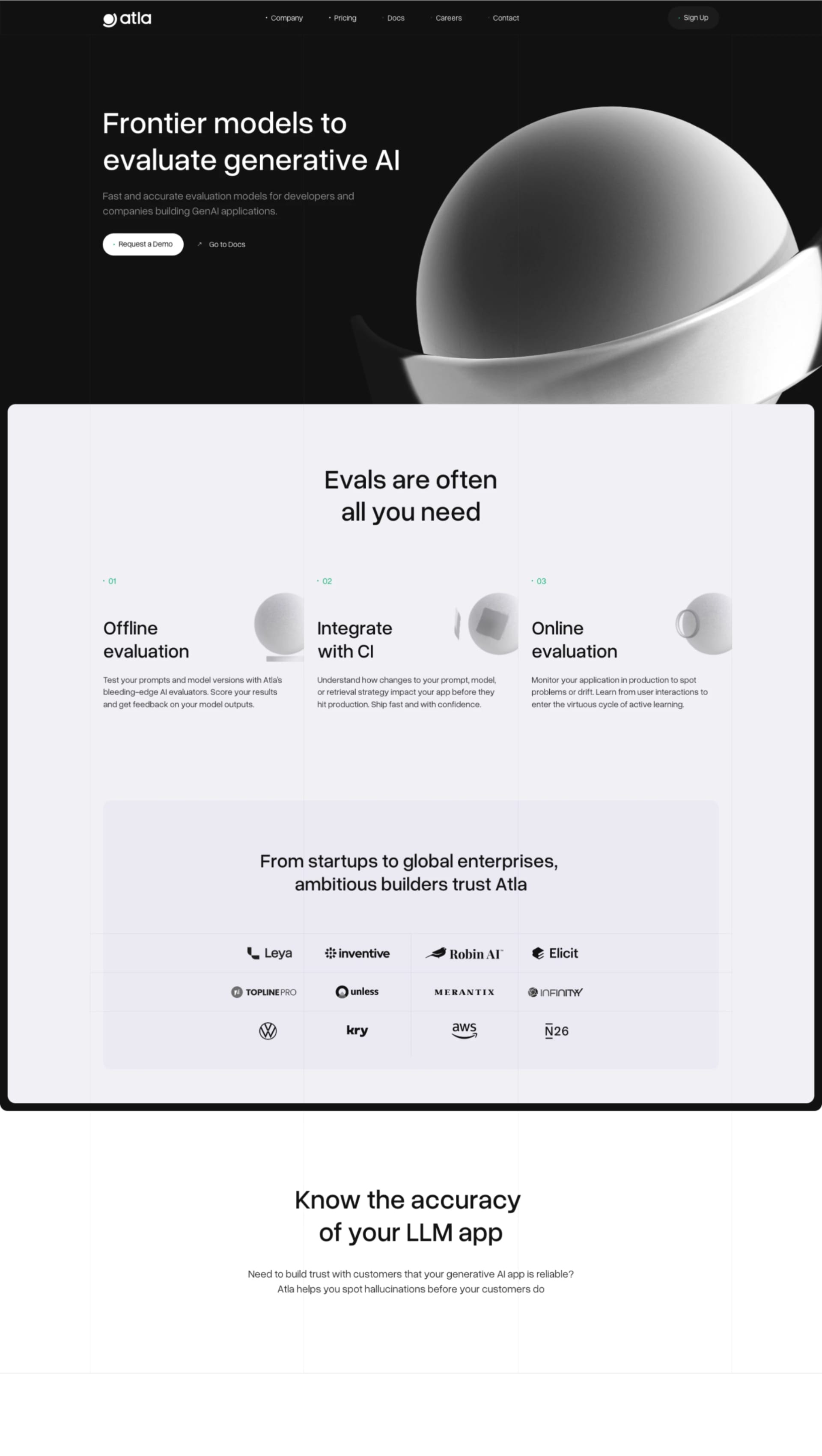
Qatalog
Clean, professional, and user-friendly. The clear hierarchy is a UX designer's dream.


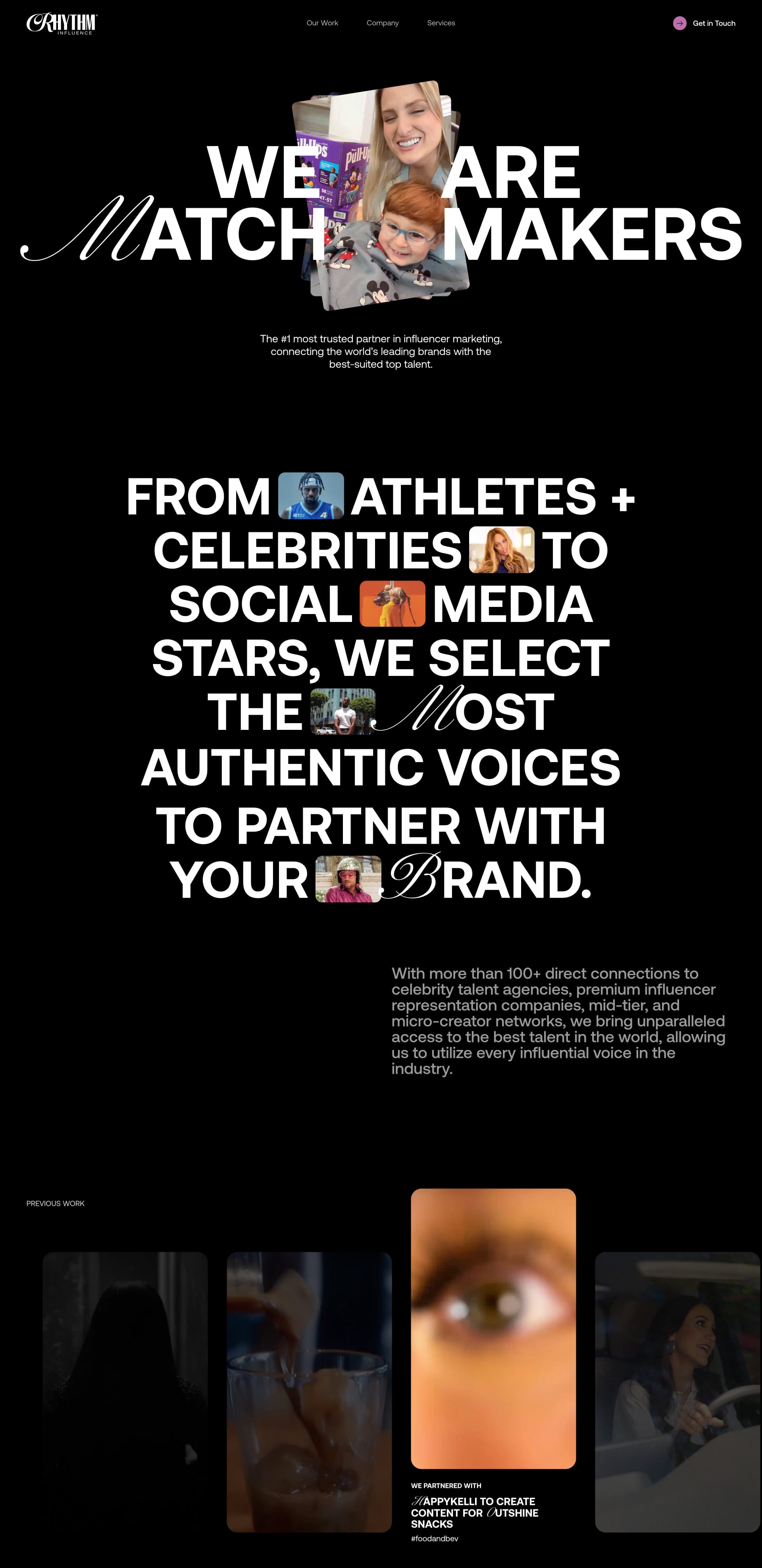
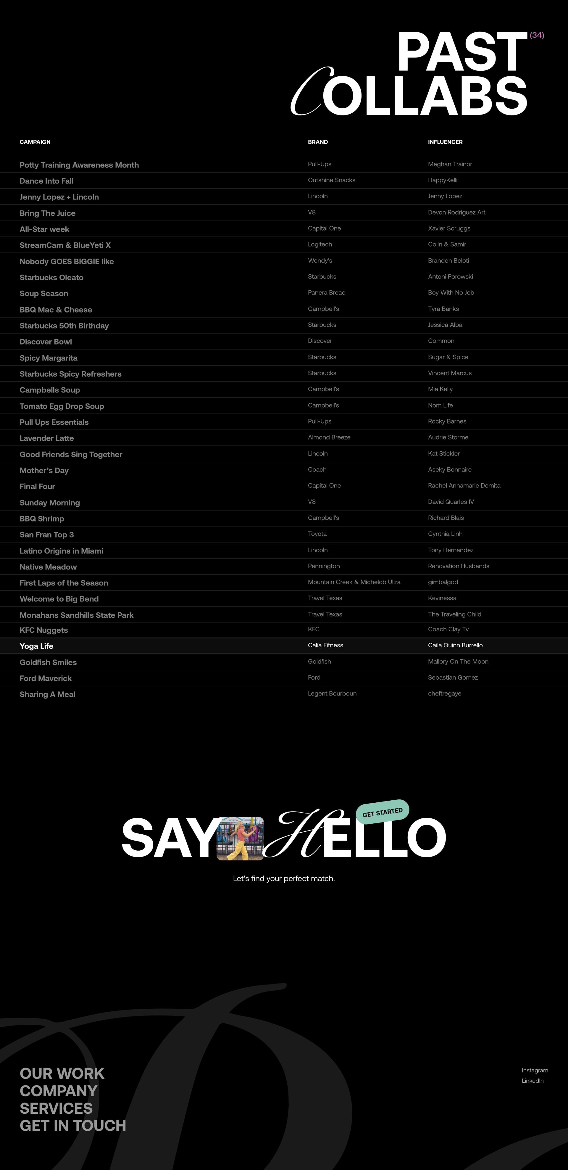
Rhythm Influence
Imagine a crisp, white canvas with bold black text and captivating photography. That's RhythmInfluence in a nutshell! The clean layout makes it super easy to navigate, and the use of negative space is chef's kiss 🤌. What do YOU think of the subtle animation?
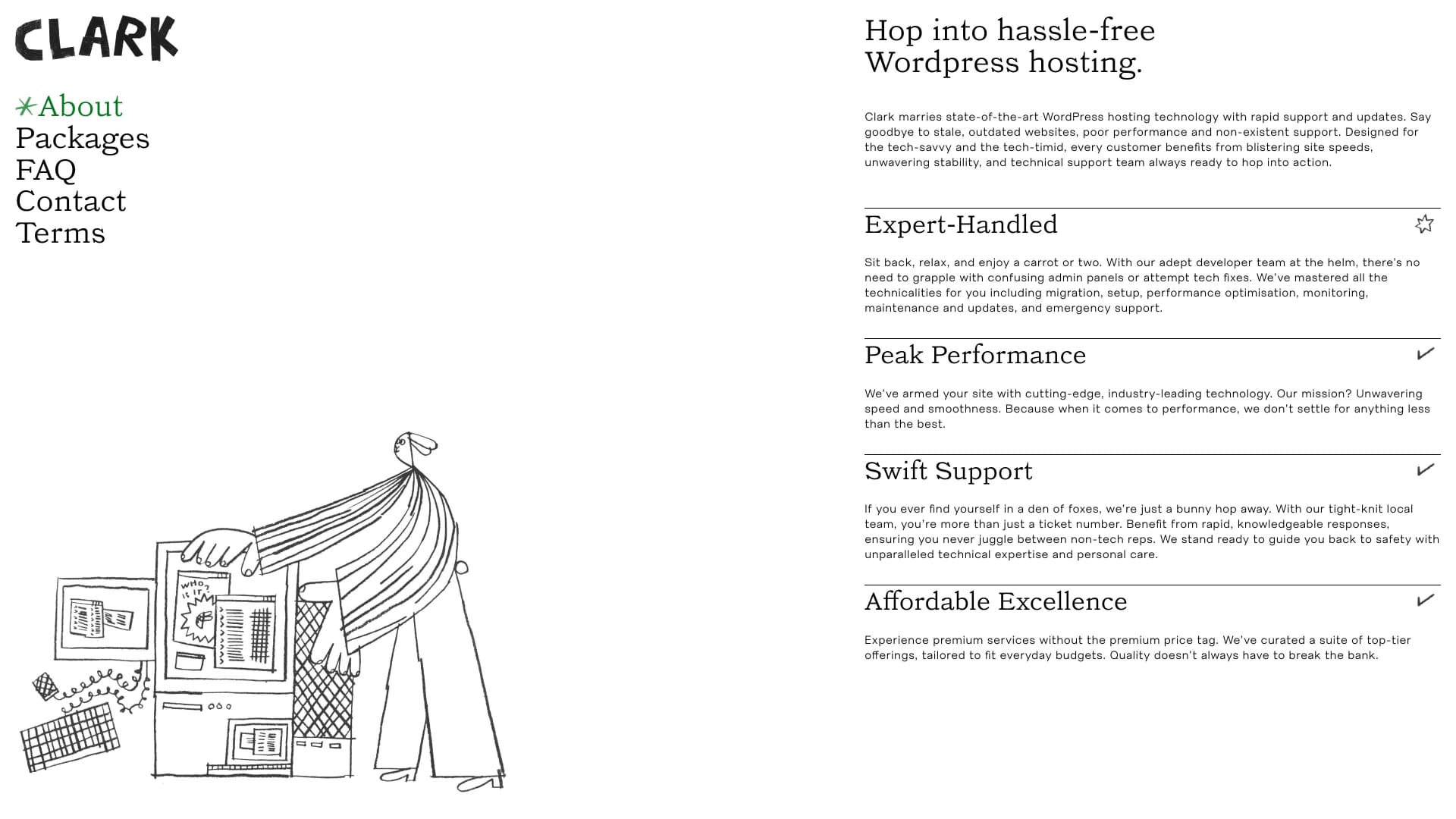
Clark Hosting
Negative space used like a pro. Your eye goes straight to that CTA. So smart!

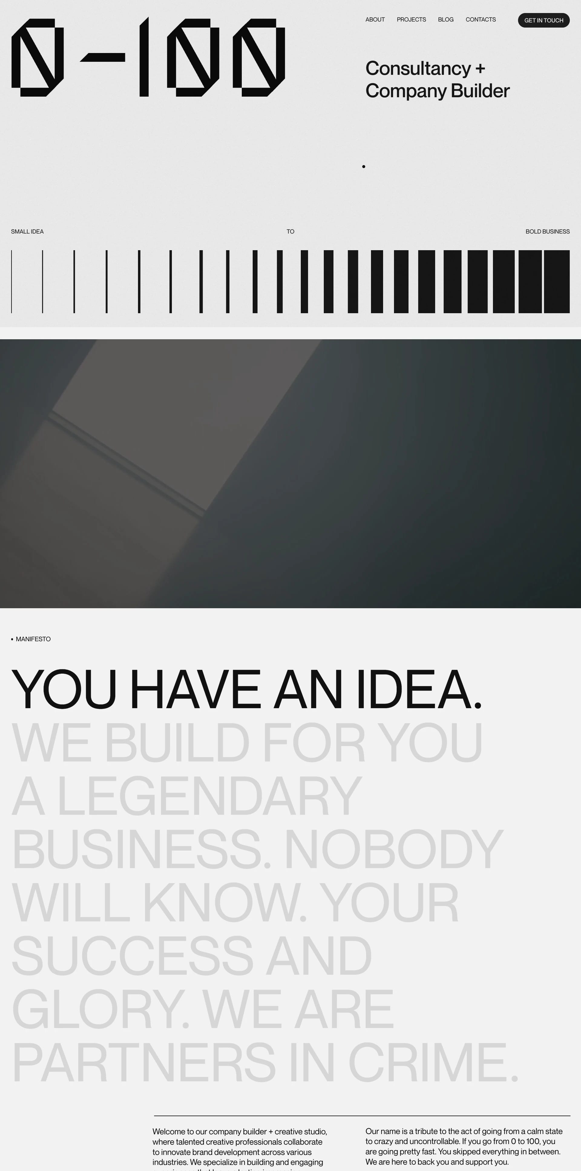
0to100
Sleek, modern, and oh-so-chic. The monochromatic palette is giving me life! 🖤🤍

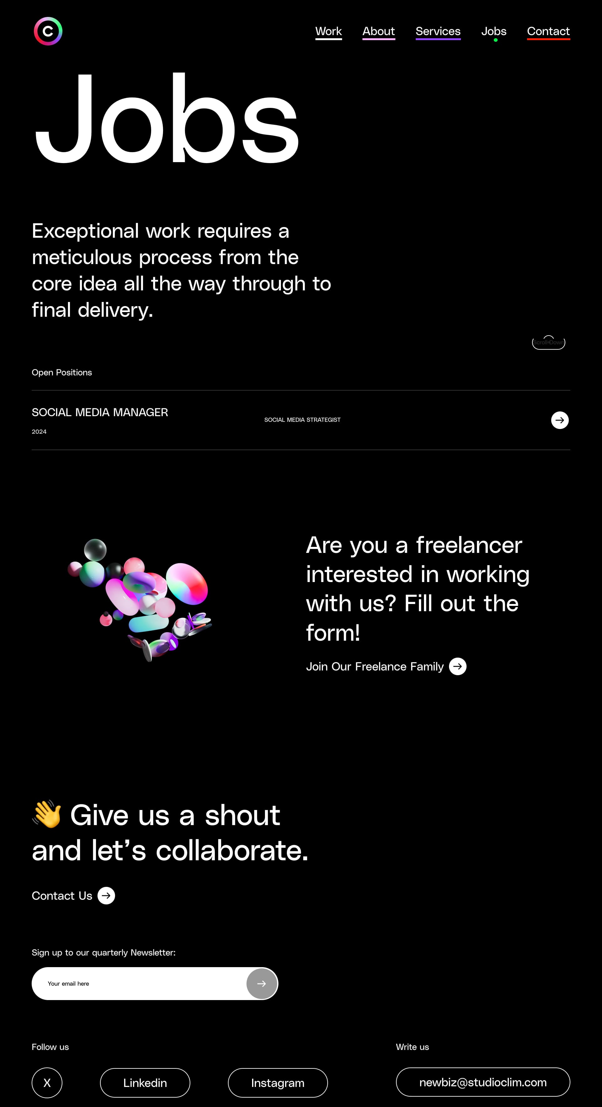
Clim Studio
This landing page is all about elegance. The black and white color scheme is accented with a touch of soft gray, creating a calming and professional vibe. The typography is on POINT. 💯 It’s like a perfectly brewed cup of coffee – simple, but oh-so-satisfying. Am I right? 😉

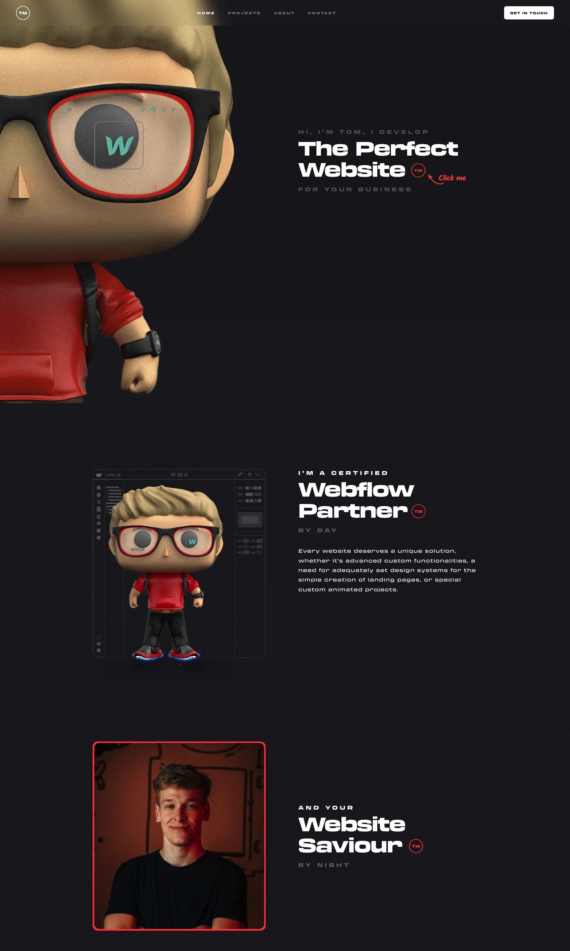
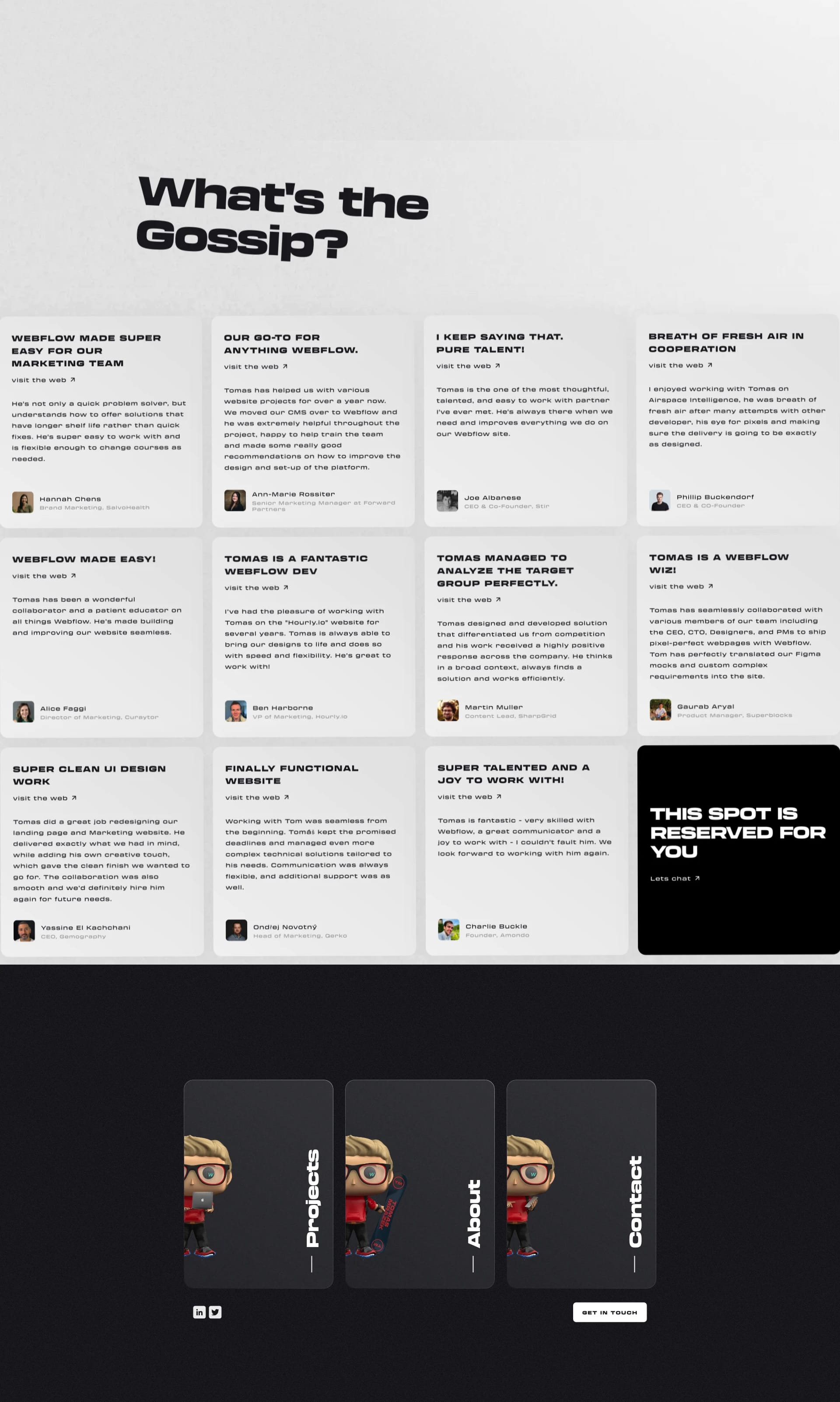
Mrazek Tomas
This one’s all about bold typography and striking photography. The black and white contrast makes the call to action POP! Feedback? Maybe a touch more whitespace wouldn't hurt. But overall? Super chic! 😎
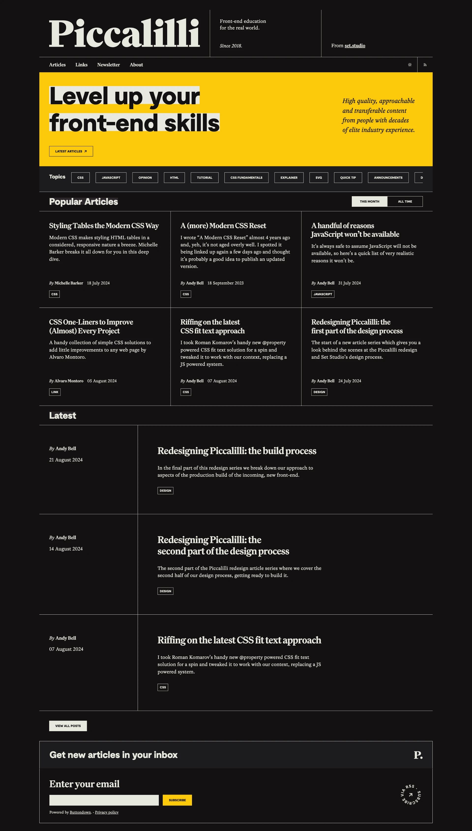
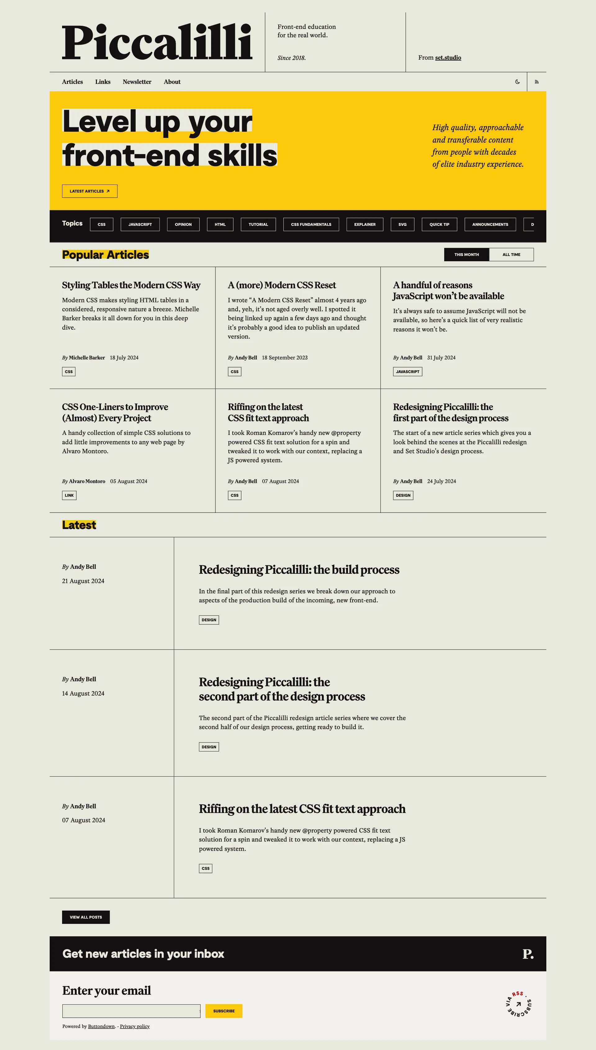
Piccalilli
Clean lines, clear messaging, and a touch of asymmetry. This design is proof that simple doesn't have to mean boring! It’s like a perfectly brewed cup of coffee - strong and gets the job done. ☕ Feedback? A slightly larger font size for the body text might improve readability.
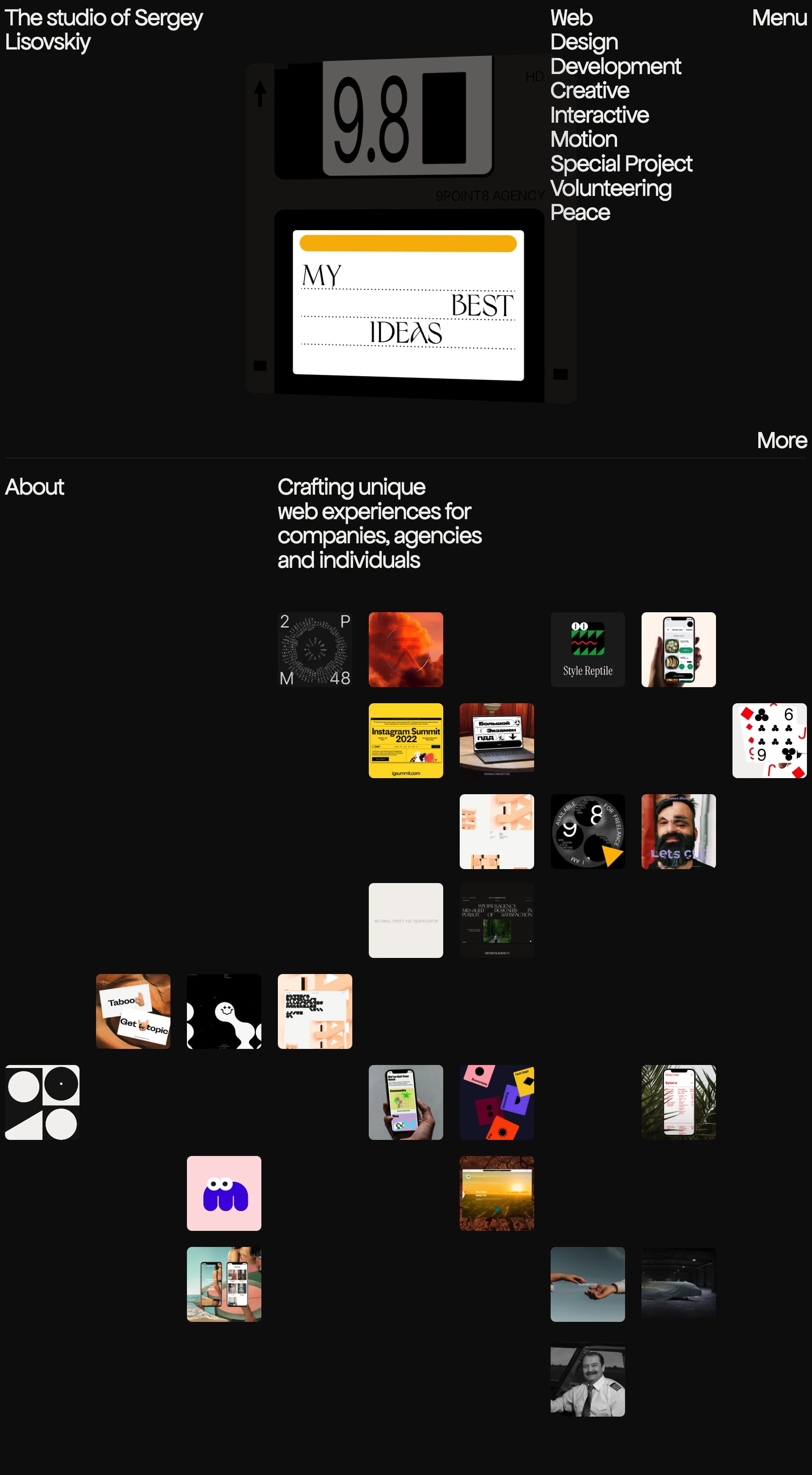
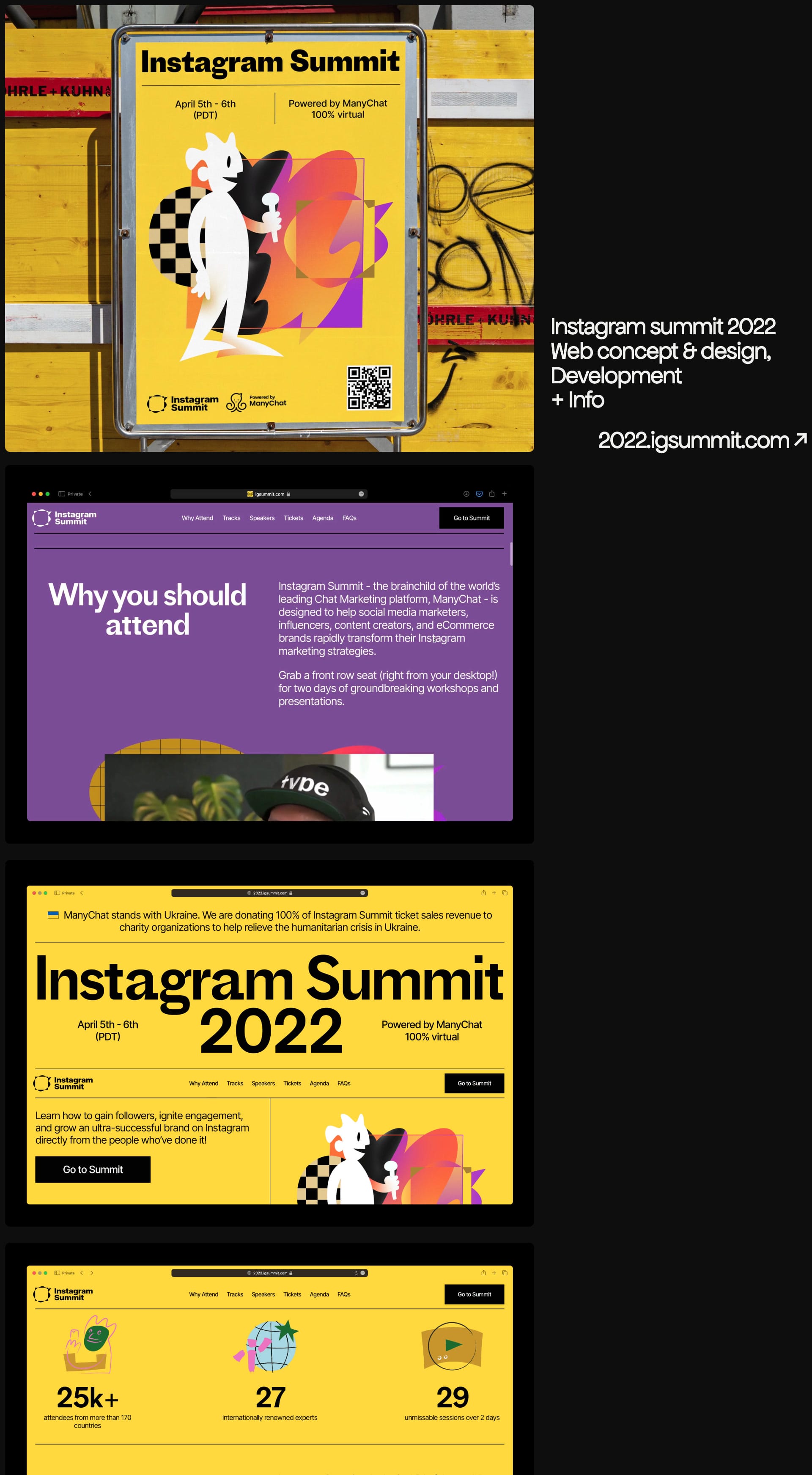
Sergey Lisovskiy
This one’s all about powerful imagery and dramatic contrast. The black and white combo makes the product the star of the show! ✨ Feedback? Maybe a teeny bit more whitespace around the call to action button. But overall? Super slick! 😎
So there you have it! Eleven black and white minimalist landing pages to inspire your inner design guru. Feeling inspired? Head over to Lapa.Ninja to grab your own minimalist ideas today! Happy designing, Lapa ninjas! 🎉
Fresh Animation Websites
This week, we explore impactful landing page designs, from Things Inc.'s bold, image-driven approach to Jaffa's smooth sophistication. We'll also look at Moved Network's subtle animations, Prand's product-focused minimalism, and Arch Agency's clean, modern design.
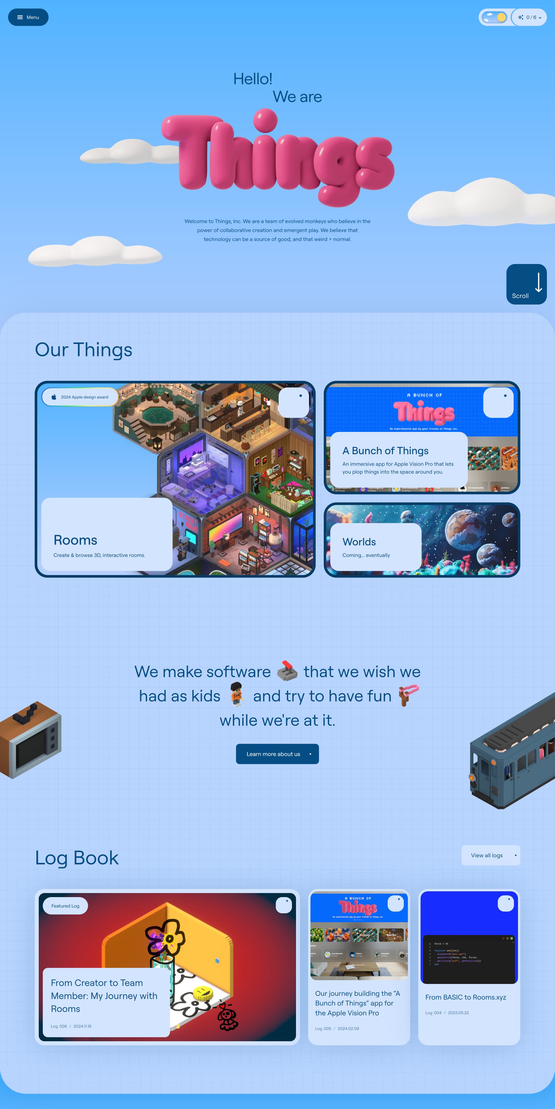
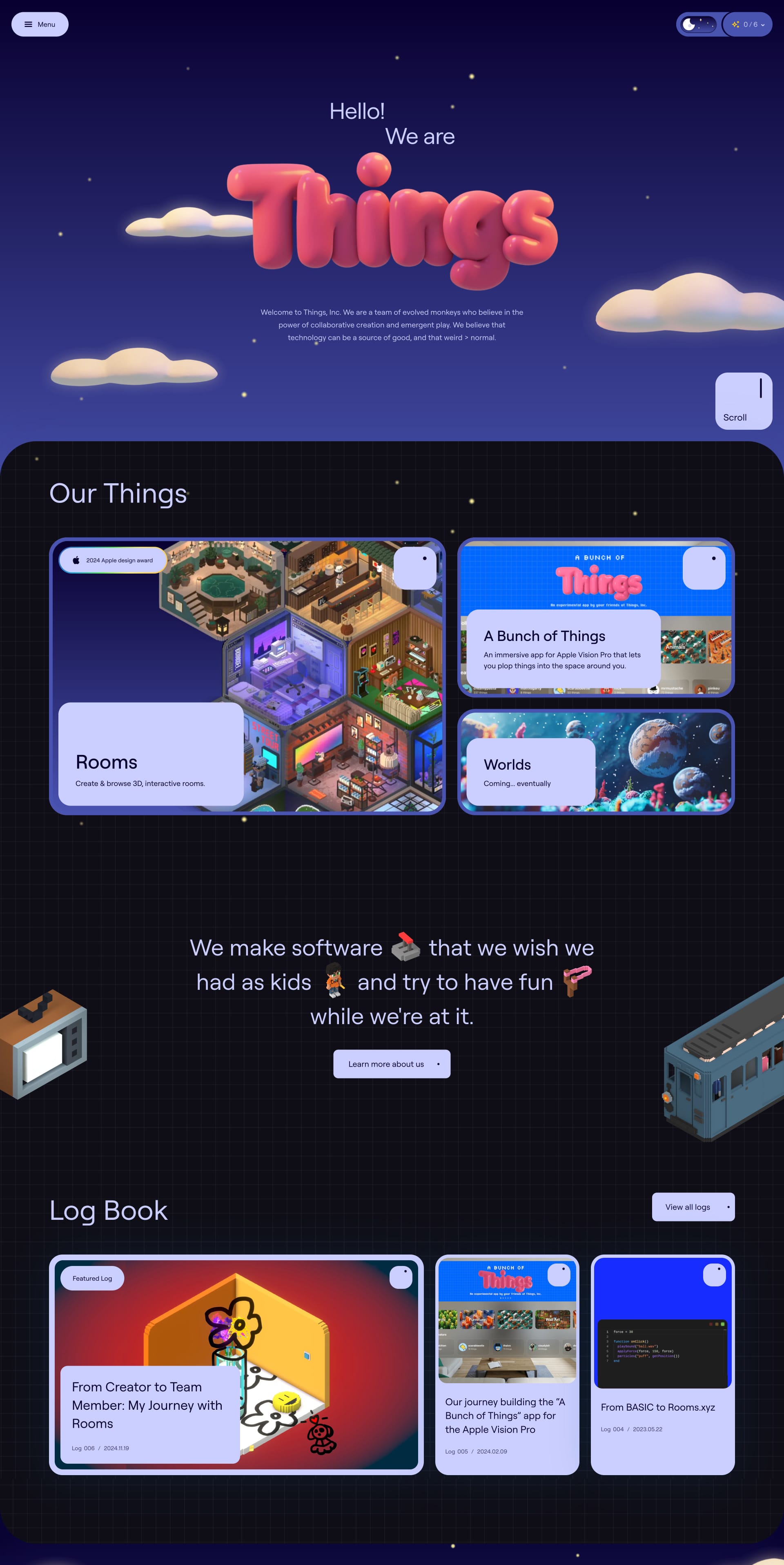
Things Inc
This landing page features captivating, sometimes adorable. It's a bold approach that draws you in and puts the product front and center. Does this eye-catching design resonate with you?
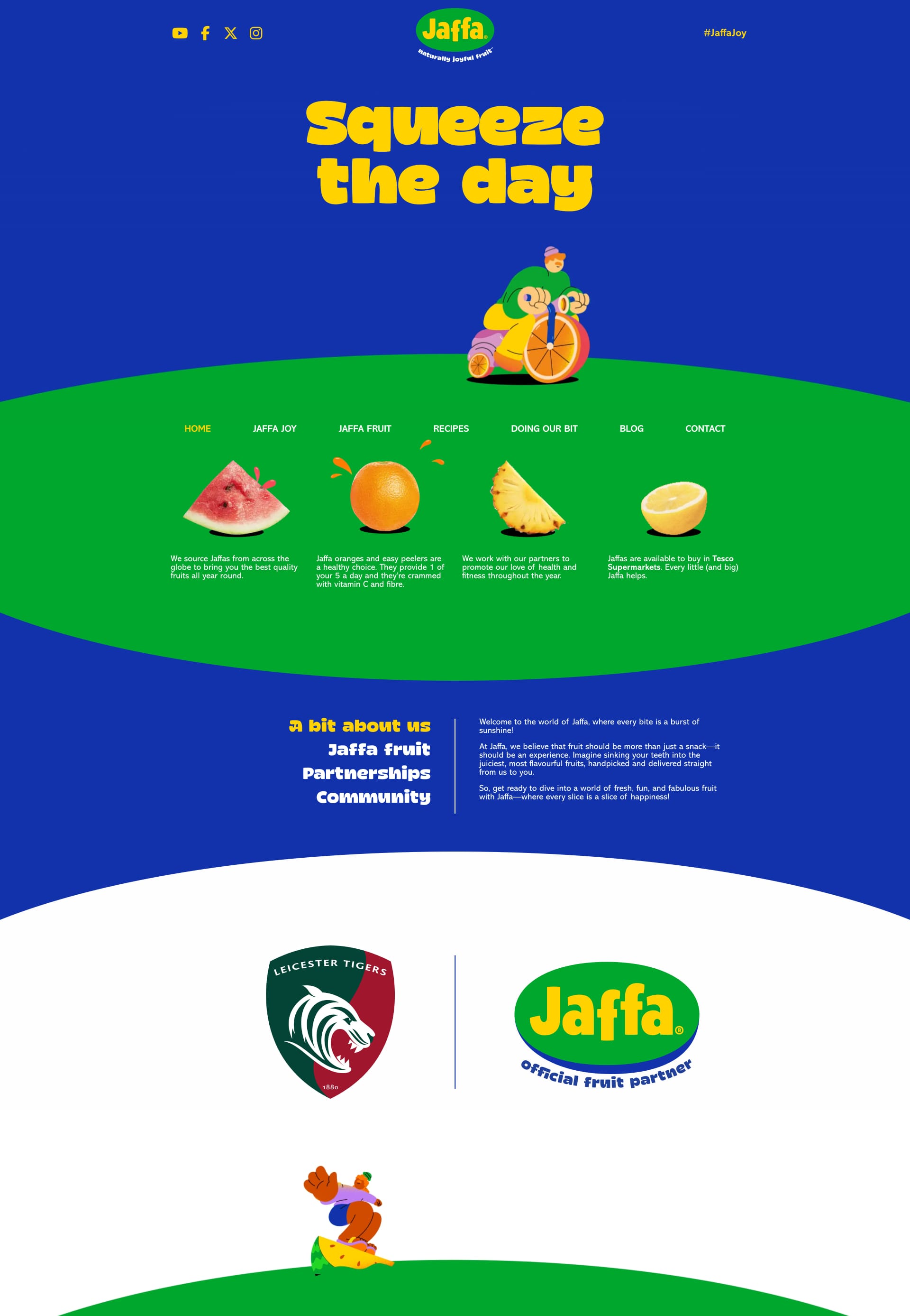
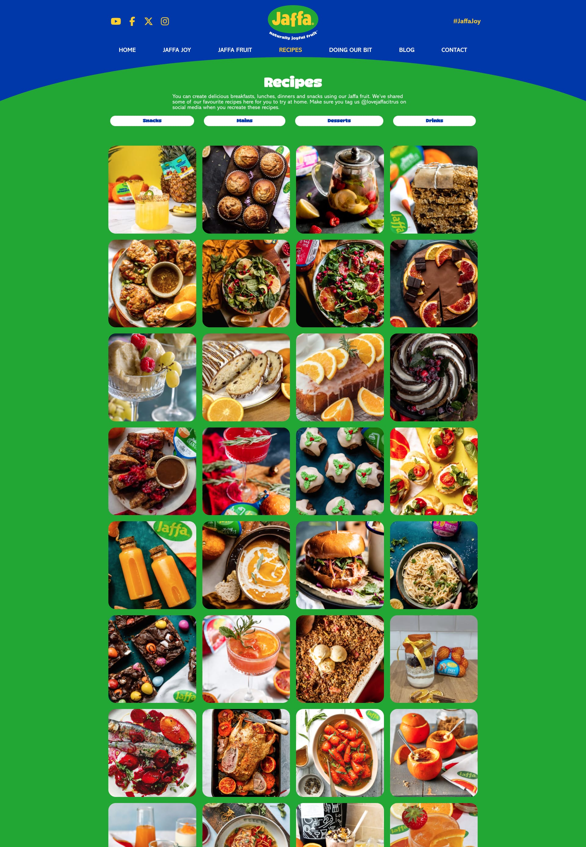
Jaffa
Smooth as silk and oh-so-sophisticated, Jaffa's landing page oozes class. The typography is chef's kiss 🤌, and the masterful use of negative space is pure genius. Agree?
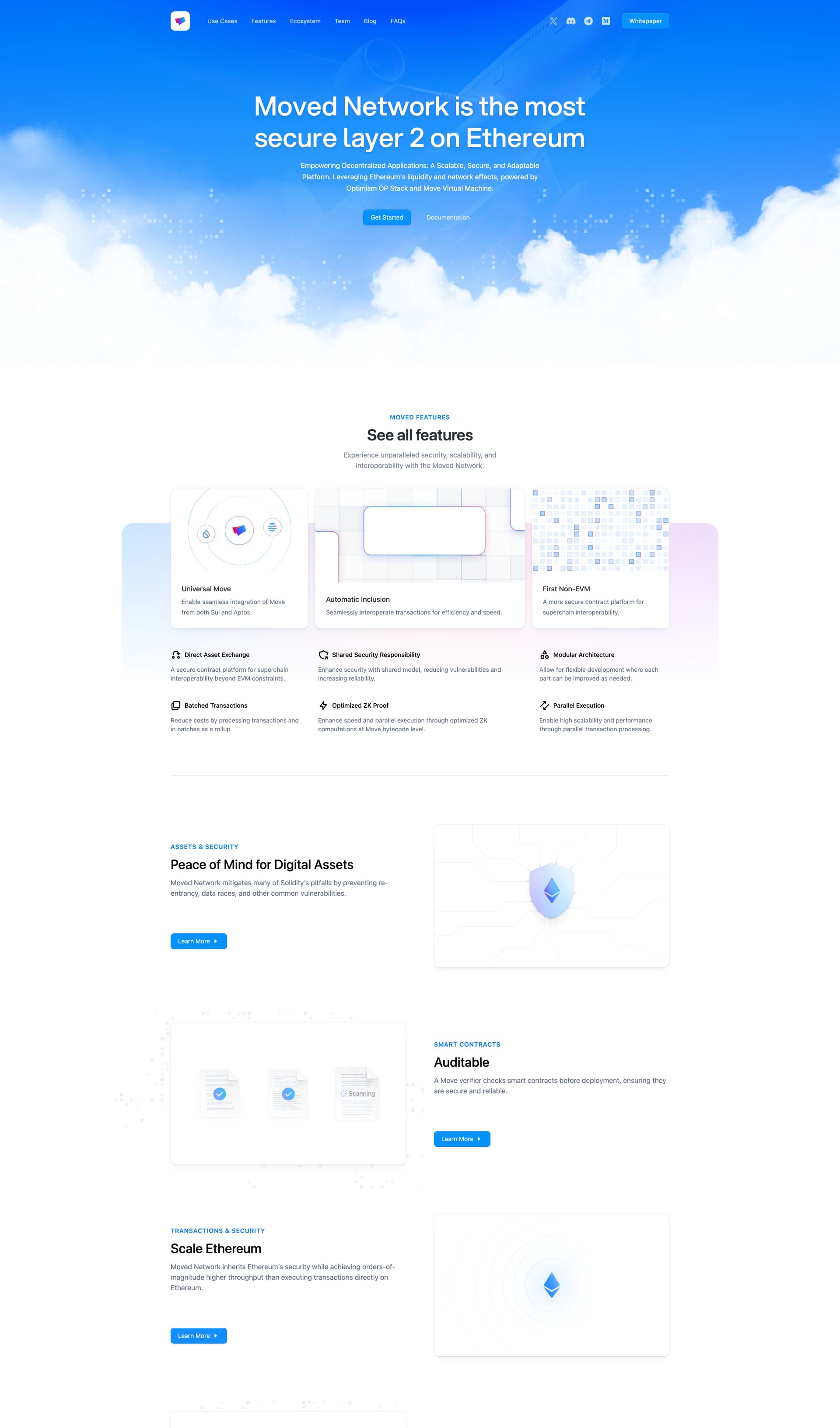
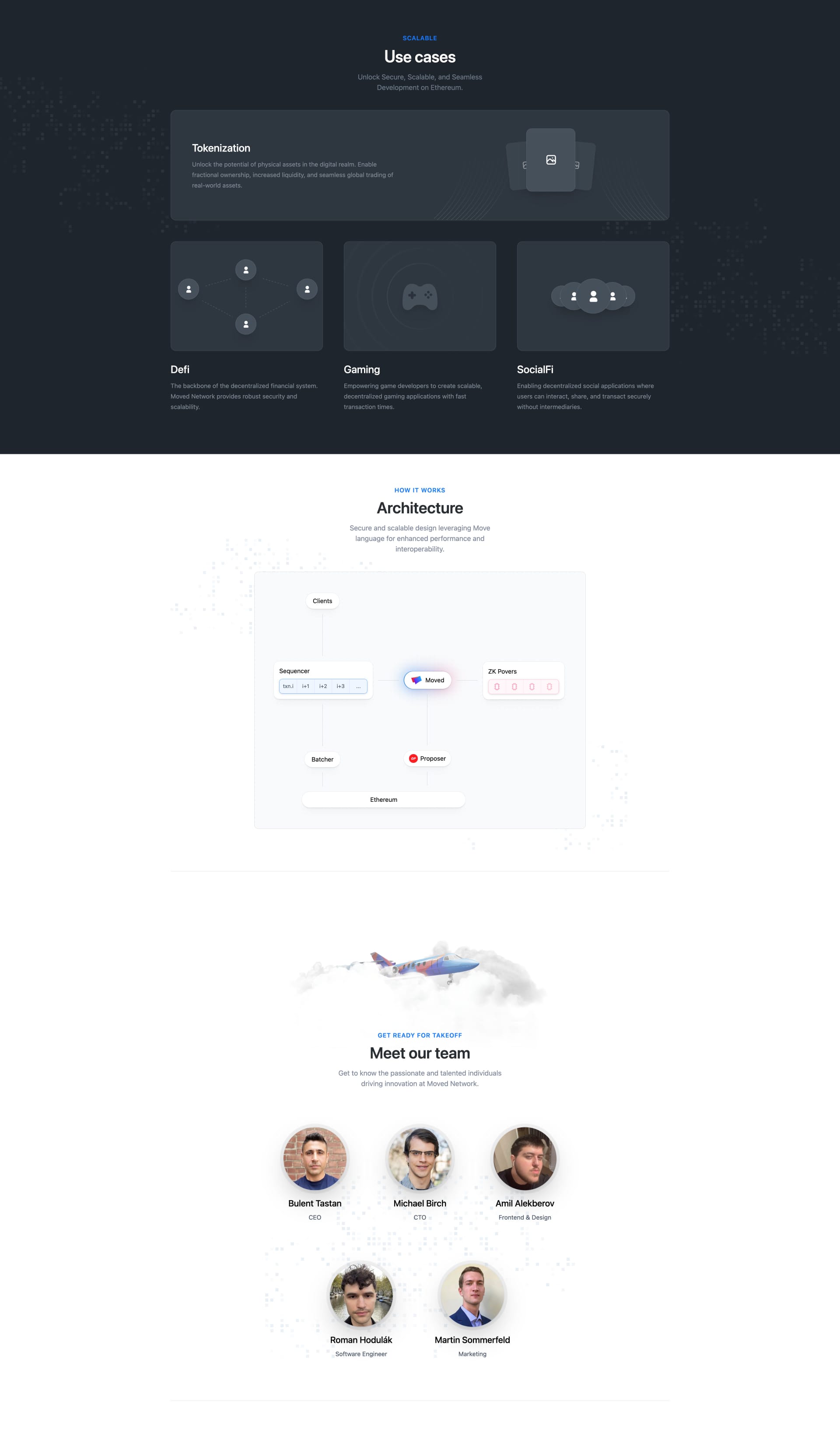
Moved Network
This clean, modern design focuses on clear communication and a seamless user experience. The layout is straightforward and easy to navigate. What do you think of this streamlined approach?
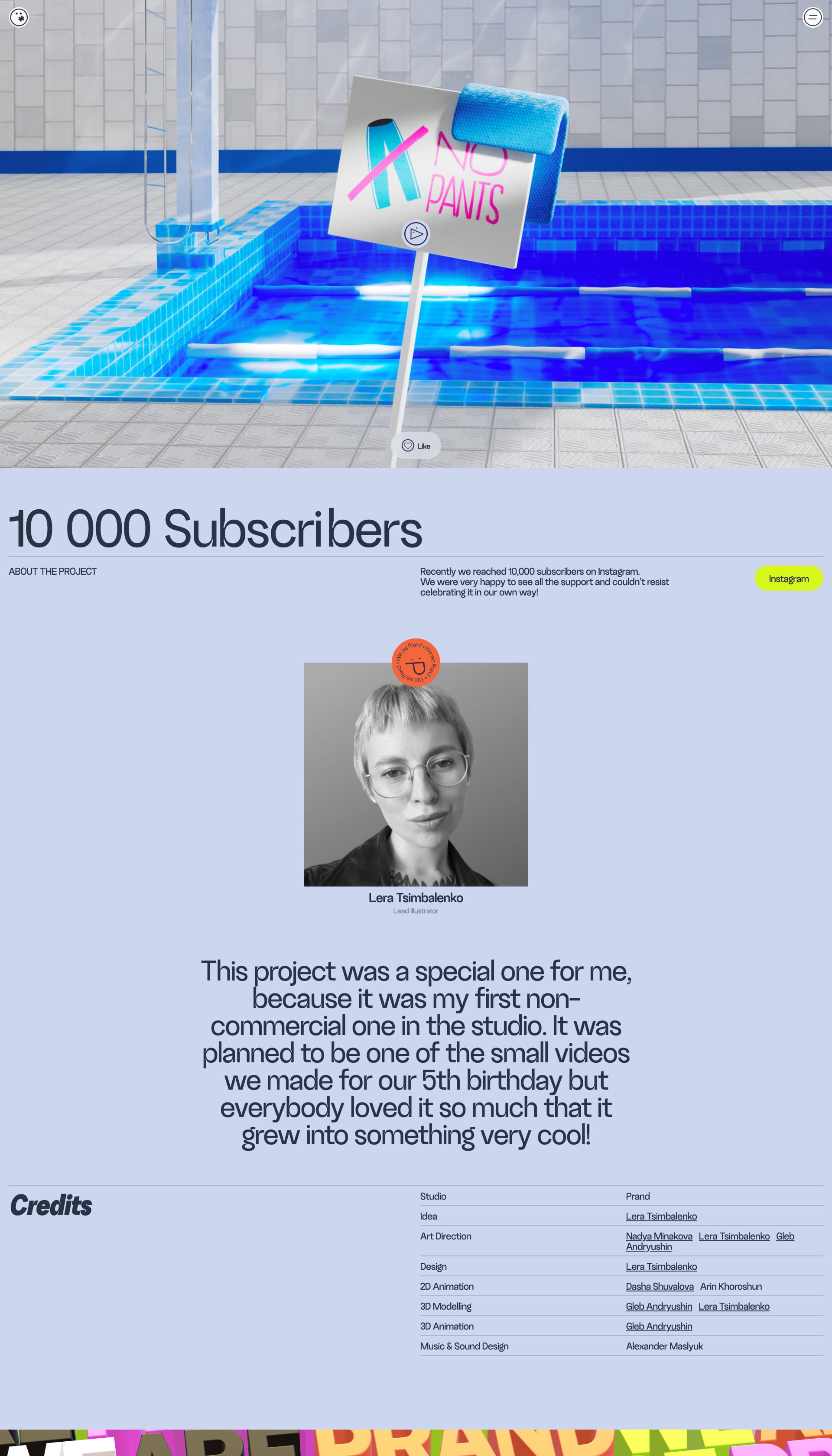
Prand
This landing page effectively showcases the product with a clean, focused design. It directs your attention to what matters most and presents the information in a clear, concise manner.

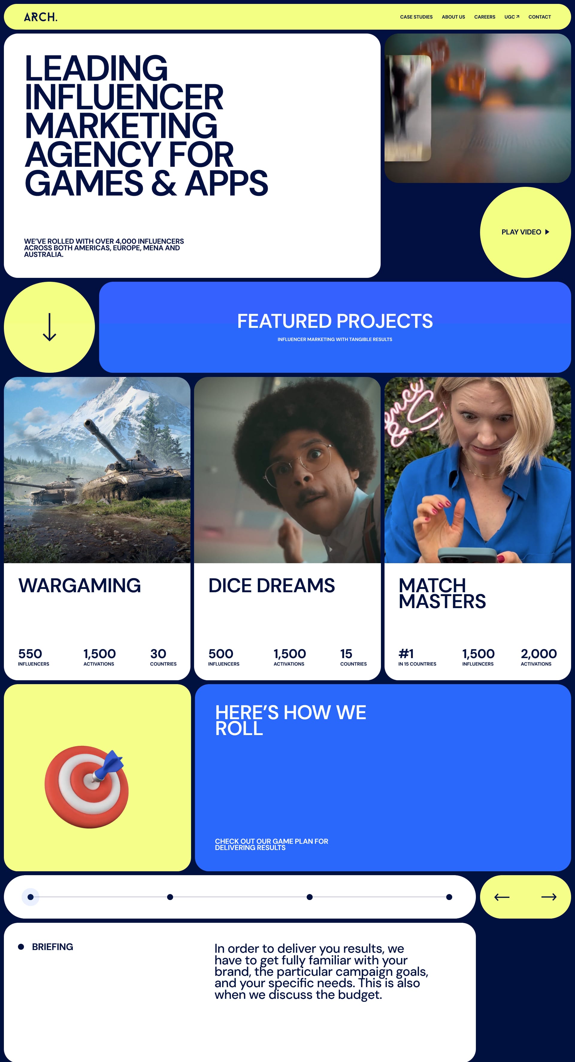
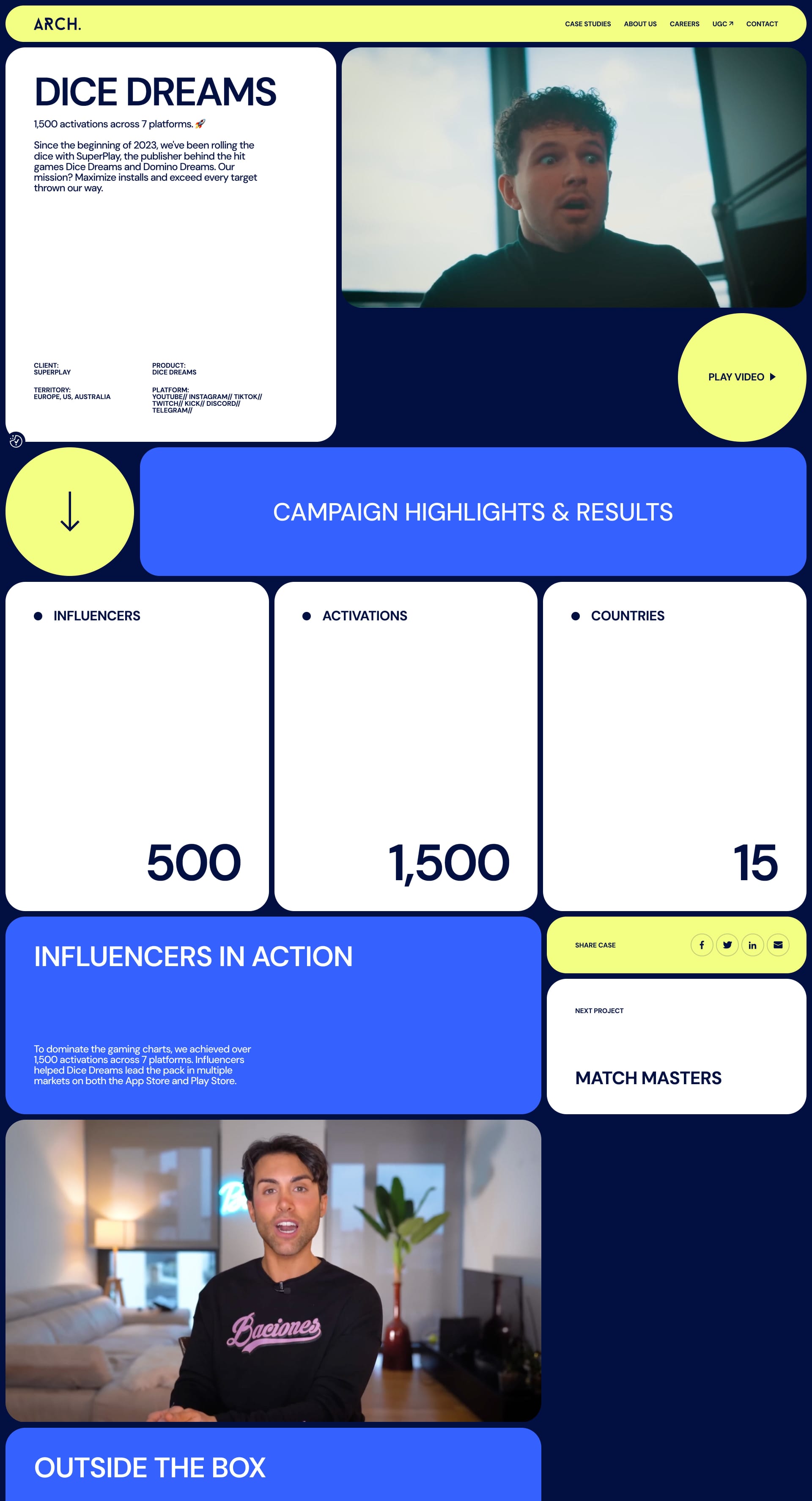
Arch Agency
This visually appealing design is all about balance and proportion. The harmonious layout and thoughtful use of color create a truly festive feel. Feeling inspired? Let us know! 🤩
Enjoyed This Issue?
Share it with a friend! Don't forget to subscribe to our Newsletter!
If you have websites that you want to appear on Lapa Ninja, do not hesitate to email the team at 💌 hi@lapa.ninja.
Stay inspired with the latest website designs by following us on X: https://x.com/lapaninja and 🦋 Bluesky https://bsky.app/profile/lapa.ninja
Stay tuned for more exciting updates in the future!
JEN from Lapa.Ninja


