Lapa Inspiration #9 - Fuel Your Creativity: Fresh SaaS Website Designs
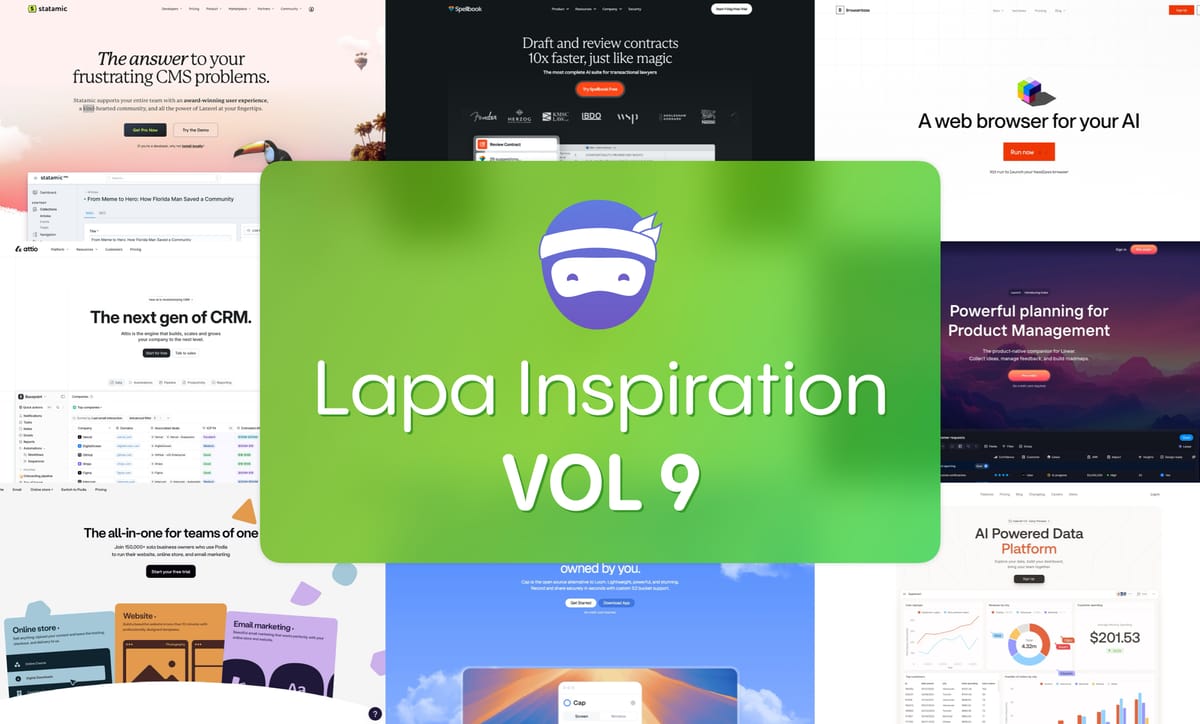
Xmas is coming to town, awesome Lapa ninjas 🎄🎄🎄! May your holidays be as delightful and inspiring as a perfectly designed landing page, filled with festive 🎉cheer and creative energy. 👋 Ready to get your creative juices flowing?
This week's Lapa Inspiration#9 is ALL about fresh SaaS website designs that perfectly blend function and style. Think sprinkles on a cupcake – delicious and beautiful! 🧁 Let's dive in!
Our Sponsor This Week

🎄🎄🎄🎄🎄🎄🎄🎄🎄🎄🎄🎄🎄🎄🎄🎄🎄🎄🎄🎄🎄🎄🎄
Statamic
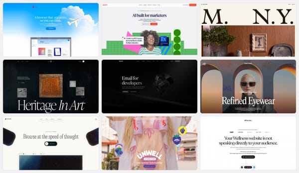
This landing page is a masterclass in clean, breathable design. Think of it like a perfectly organized zen garden – calming, balanced, and effortlessly stylish. The generous use of negative space gives the content room to breathe, and the crisp typography is chef's kiss! 👌


Spellbook
Abracadabra! ✨ This design magically balances simplicity with personality. The playful font adds a touch of whimsy, while the black and white palette keeps things grounded and sophisticated. It's like a perfectly frosted cupcake – simple but delightful! 🧁


Cap
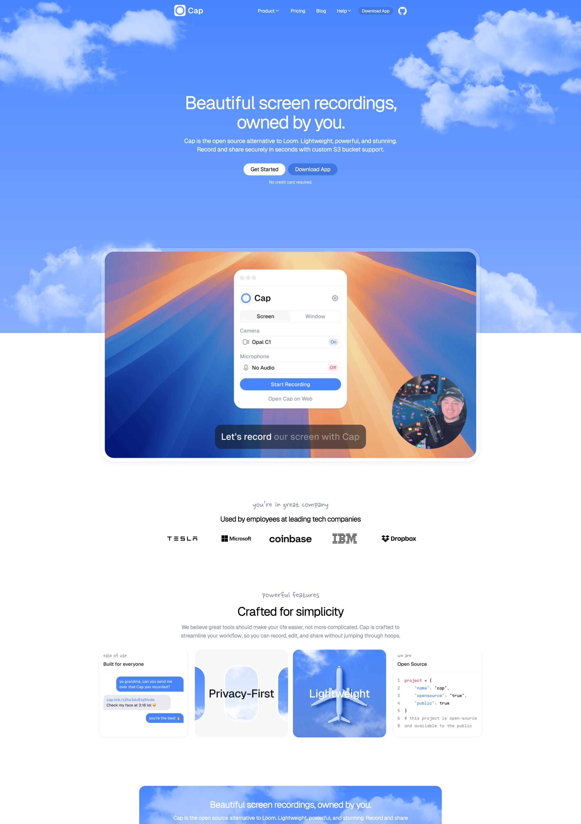
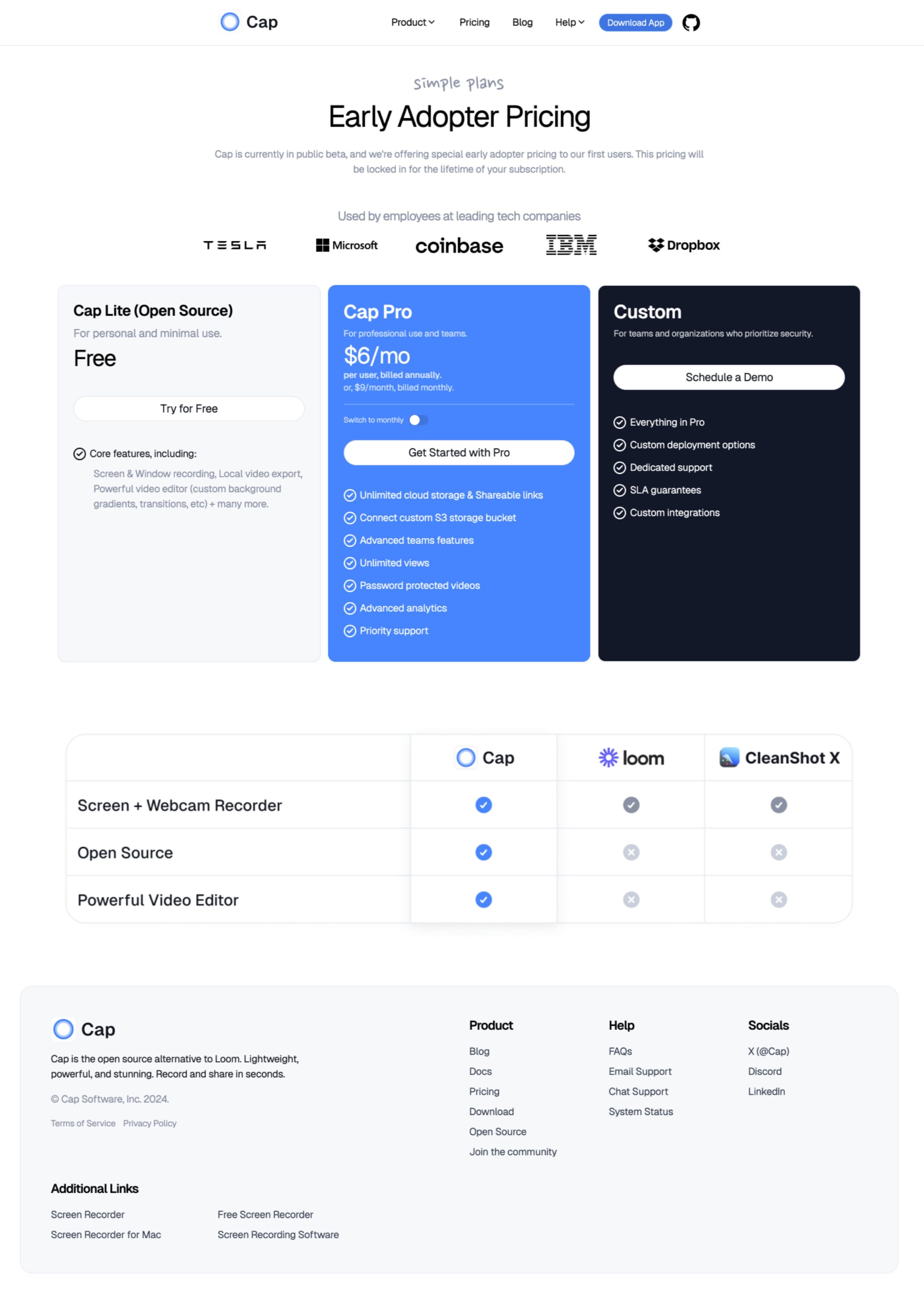
Talk about impactful! This landing page goes straight to the point with a bold headline and a single, striking image. It's like a laser beam of focus – directing your attention exactly where it needs to be. 💥 Perfect for those who want to make a statement without any fuss!
Portal
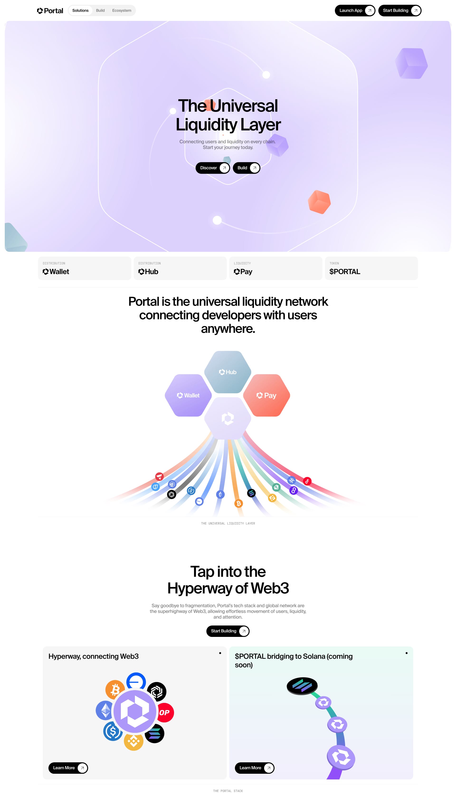
Game on! 🎮 This landing page proves that minimalism doesn't have to be boring. The dynamic layout and strong visuals create a sense of excitement and energy. Think less wall of text, more action-packed trailer.

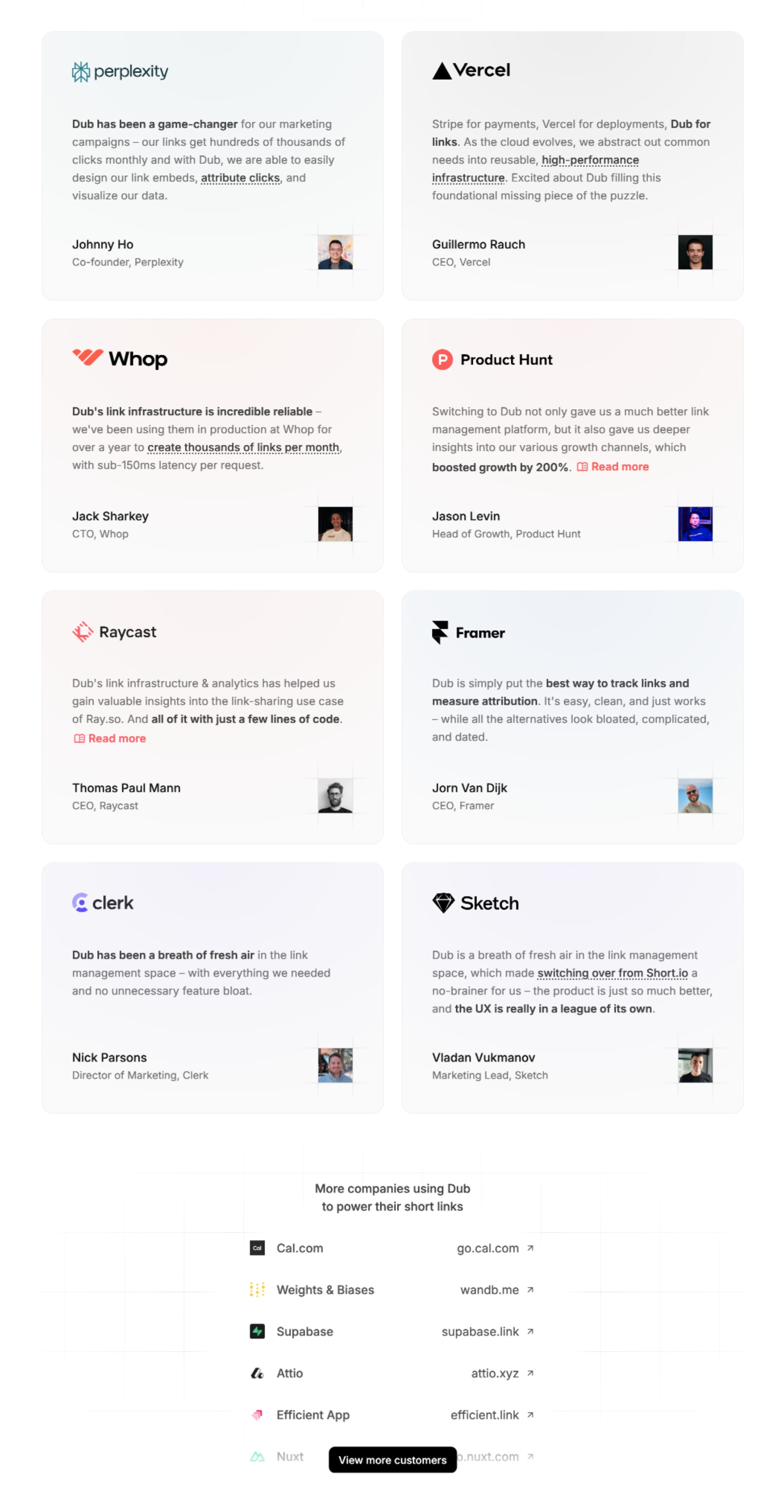
Dub.co
Sleek white background, single powerful image. Boom! Gets straight to the point. Love the clear call to action.

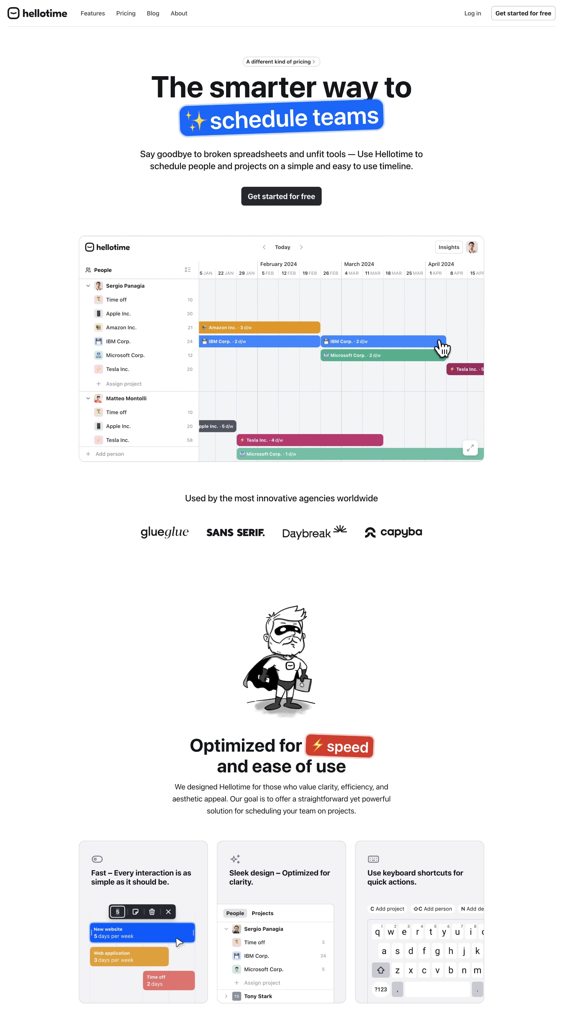
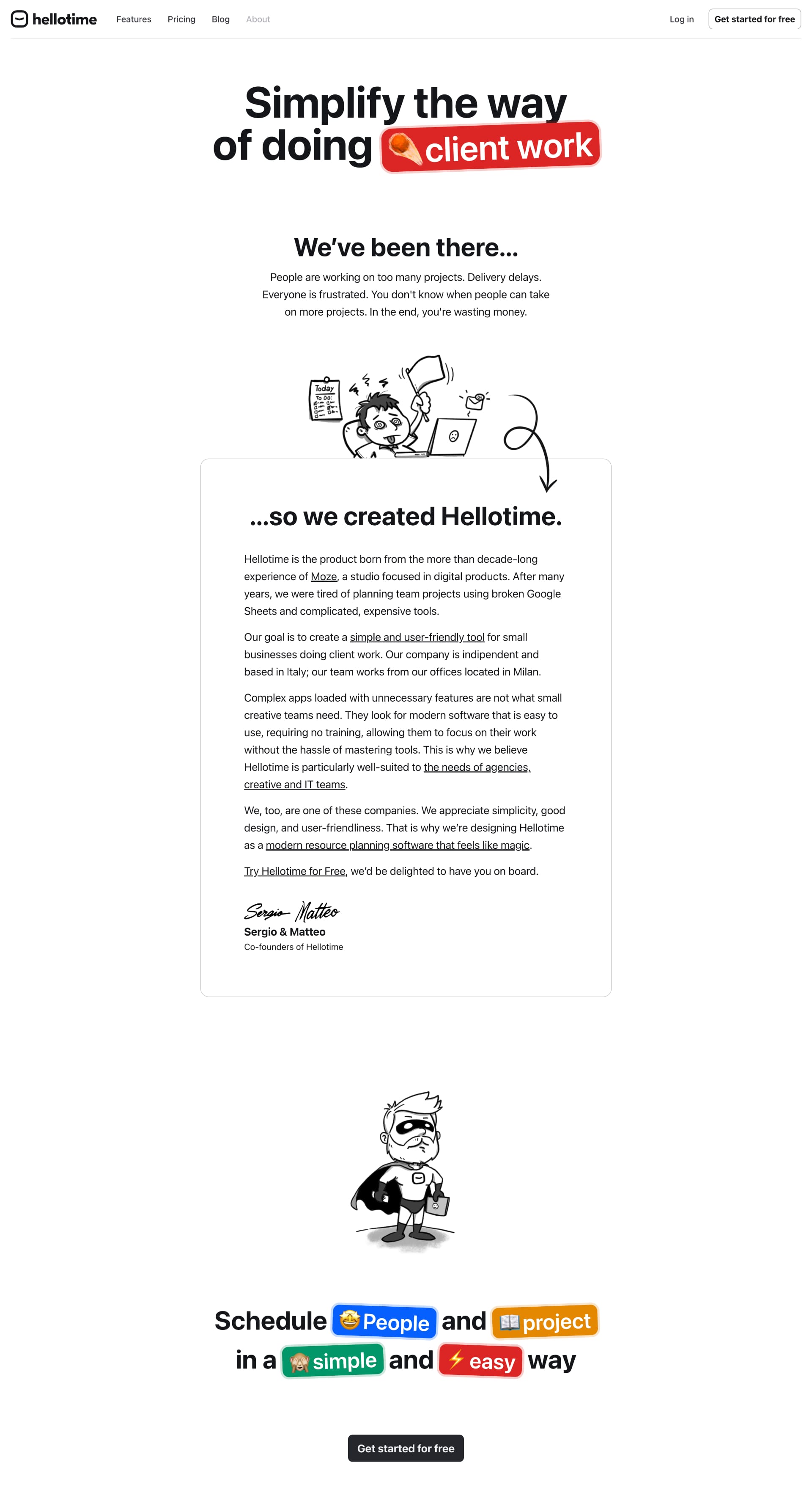
Hellotime
Super clean and minimal. The color palette is so calming. Perfect for a time management app! What do YOU think of the layout?
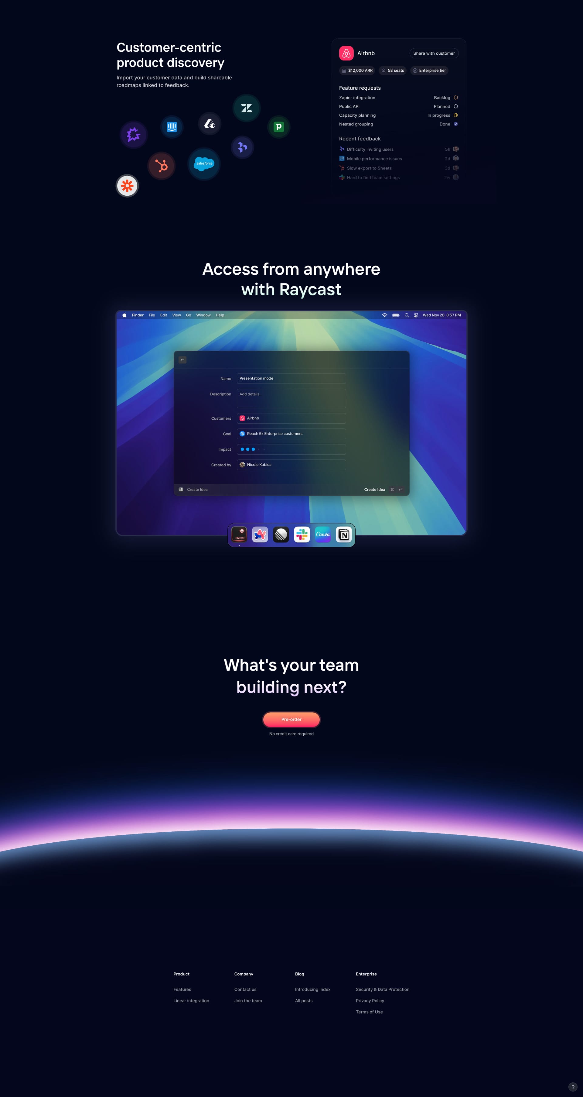
Index Inc
Bold typography and striking visuals. This design definitely makes a statement. Maybe a little too much going on?

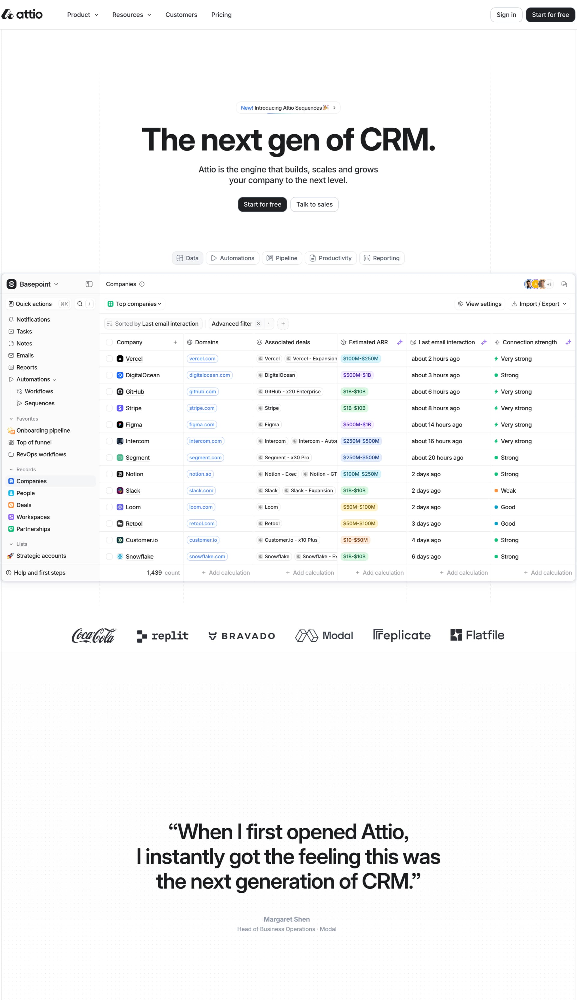
Attio
Sophisticated and professional. The use of negative space is 💯. A masterclass in elegant design.

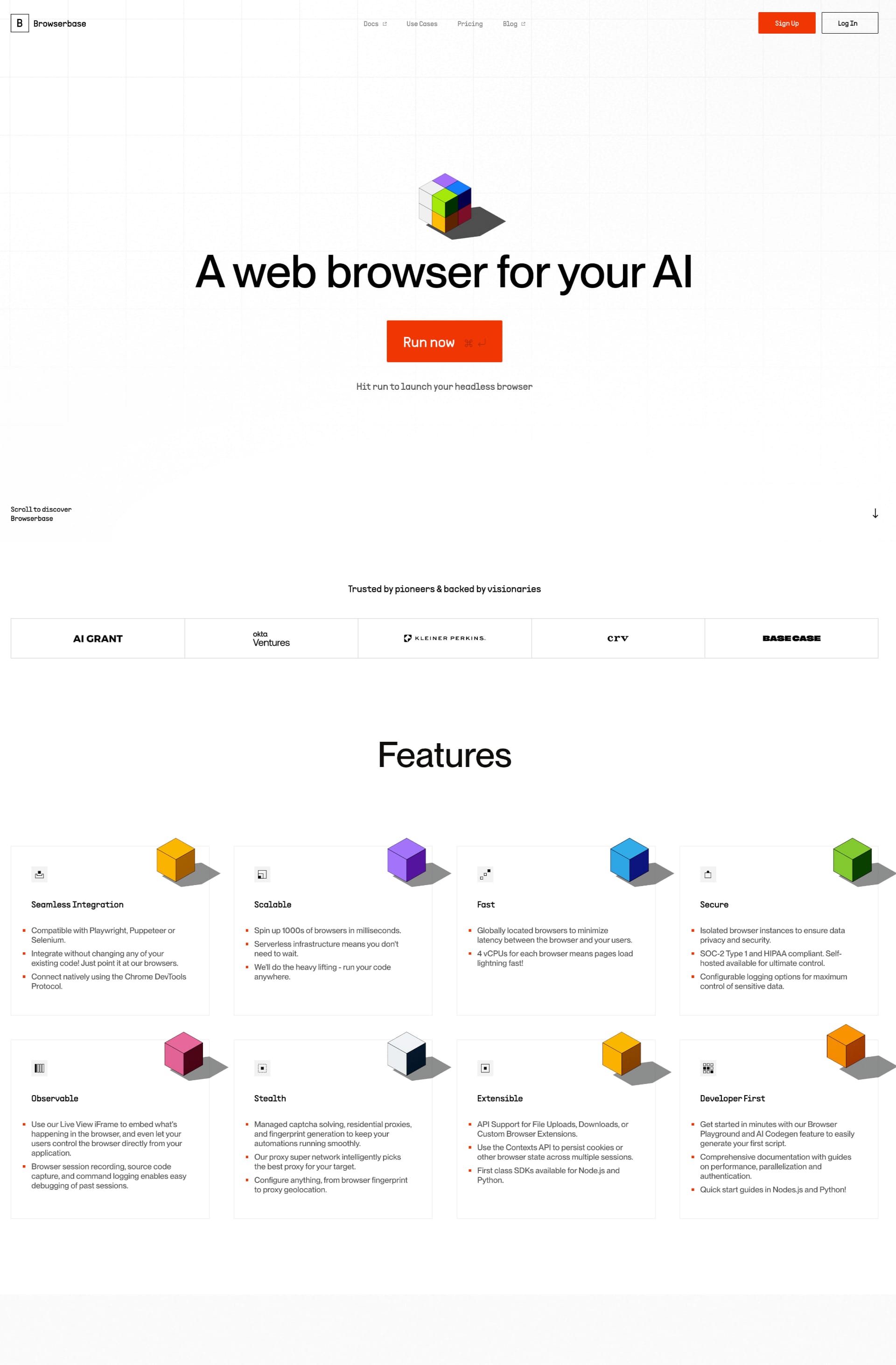
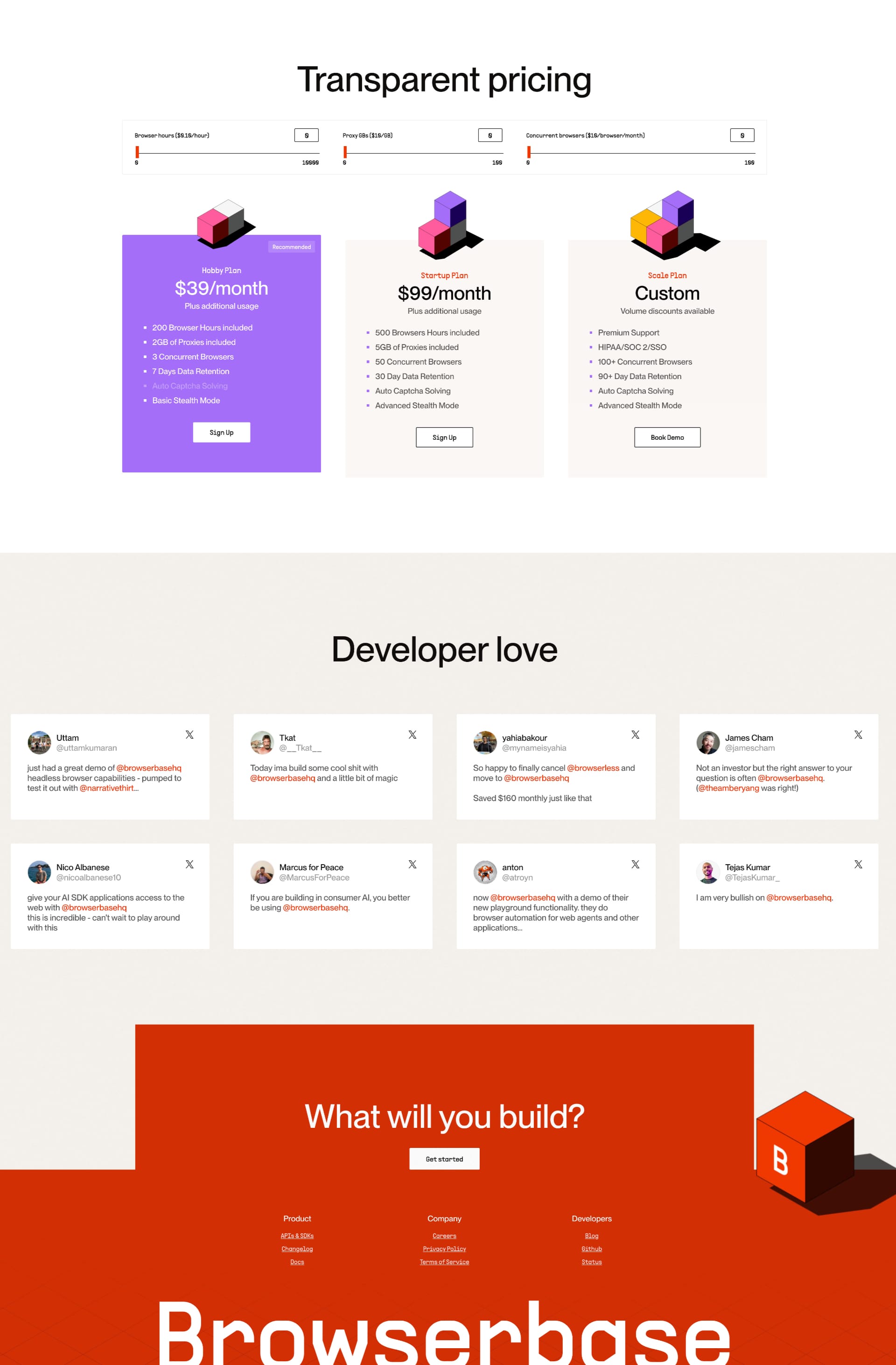
Browserbase
Funky and modern. Super clean with that crisp white background! I'm really digging the bold typography and clear layout. What's your take on their use of whitespace? Effective or too much? 🤔
Index
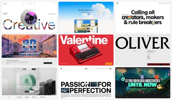
Clean lines, simple navigation. Easy peasy lemon squeezy to use. Just like Lapa! 😉

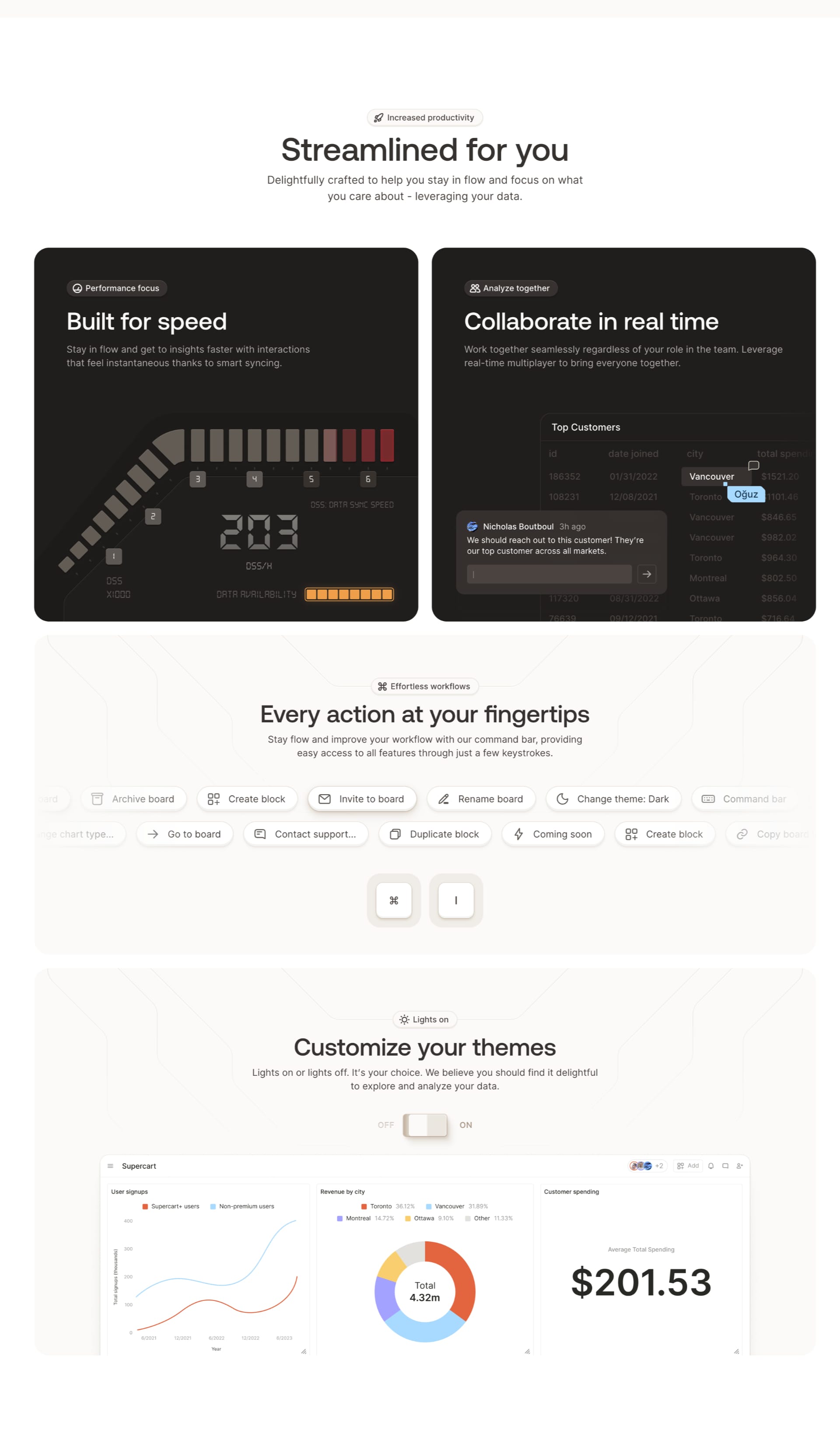
Granola
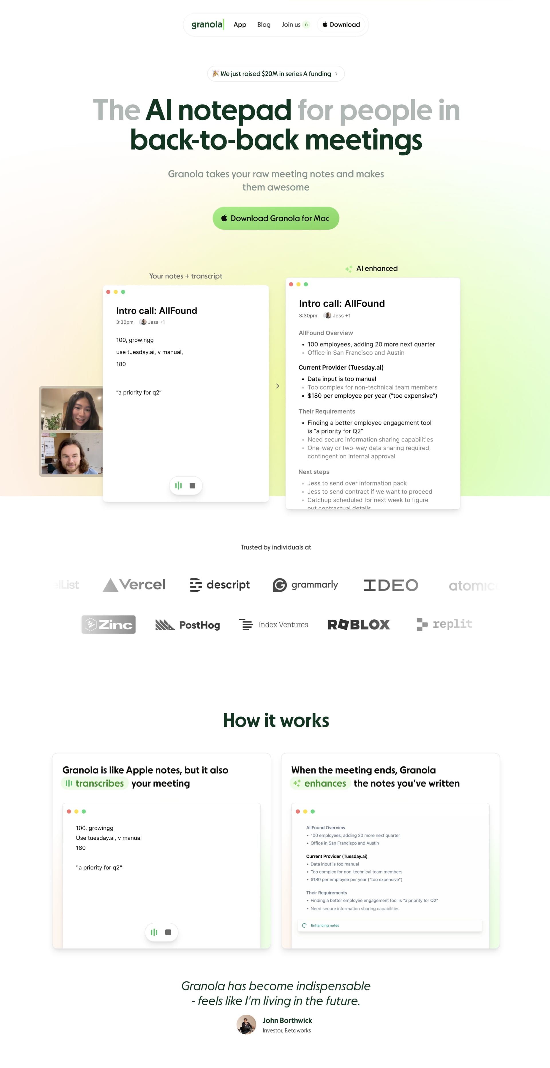
Warm, inviting, and uses visuals that tell a story. 📖 It's like a visual hug for your website visitors! 🤗

Podia
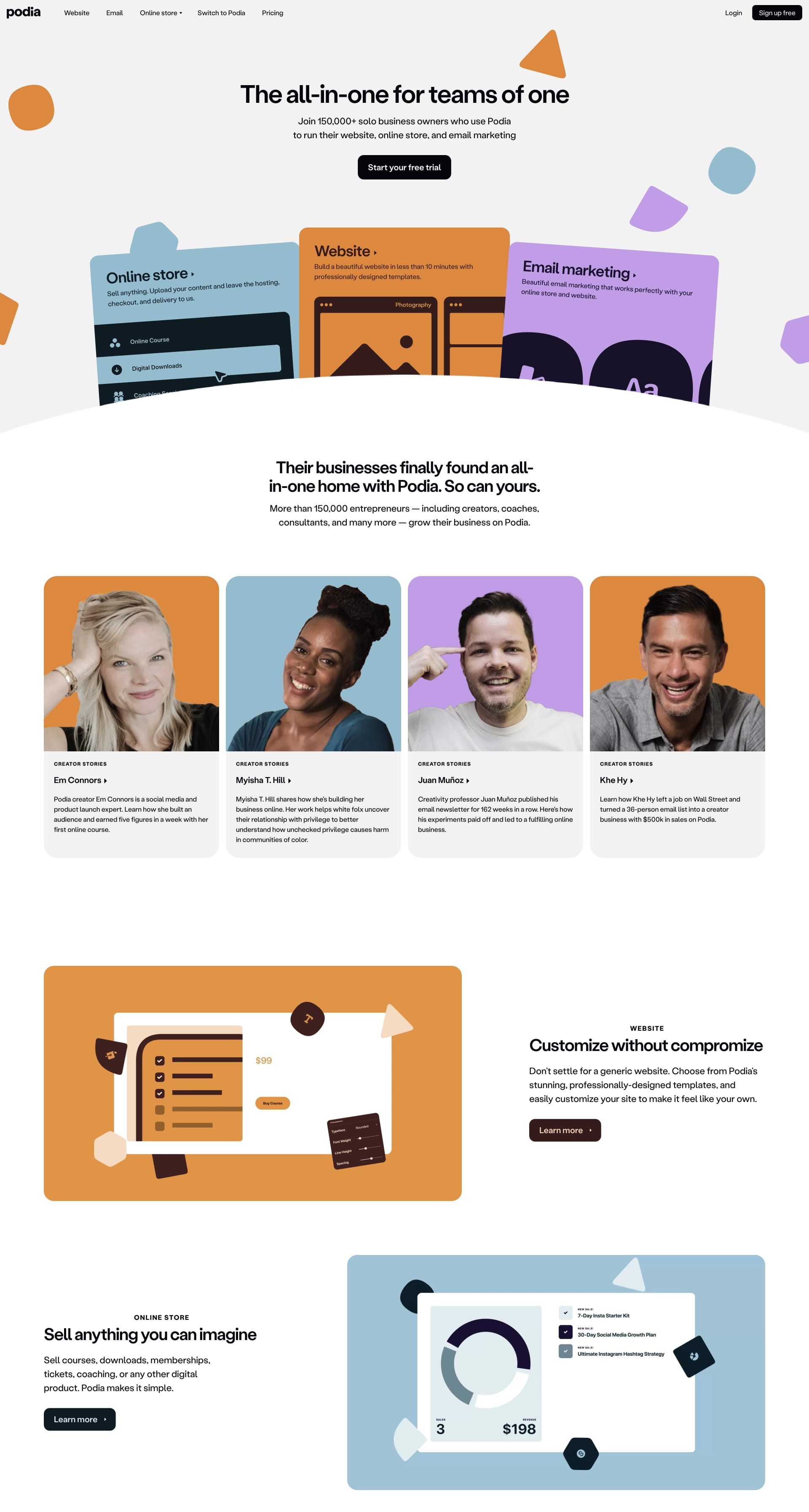
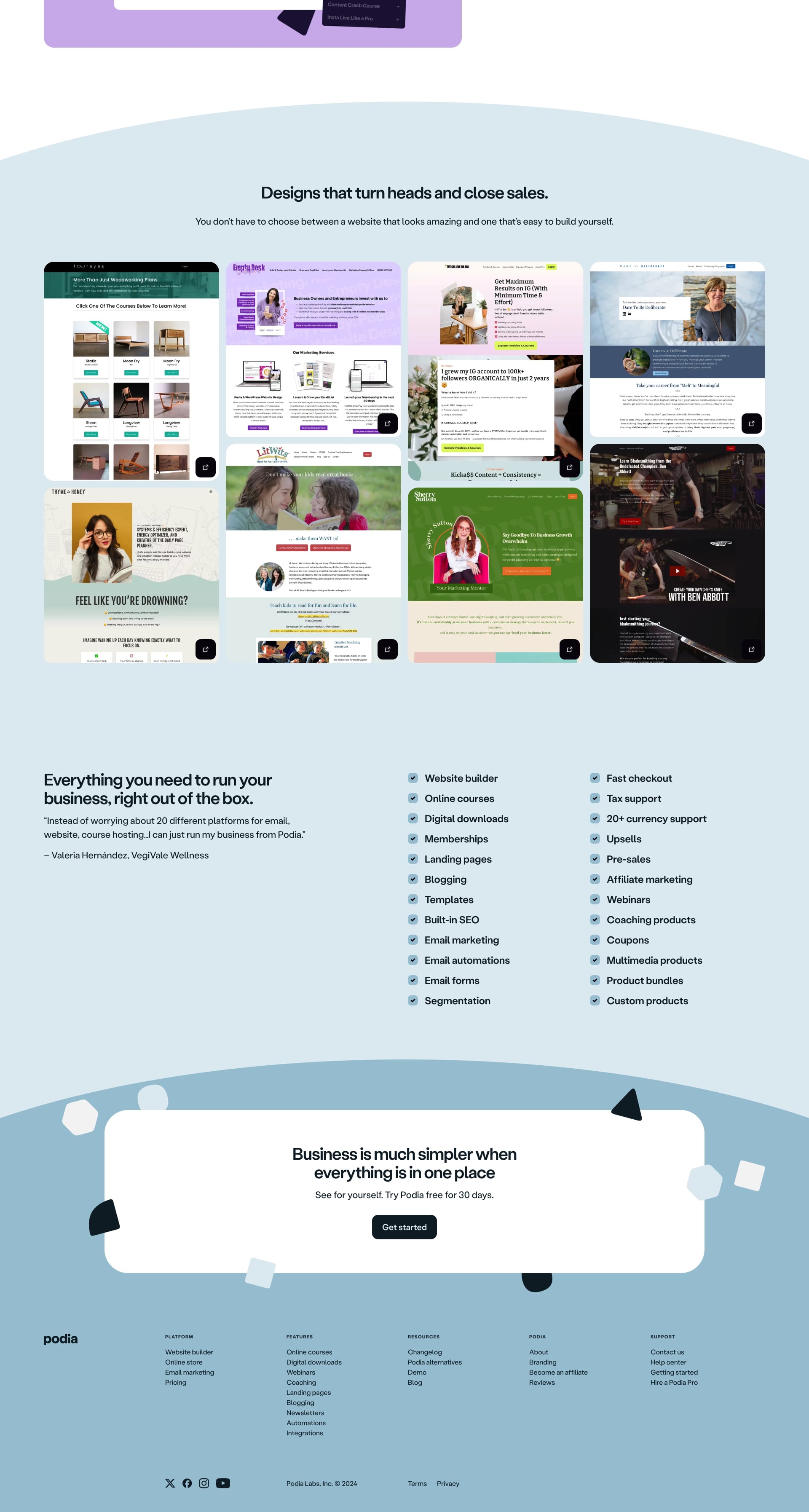
Bright, playful, and full of personality! Definitely captures the spirit of creativity and entrepreneurship. Feeling inspired yet? ✨
Buddy
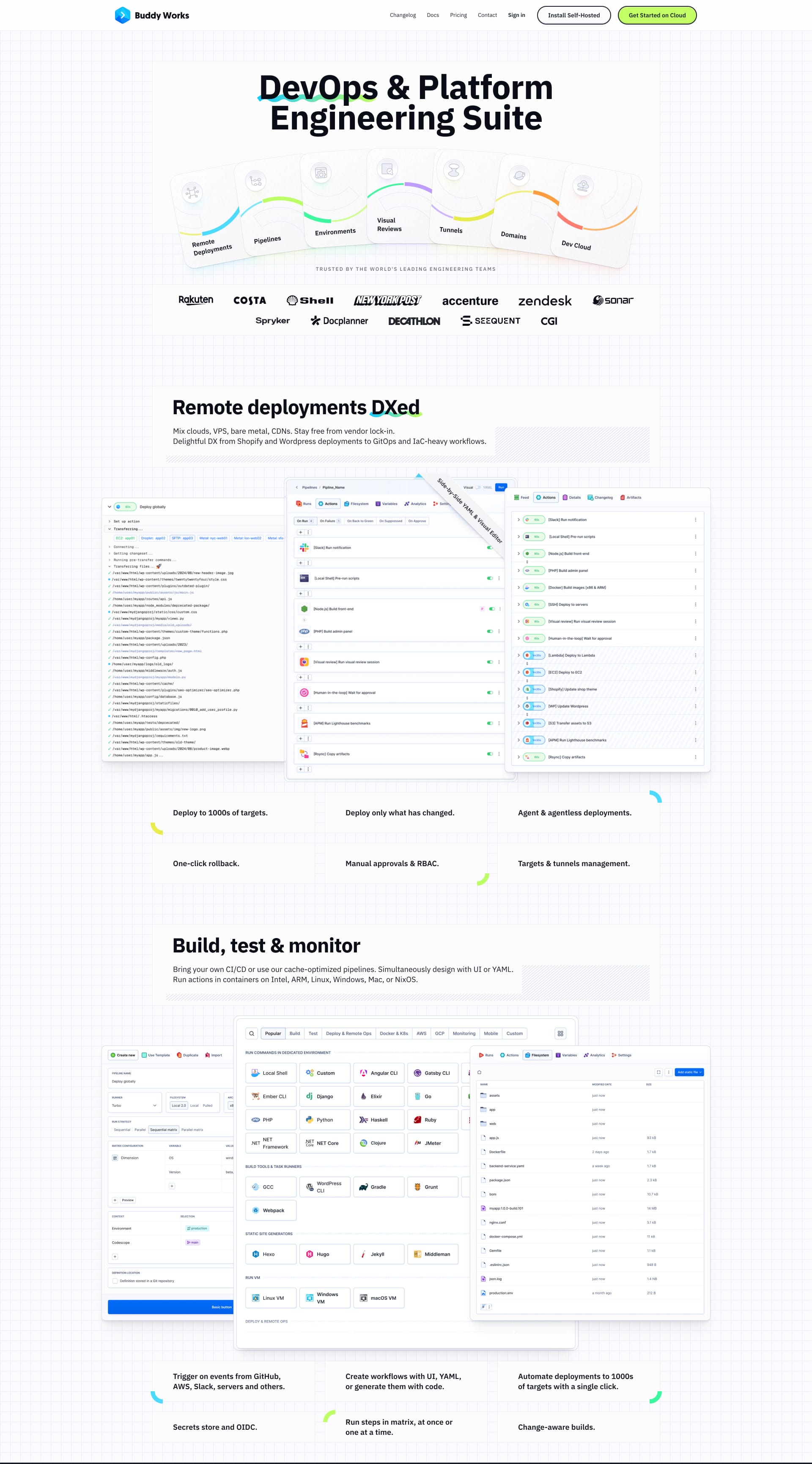
Streamlined and efficient, just like the workflow it promises. No clutter, just pure functionality. Love it! 😍

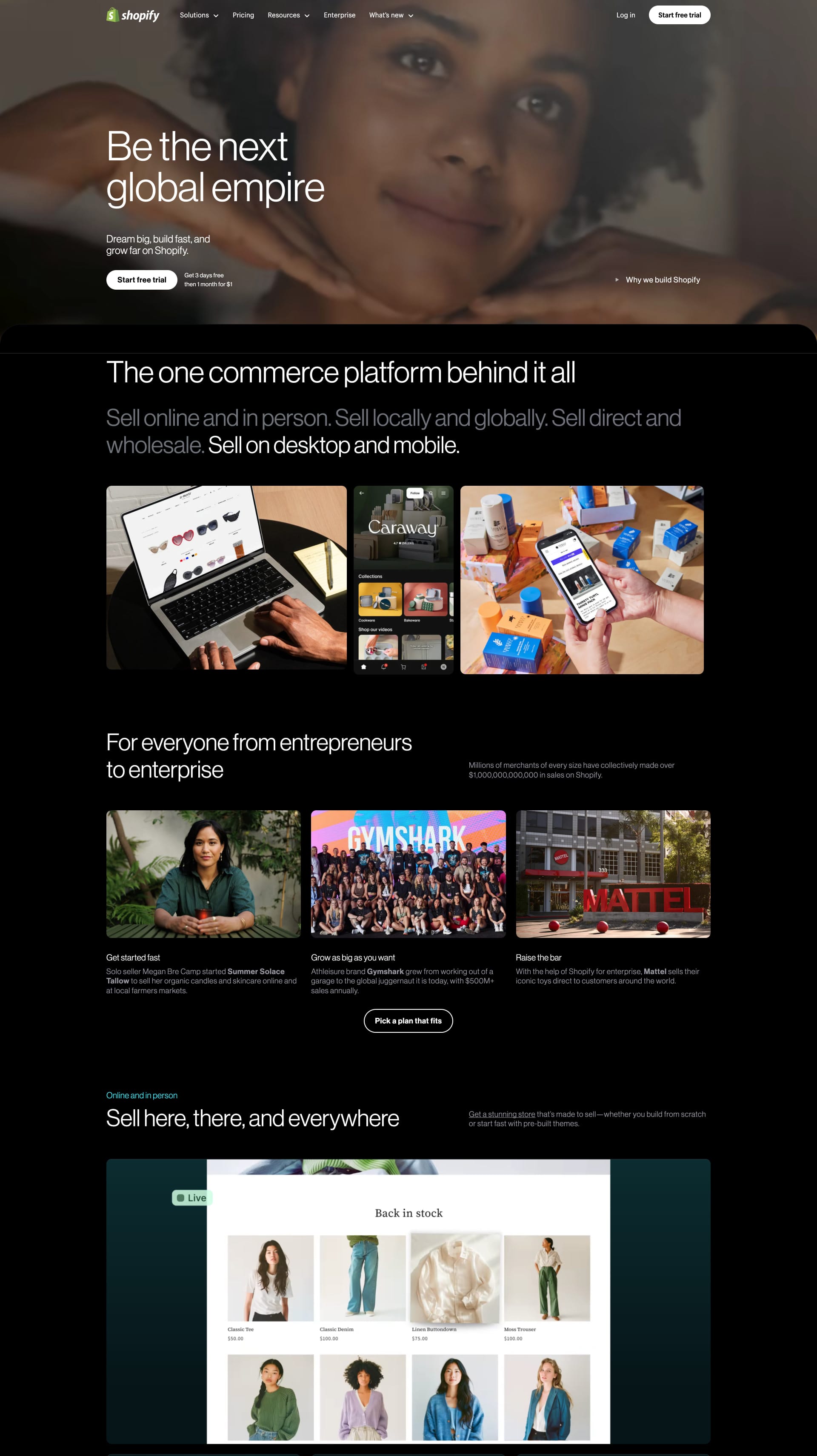
Shopify
You know Shopify, you love Shopify. ❤️ This design showcases their brand perfectly: modern, accessible, and ready to help you sell. Ka-ching! 💰

🎄🎄🎄🎄🎄🎄🎄🎄🎄🎄🎄🎄🎄🎄🎄🎄🎄🎄🎄🎄🎄🎄🎄
New Website Designs This Week
Alright Lapa ninjas, let's dissect five more fantastic landing page designs! Get ready for some quick-fire insights🔥
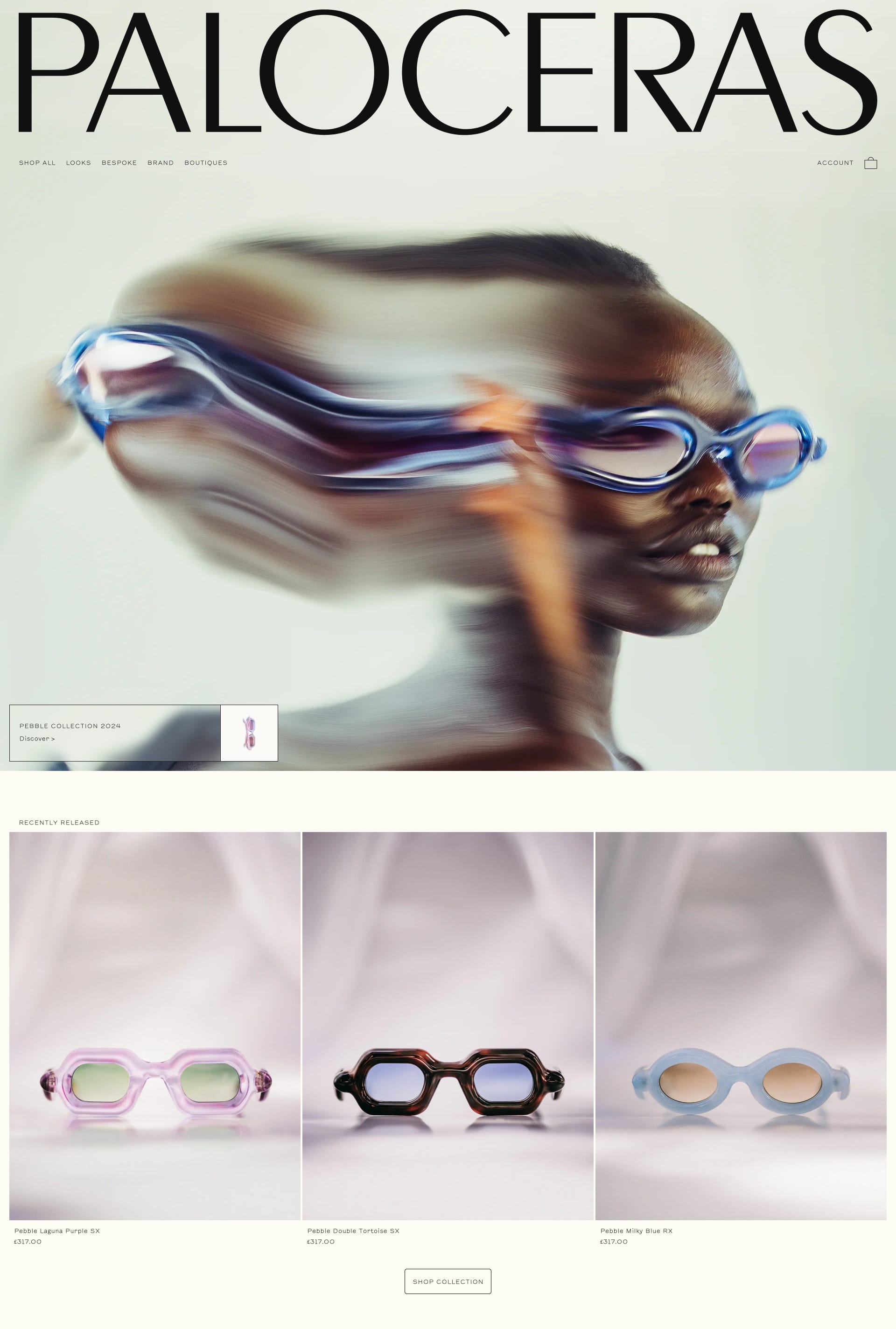
Paloceras
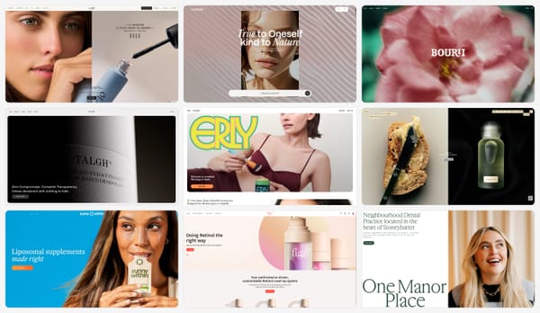
Beautiful photography and earthy tones create a calming, natural vibe. 🌿

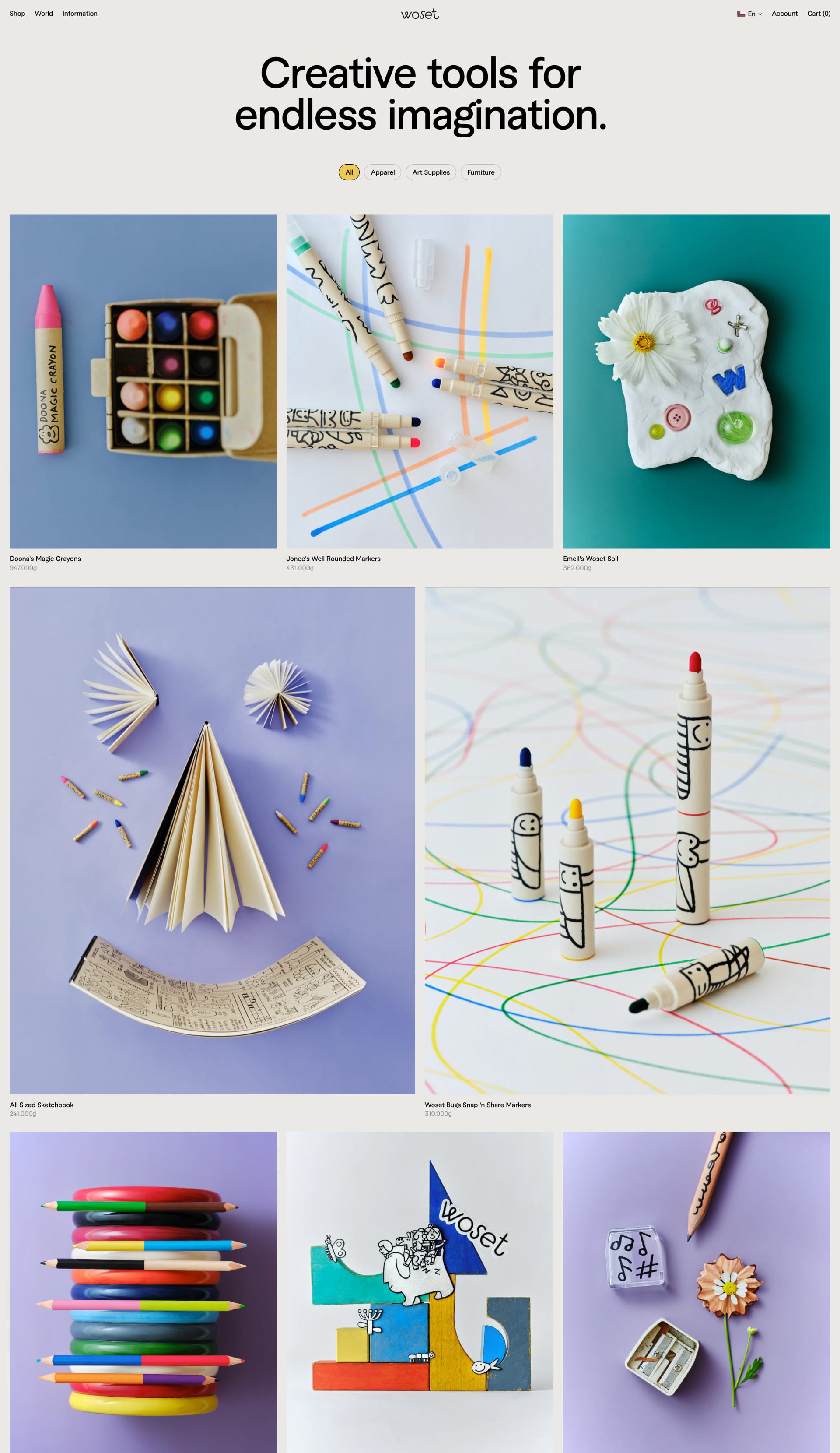
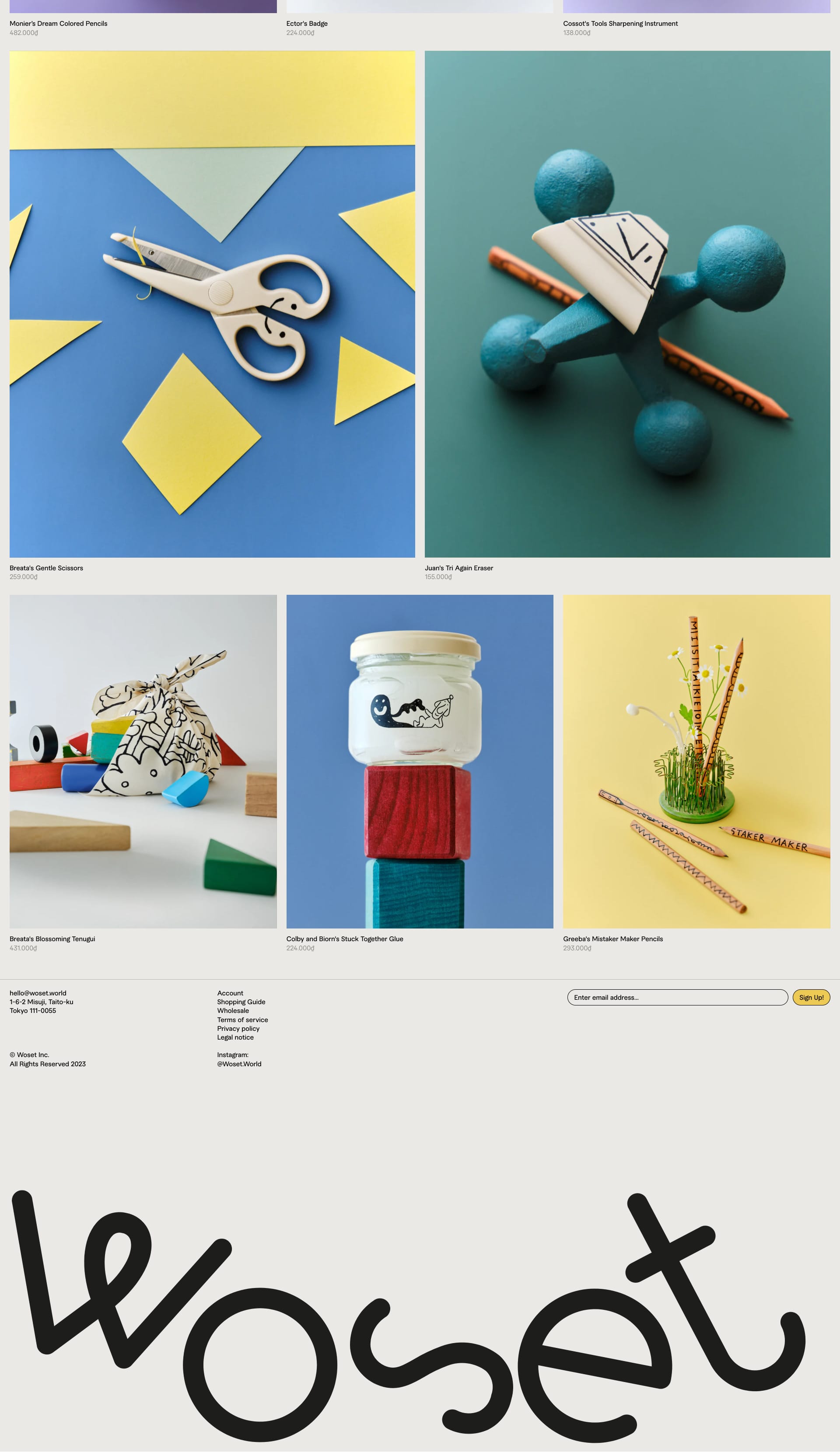
Woset
Clean and modern with a focus on showcasing their product👍
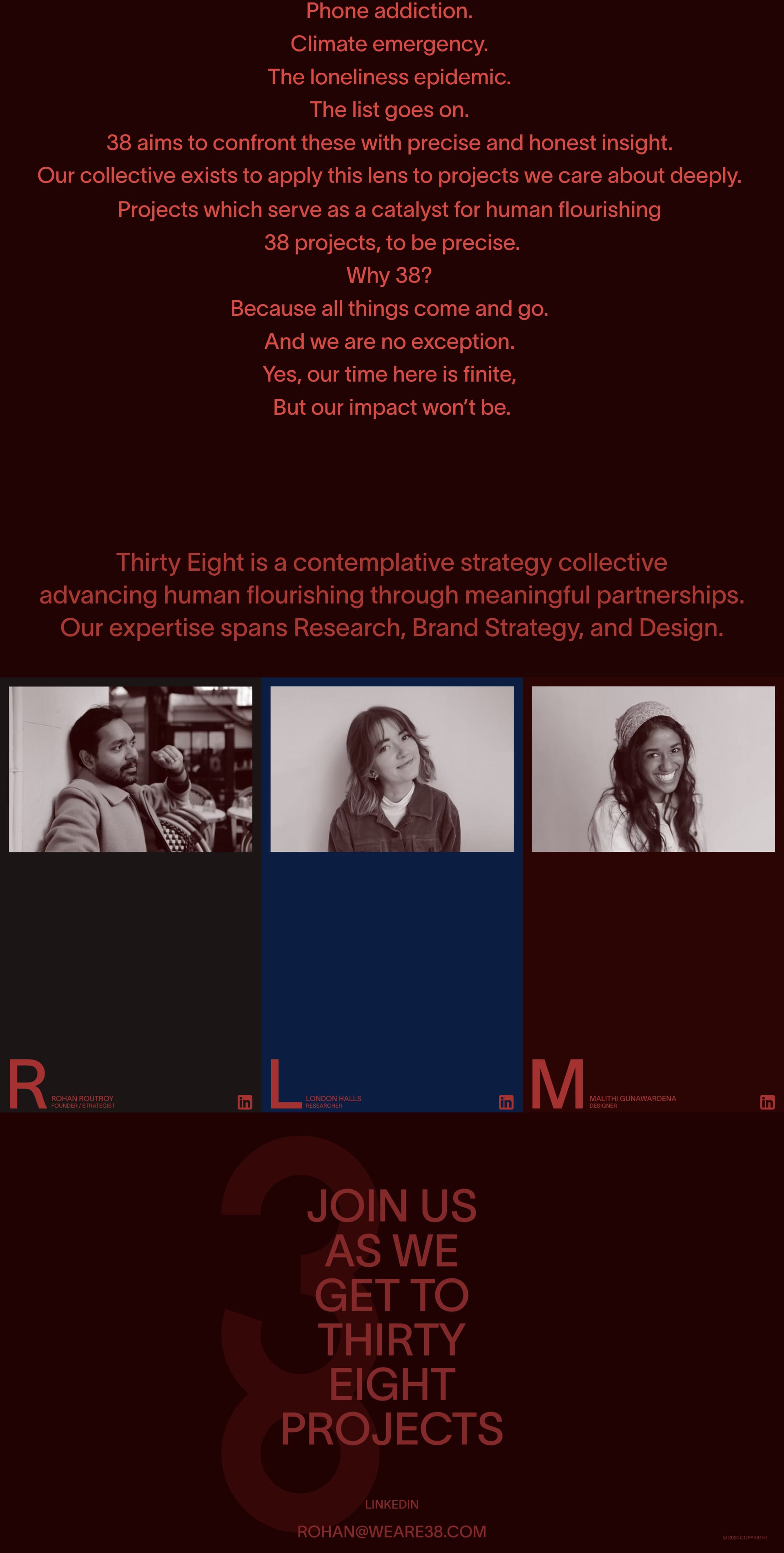
Studio 38
Bold, dynamic, and energetic! ⚡ The use of video is eye-catching.

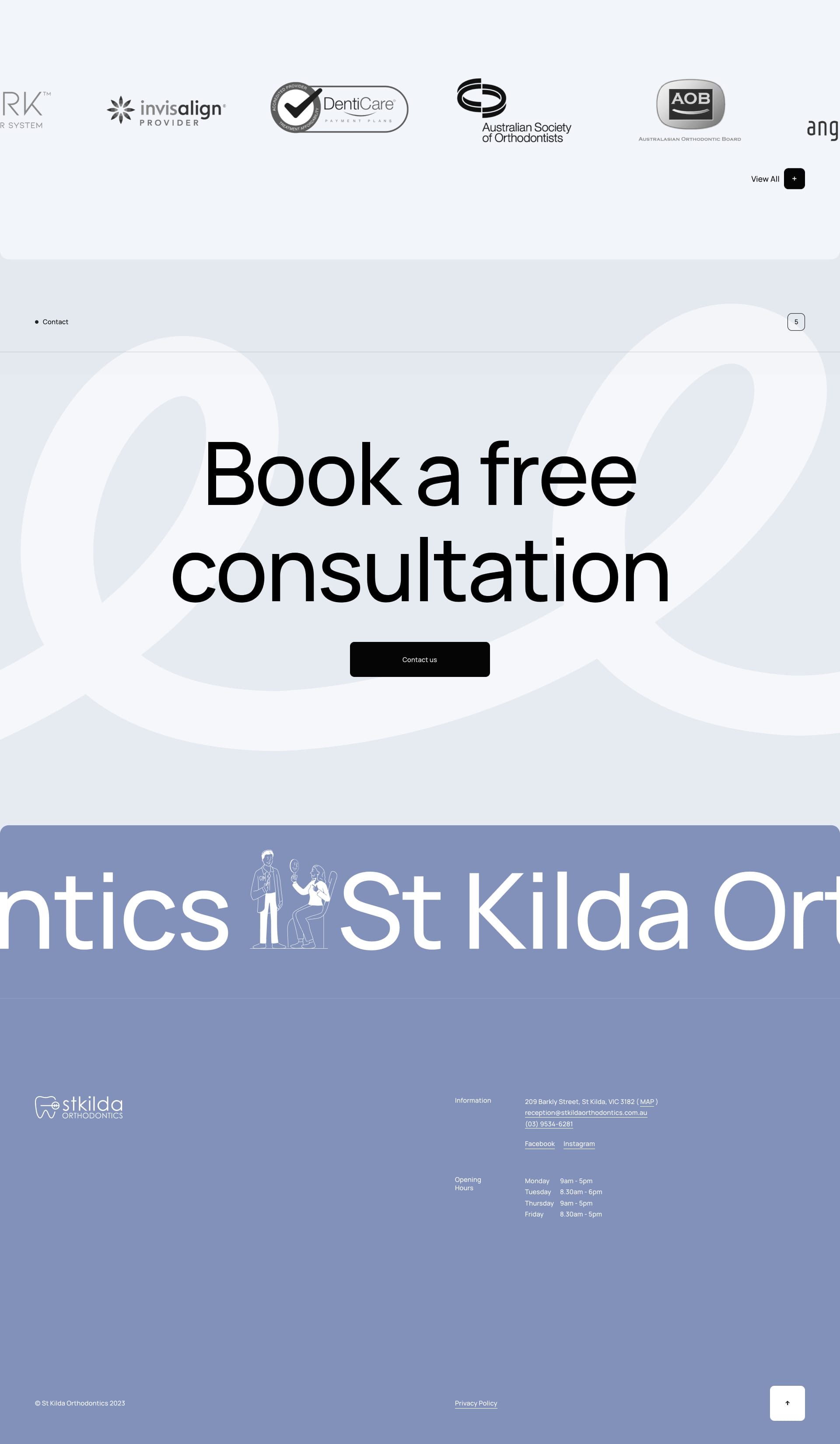
St Kilda
Friendly faces and a reassuring tone. 😊 Builds trust instantly!

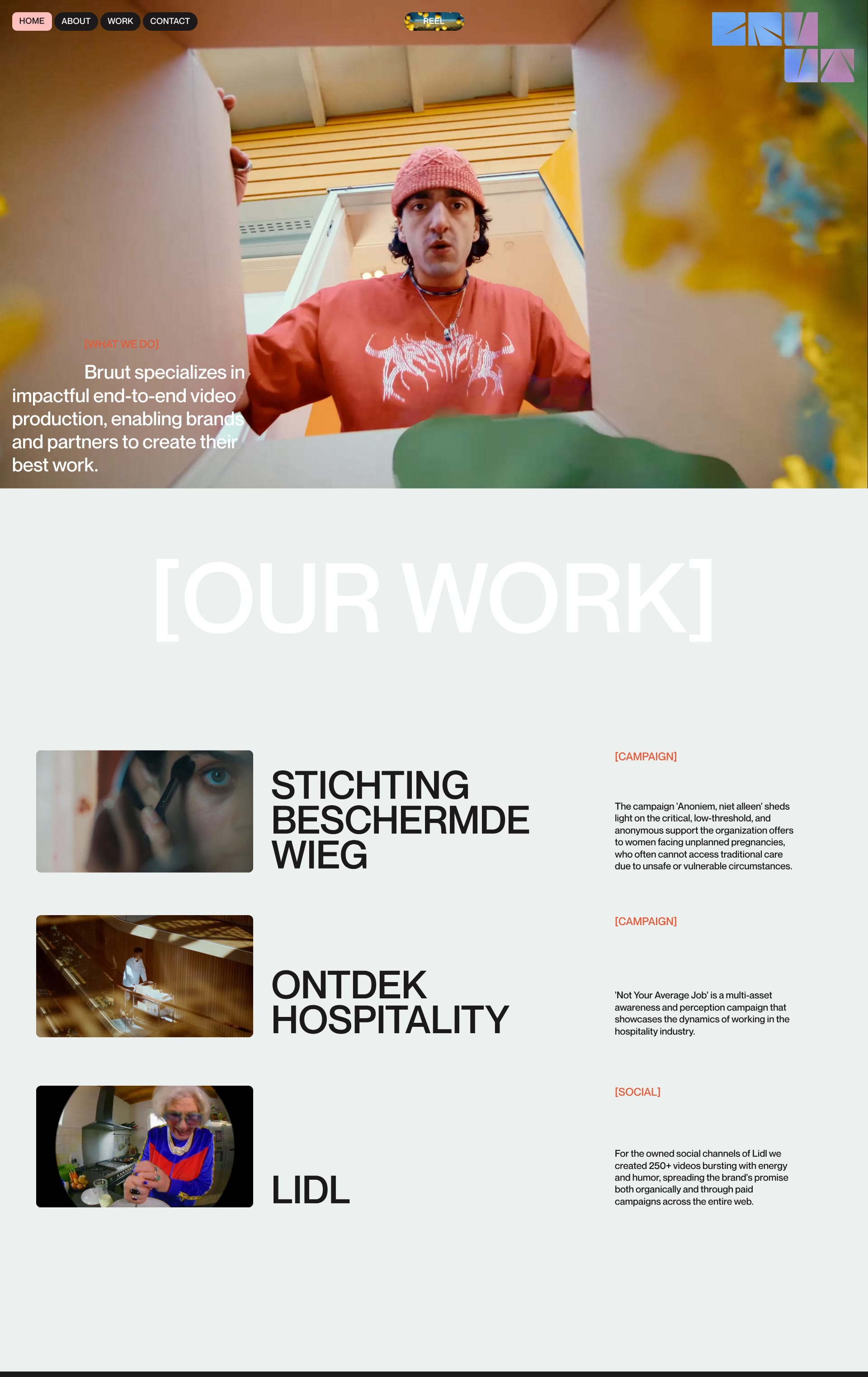
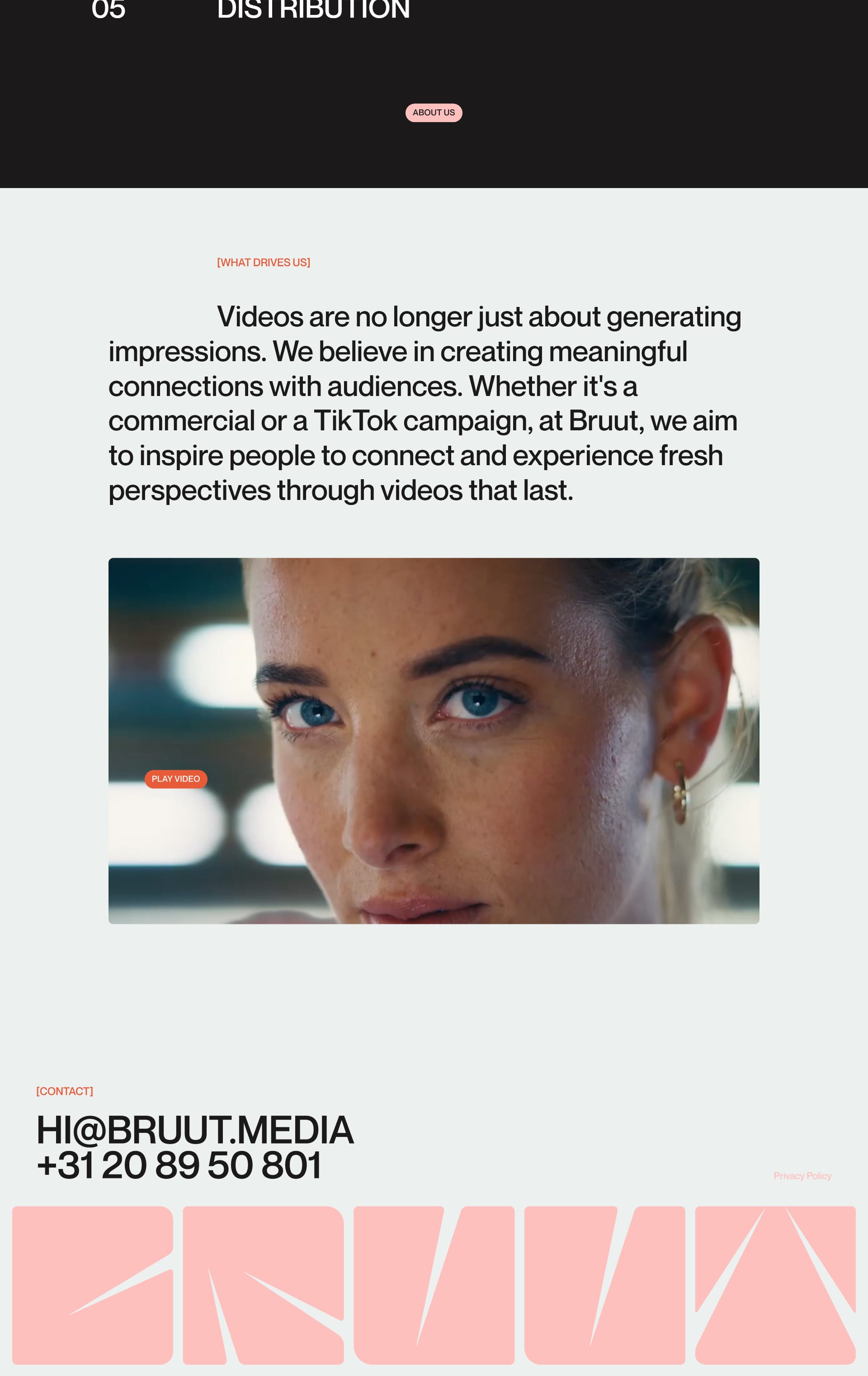
Bruut
Think clean lines, minimalist design, and a whole lotta white space. It's all about letting the content breathe!
Enjoyed This Issue?
Share it with a friend! Don't forget to subscribe to our Newsletter!
If you have websites that you want to appear on Lapa Ninja, do not hesitate to email the team at 💌 hi@lapa.ninja.
Stay inspired with the latest website designs by following us on X: https://x.com/lapaninja and 🦋 Bluesky https://bsky.app/profile/lapa.ninja
Stay tuned for more exciting updates in the future!
JEN from Lapa.Ninja


