Lapa Inspiration #8 - Top Latest No-Code Websites Built with Framer – A Must-See for Your Next Project! 🚀
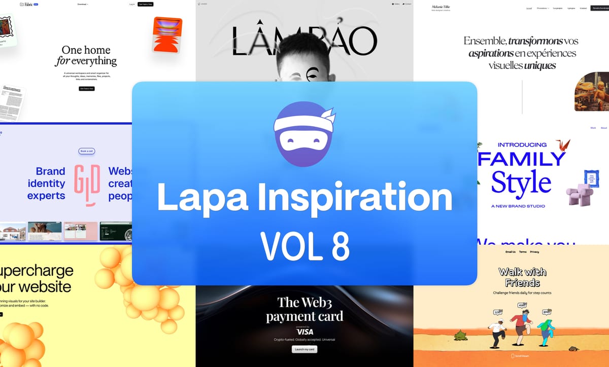
Hey awesome Lapa ninjas! 👋 Ready to be blown away by some seriously cool landing pages? This week, we’re diving headfirst into the world of Framer – A no-code platform that's making waves! 🌊 These ten examples are SO inspiring, they’ll have you itching to start your next project 😉
Let's get this Framer party started! 🎉
Lapa.Ninja currently features 6739 landing page designs. We've added incredible new content for you to explore. Get inspired by real landing page examples with full website screenshots. Check out the latest amazing websites below.
Our Sponsor This Week

Top Latest No-Code Websites Built with Framer
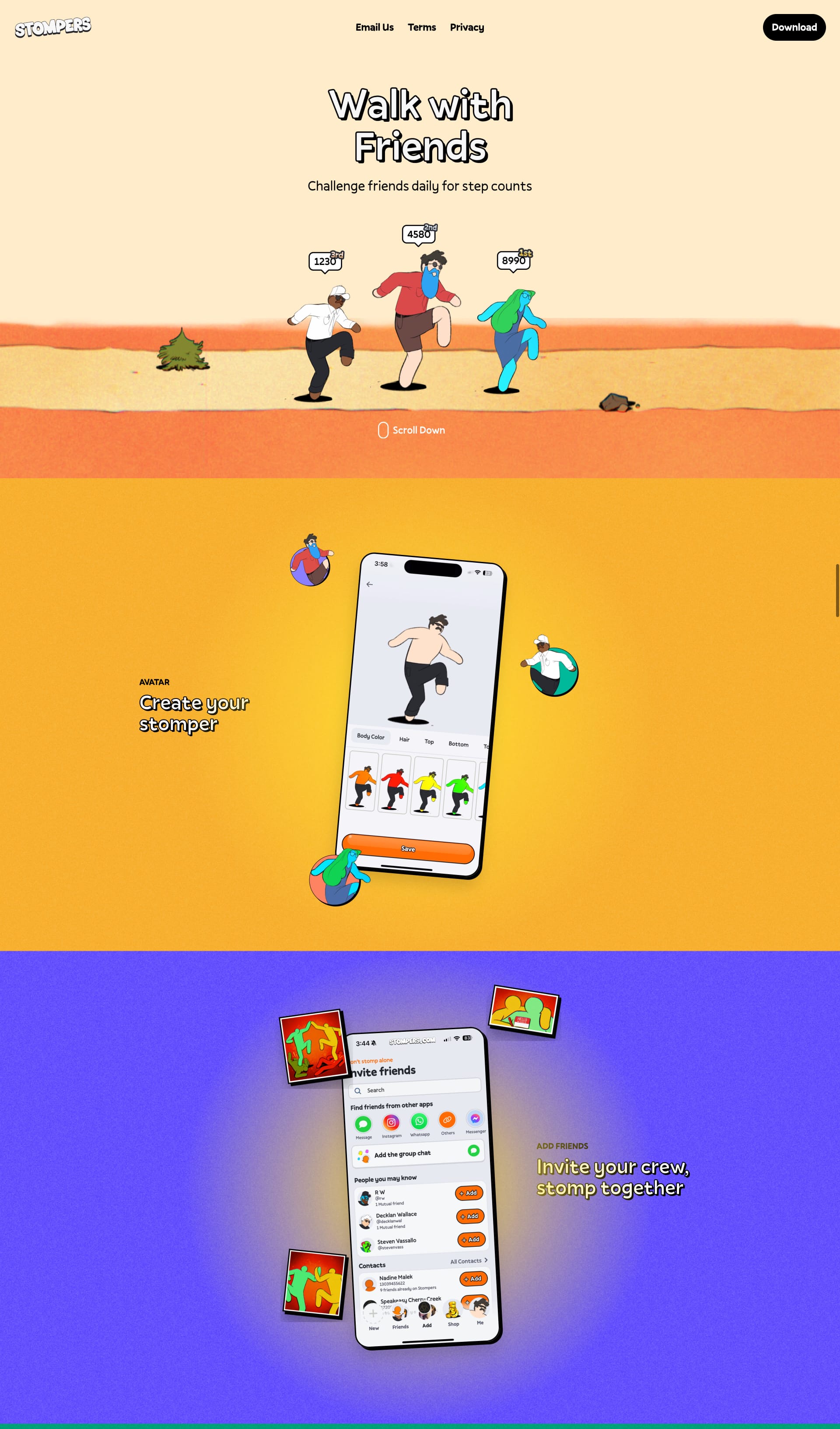
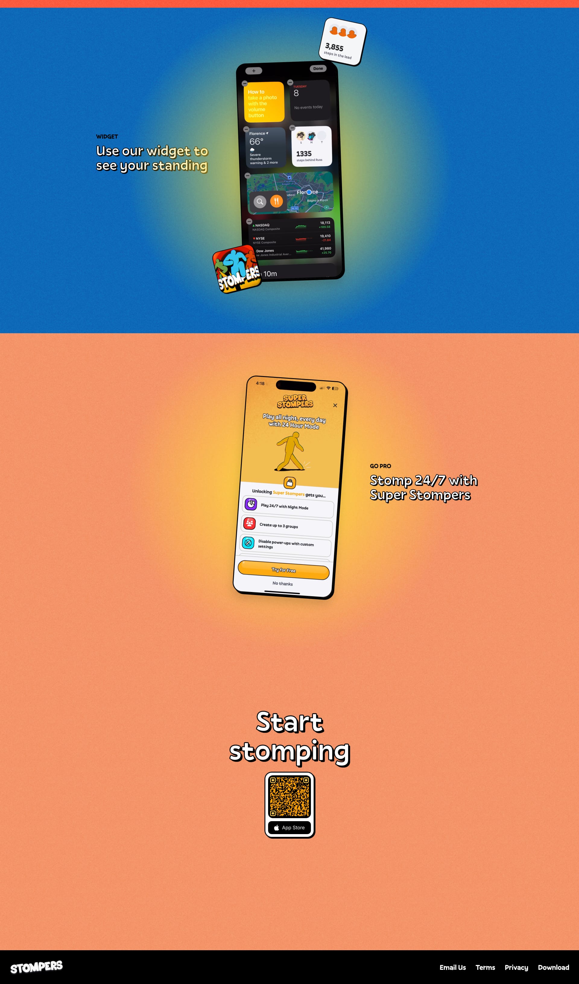
Stompers
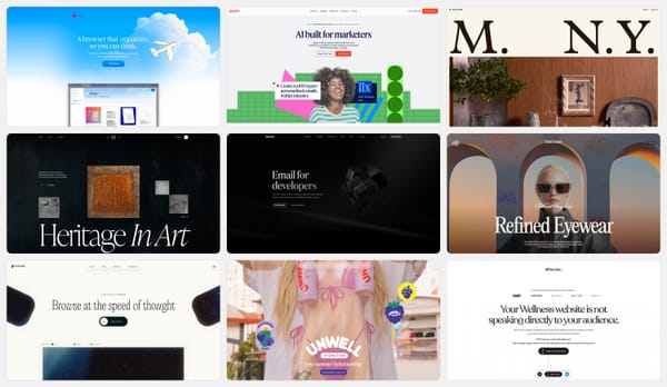
This design features a dynamic, animated gradient background that immediately draws the eye. The vibrant phone takes center stage, creating a modern and energetic feel. It effectively balances visual interest with clear branding. ✨ What are your thoughts on this approach? 🤔
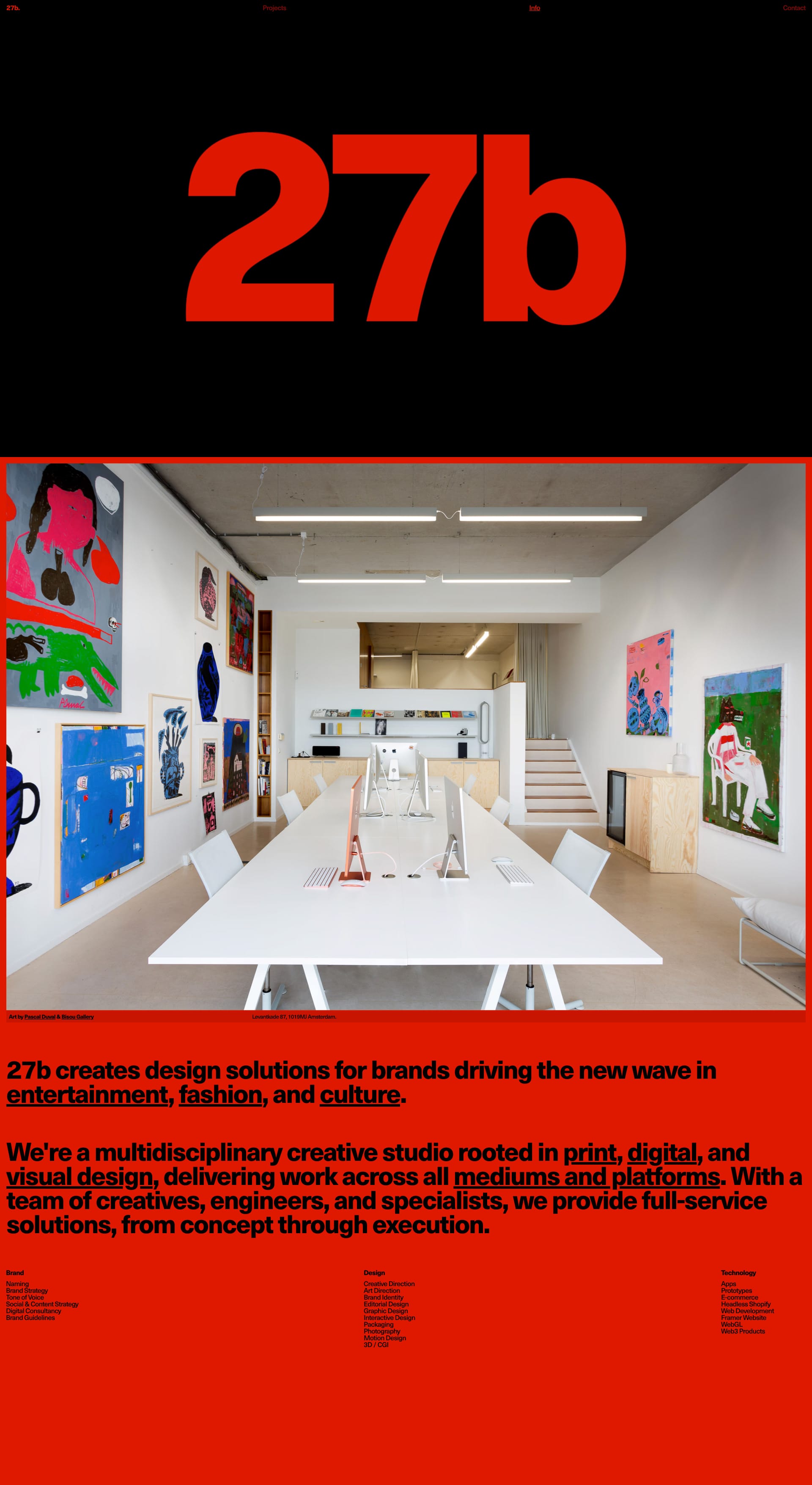
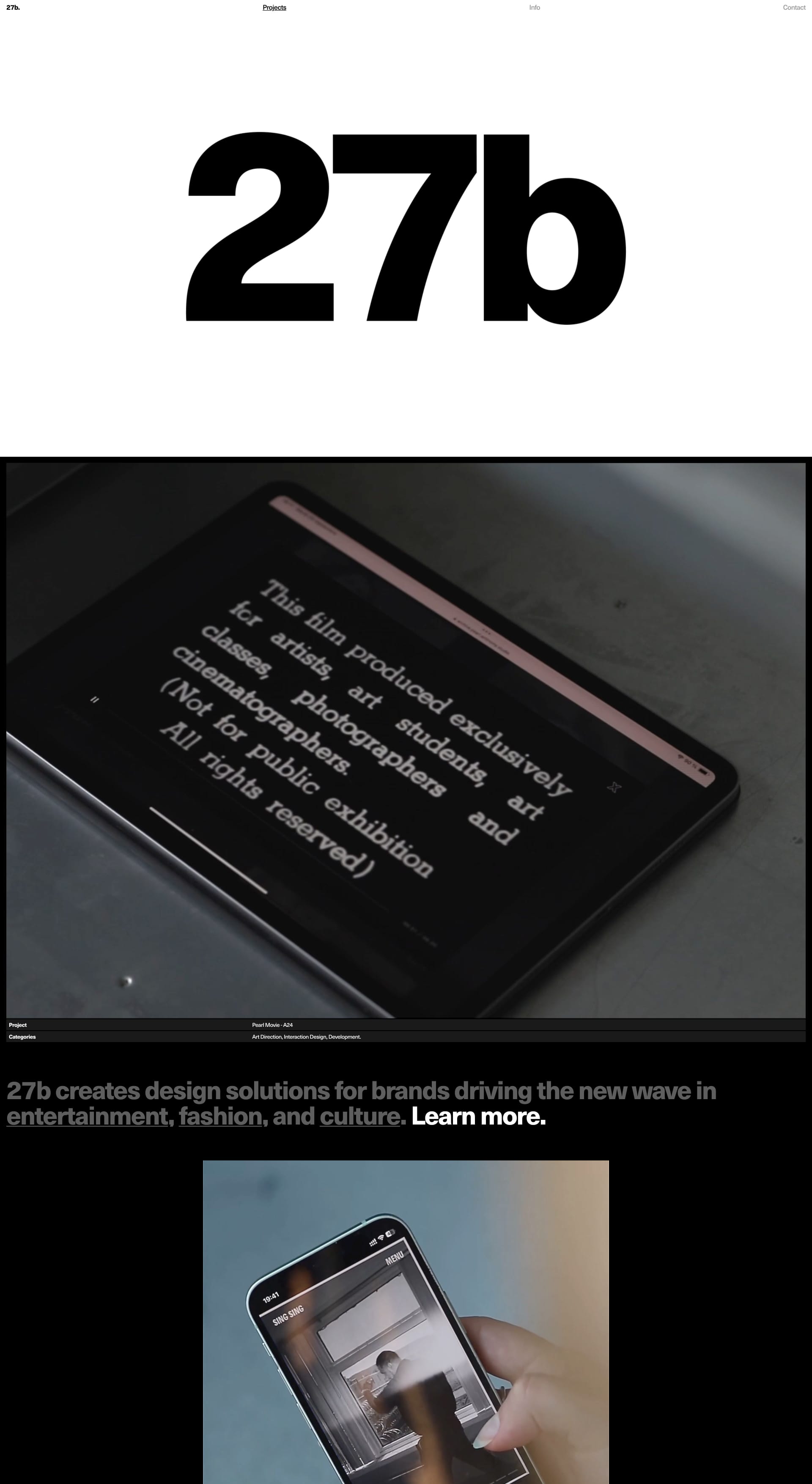
27b
This design uses cool, muted colors and sleek graphics to create a sophisticated and modern feel. The overall effect is polished and professional, while still feeling fresh and contemporary. What do you think of this more refined approach? 🤔
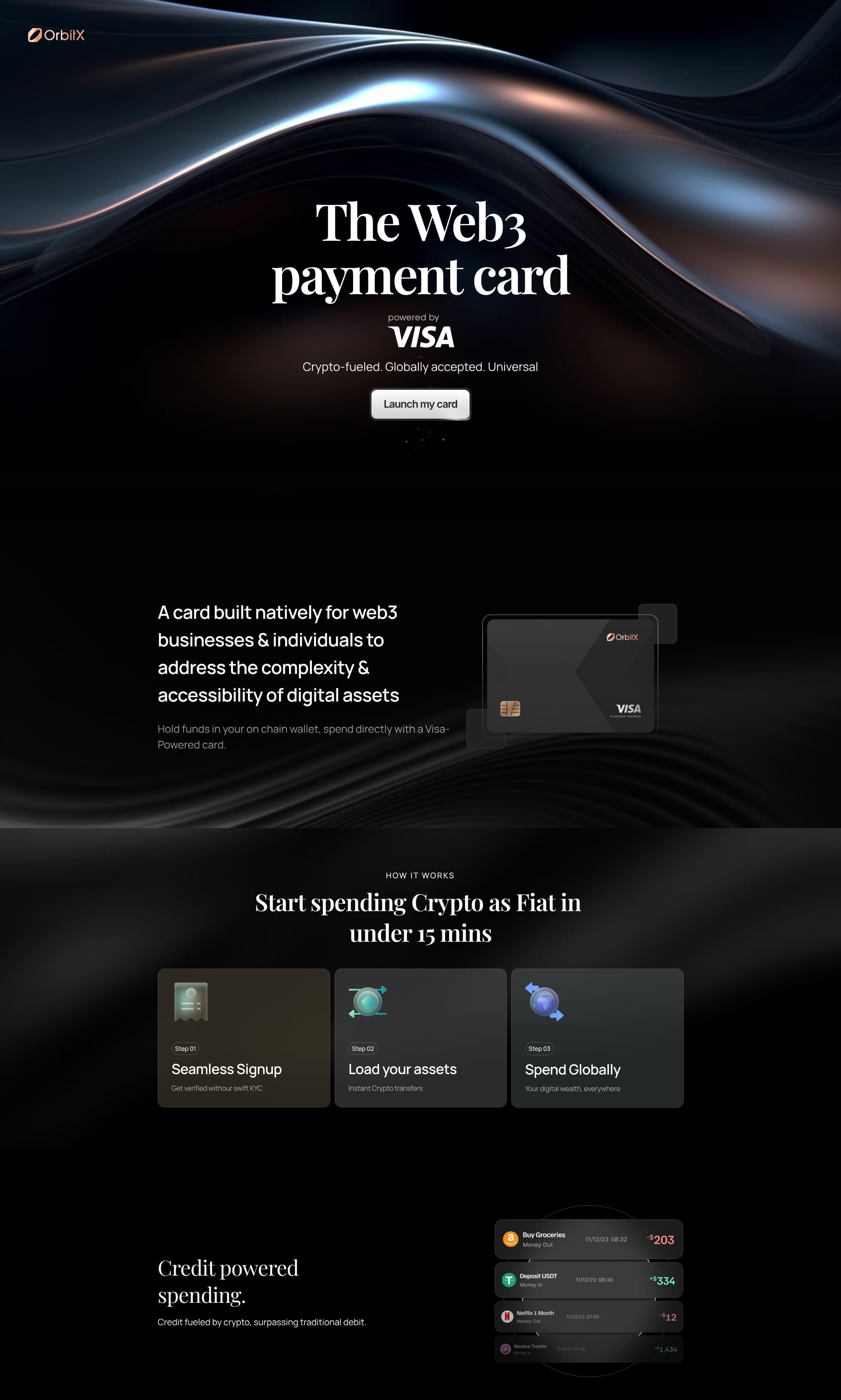
OrbitX
Dark, futuristic vibes with neon accents. Think cyberpunk meets finance! 🌃 This design uses color and typography to create a strong brand identity.
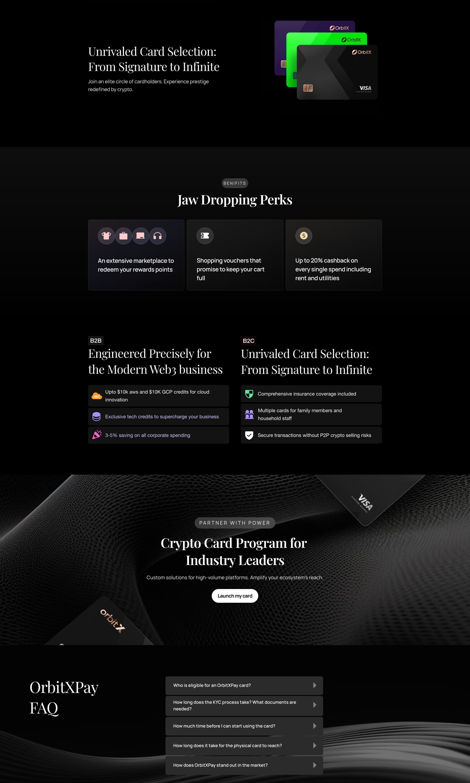
HeroKit
This design utilizes a bold yellow and black color palette to create a high-contrast, attention-grabbing look. Combined with a single, powerful image and concise messaging, it delivers a clear and impactful message. Less is definitely more here! 🎯 What do you think of this high-contrast approach? 🤔

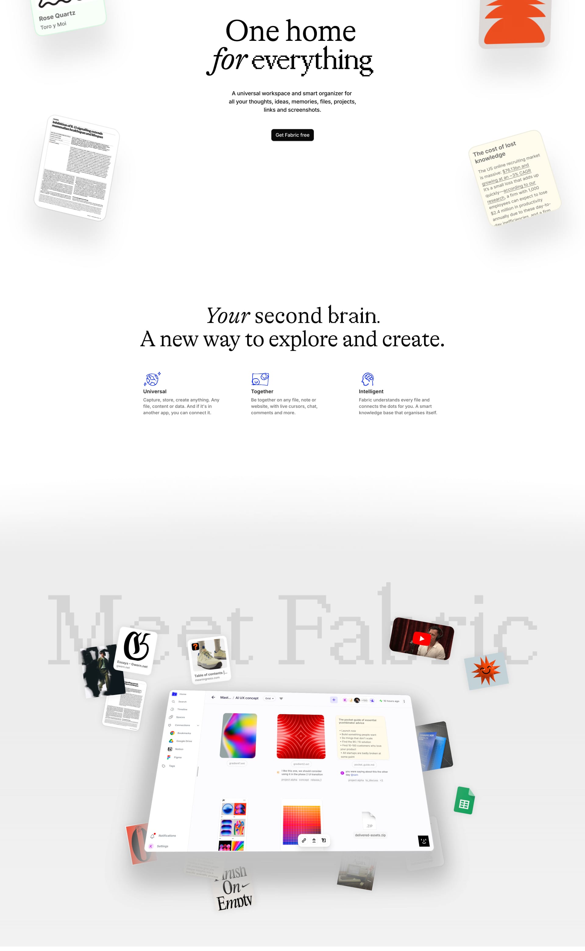
Fabric
This design features clean lines, subtle animations, and a sophisticated color palette to create a smooth and modern feel. The focus is on showcasing the platform's features in a stylish and user-friendly way.

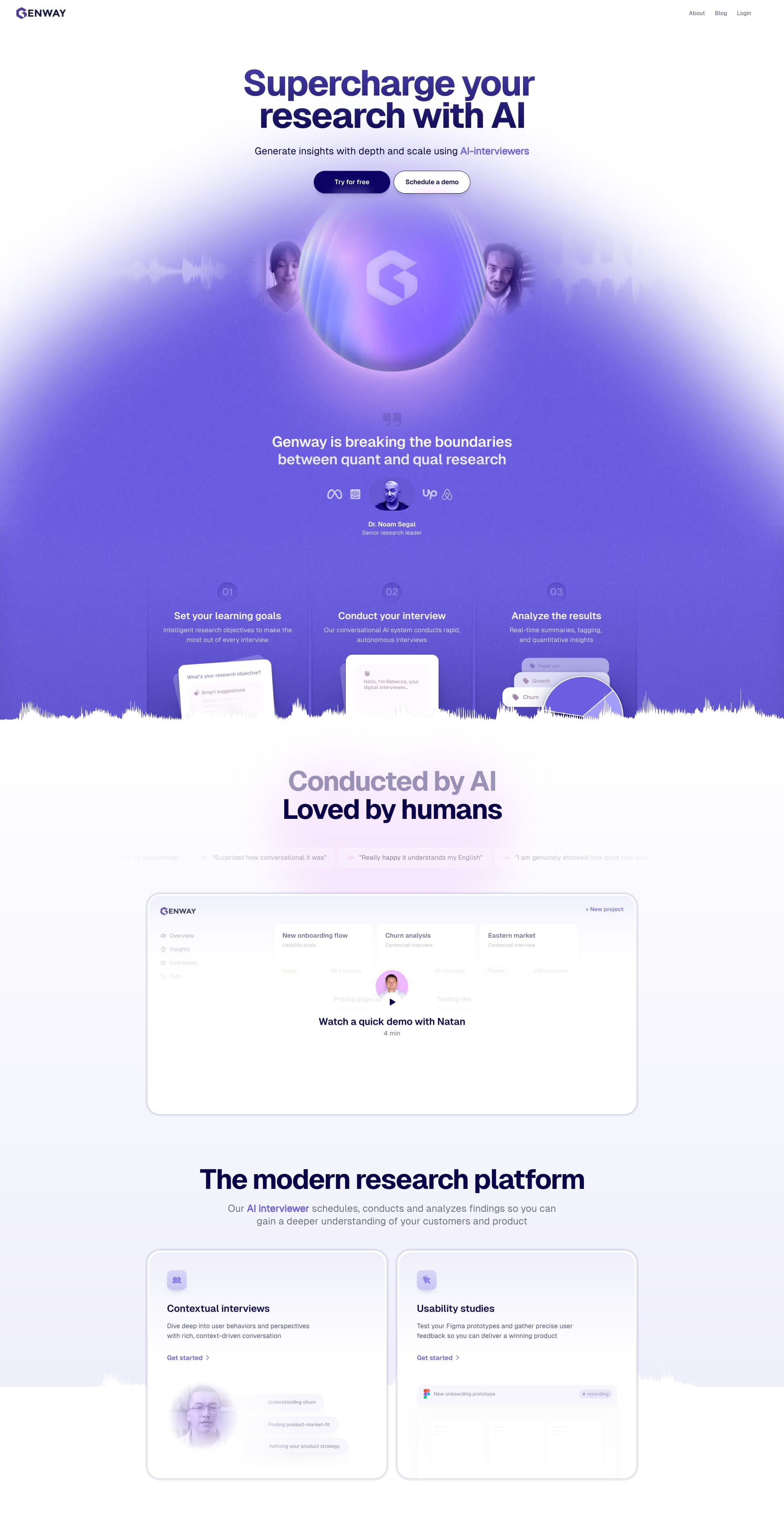
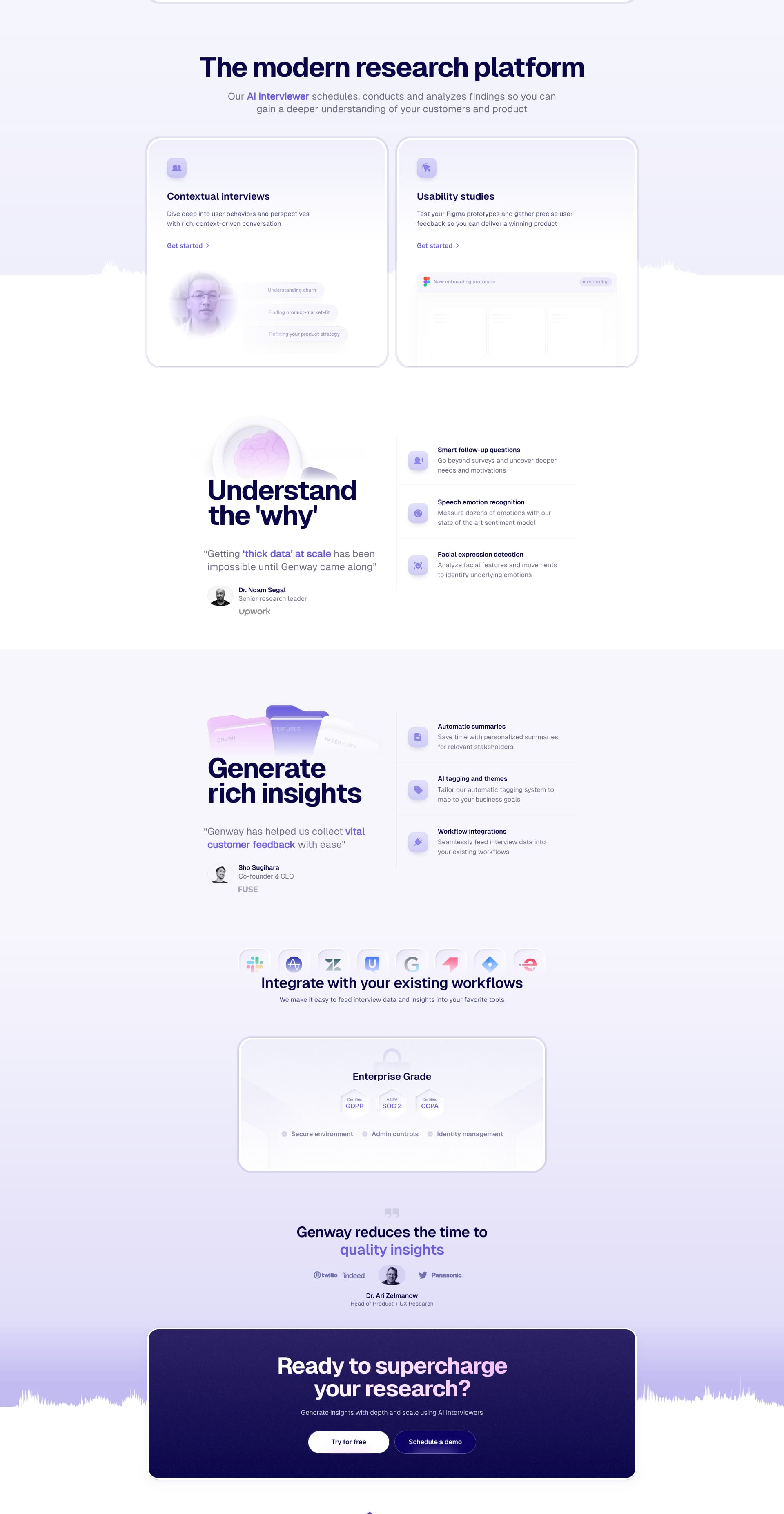
Genway
This design uses a vibrant purple and white color scheme to create a modern and eye-catching look. It clearly communicates a sense of innovation and technology, while maintaining a professional feel. What are your thoughts on this colorful yet professional approach?
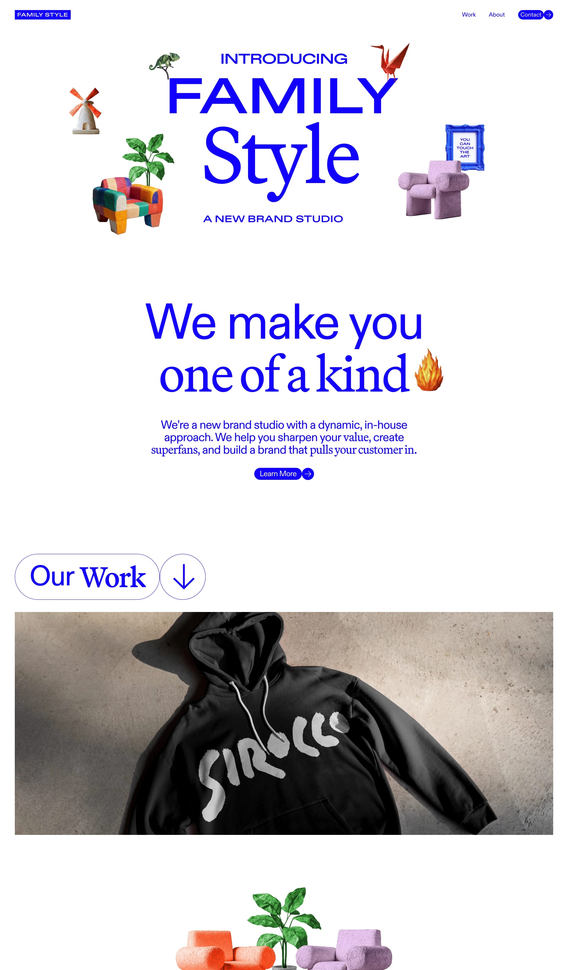
Family Style
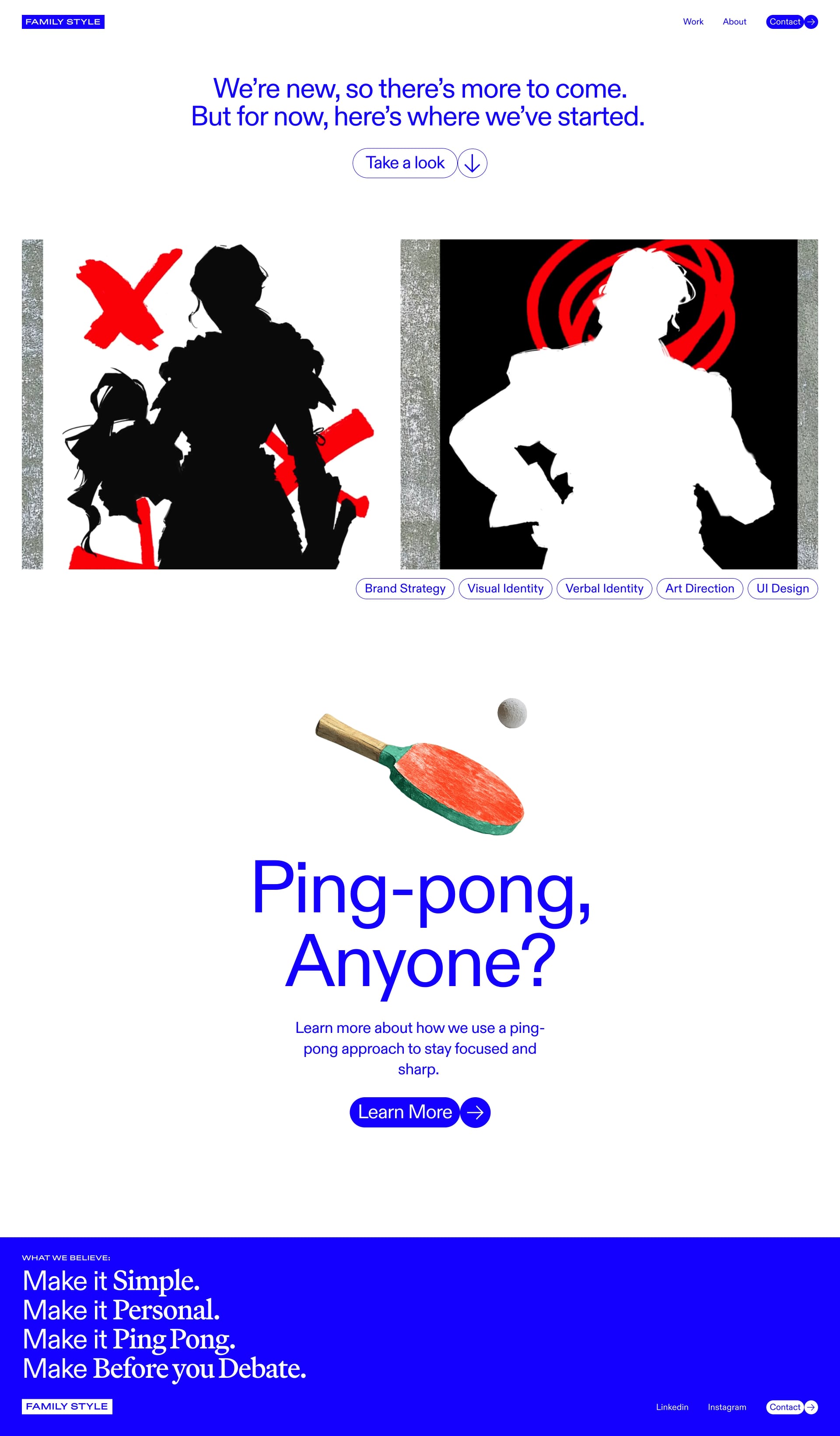
This landing page centers around a vibrant blue color scheme, complemented by playful illustrations and bold typography. It creates a welcoming and energetic feel, while still maintaining a sense of professionalism.
Mélanie Tillie
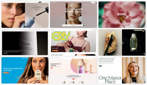
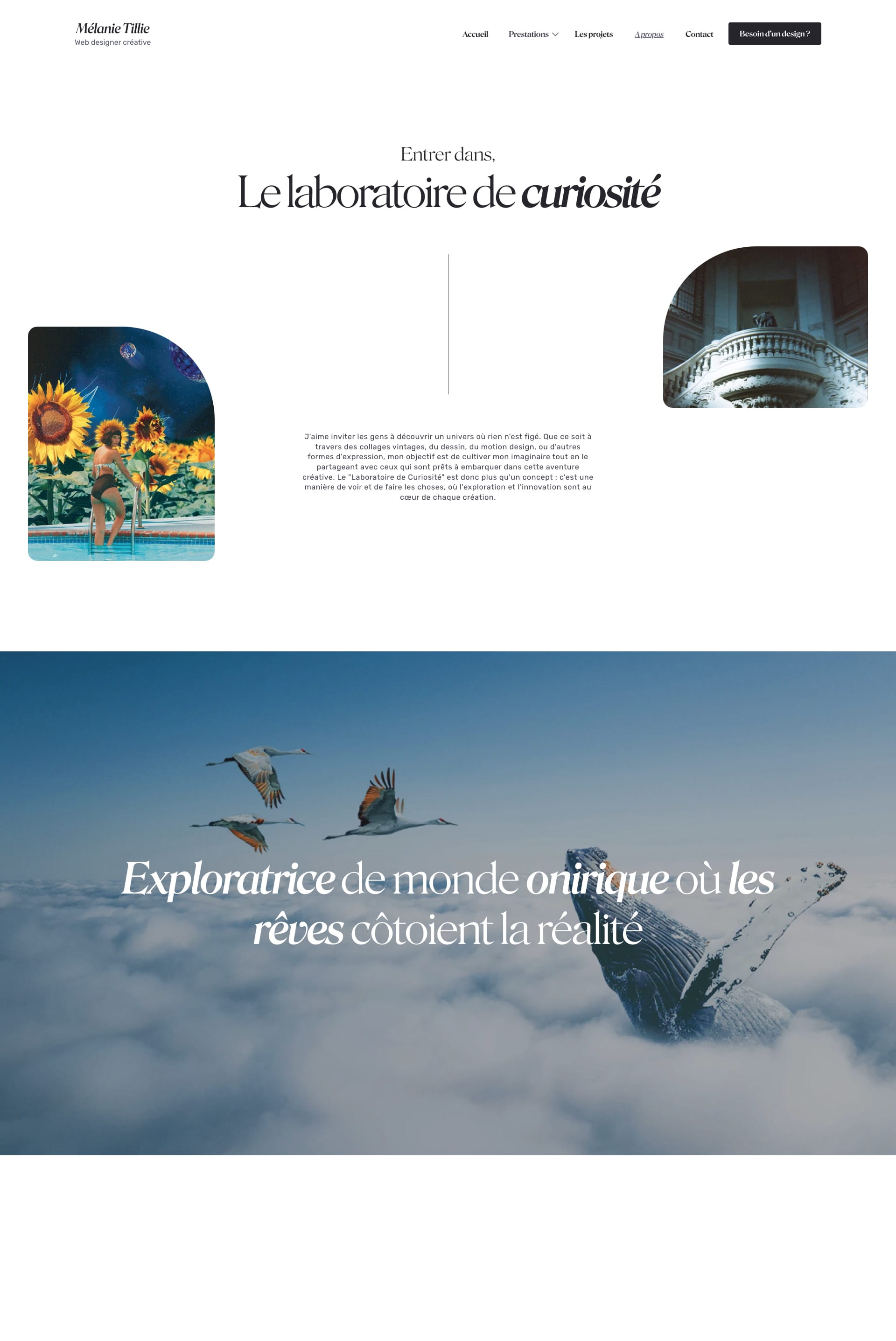
Sleek and stylish portfolio showcasing stunning visuals. Think high-fashion magazine! 💃 This design uses imagery to tell a compelling story.

Lâm Bảo
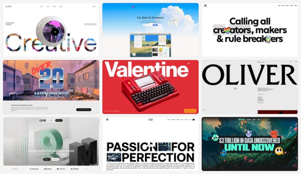
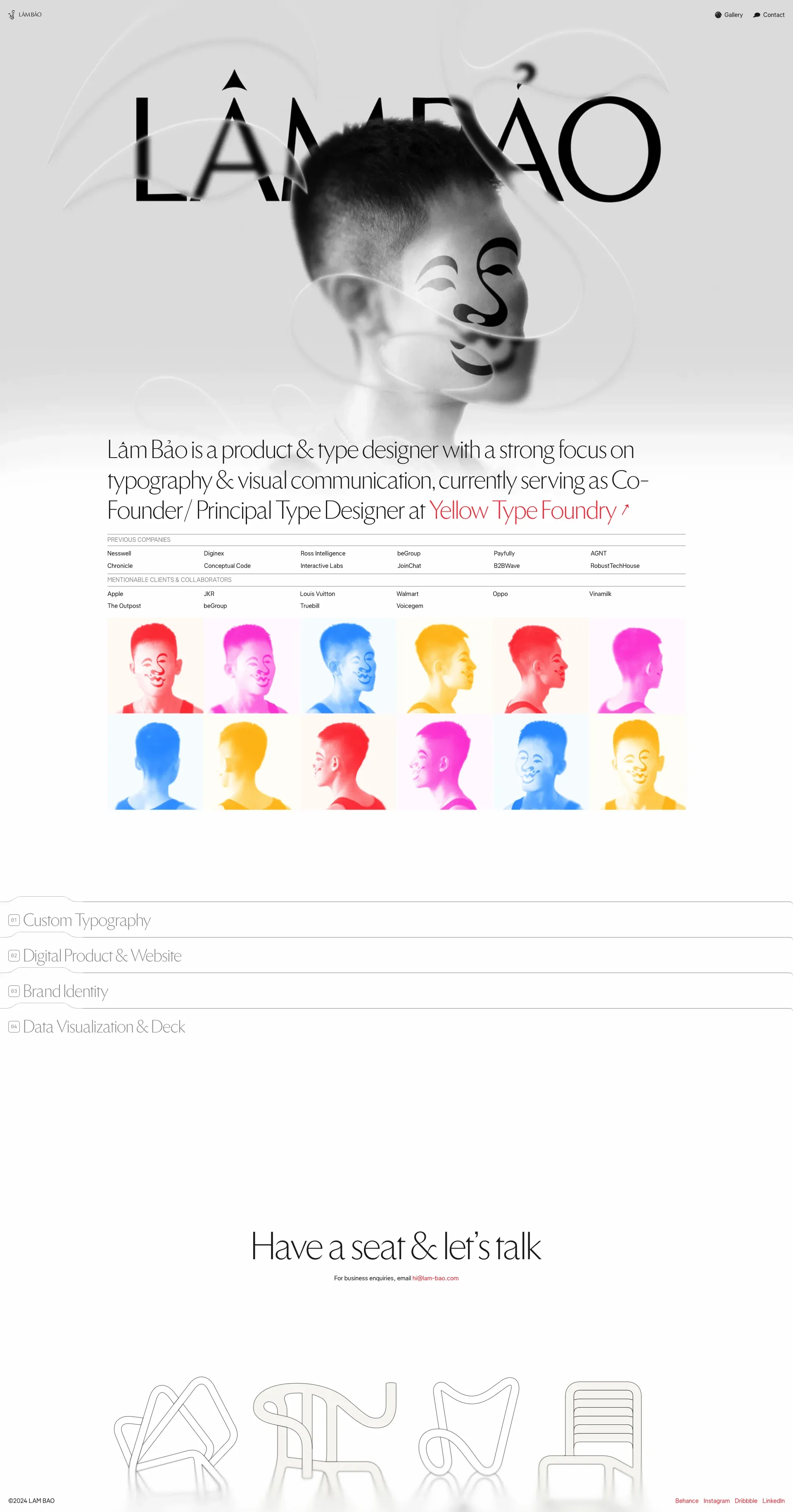
Unique layout and bold visuals make this design stand out. It’s like a splash of color on a canvas! 🎨 This design embraces creativity and originality.

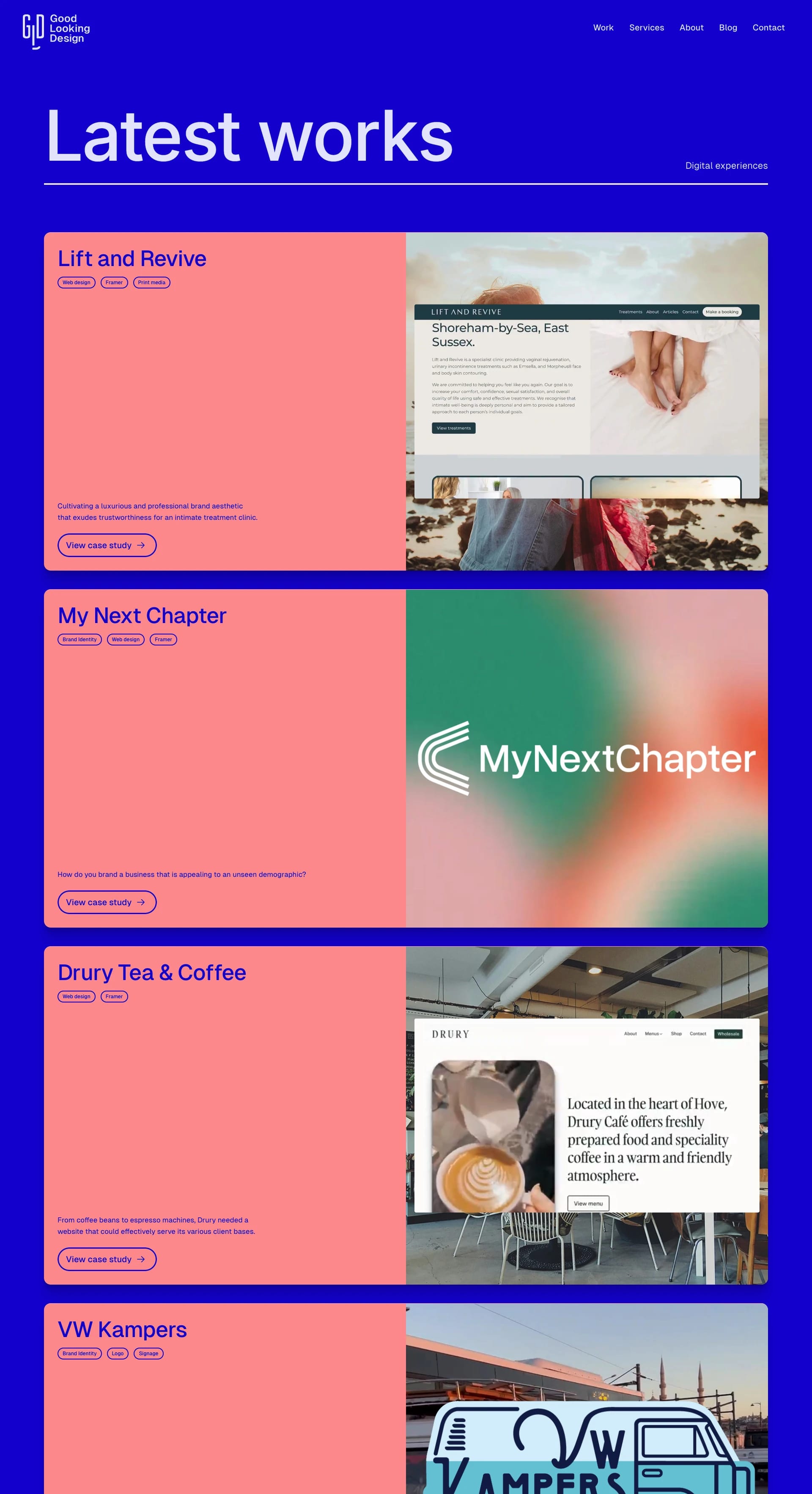
Good Looking
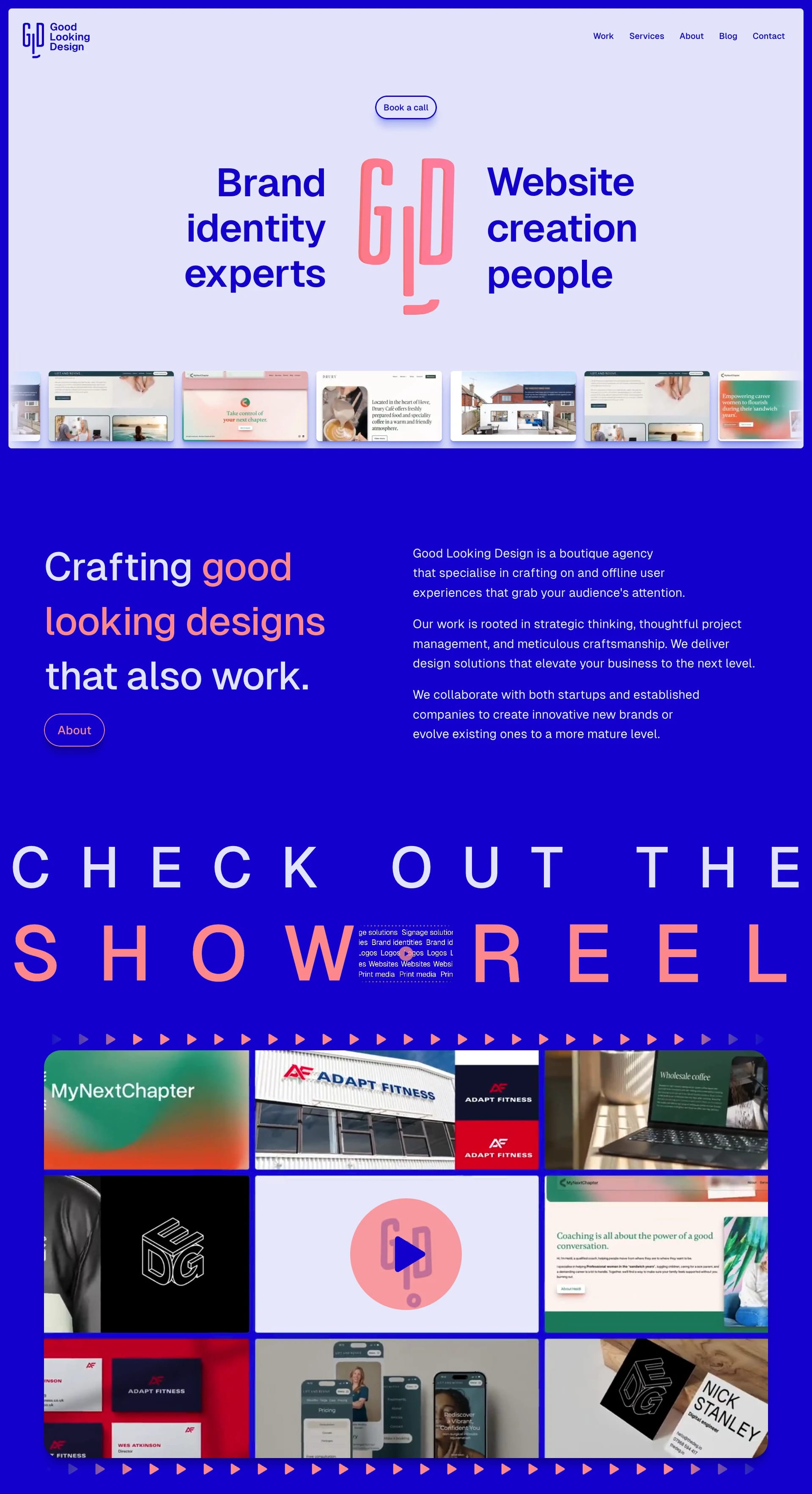
This landing page for a design agency uses a refreshing blue and coral color palette to create a modern and inviting aesthetic. The clean design and concise messaging effectively communicate the agency's brand and services.
So there you have it, folks! Ten amazing Framer websites to fuel your inspiration. 🔥 Ready to unleash your inner design ninja? Head over to Lapa and start creating your own landing page masterpiece! 😄
Fresh Animation Websites
This week, we're diving into diverse landing page designs, from Melrose PR's clean and professional aesthetic to Oda Services' vibrant and engaging layout. We'll also analyze Summer Smash Tennis's energetic, action-oriented design, Pudgy Penguins' playful and whimsical approach, and Euphemia's elegant and sophisticated minimalism.
Melrosepr
Think sunshine and citrus! ☀️ This landing page is bathed in a warm, inviting light yellow, with pops of vibrant orange that really grab your attention. The text still slides into view, but now it's against this sunny backdrop, adding a touch of playful sophistication. Like a perfectly ripe orange, it's refreshing and memorable! 🍊


ODA
This one's all about bold colors and dynamic transitions! Think playful, energetic, and oh-so-modern. Oda uses animation to guide your eye through the page, making it super easy to digest all the important info. Plus, those little bouncing icons? Pure joy! 😄


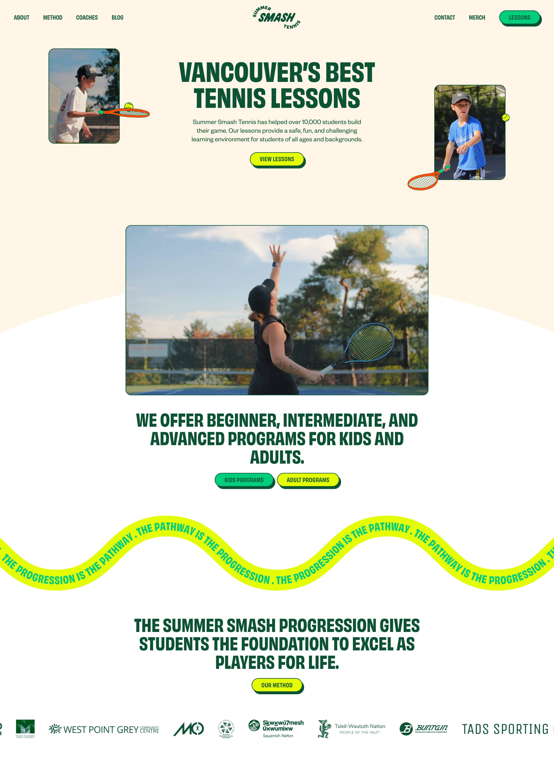
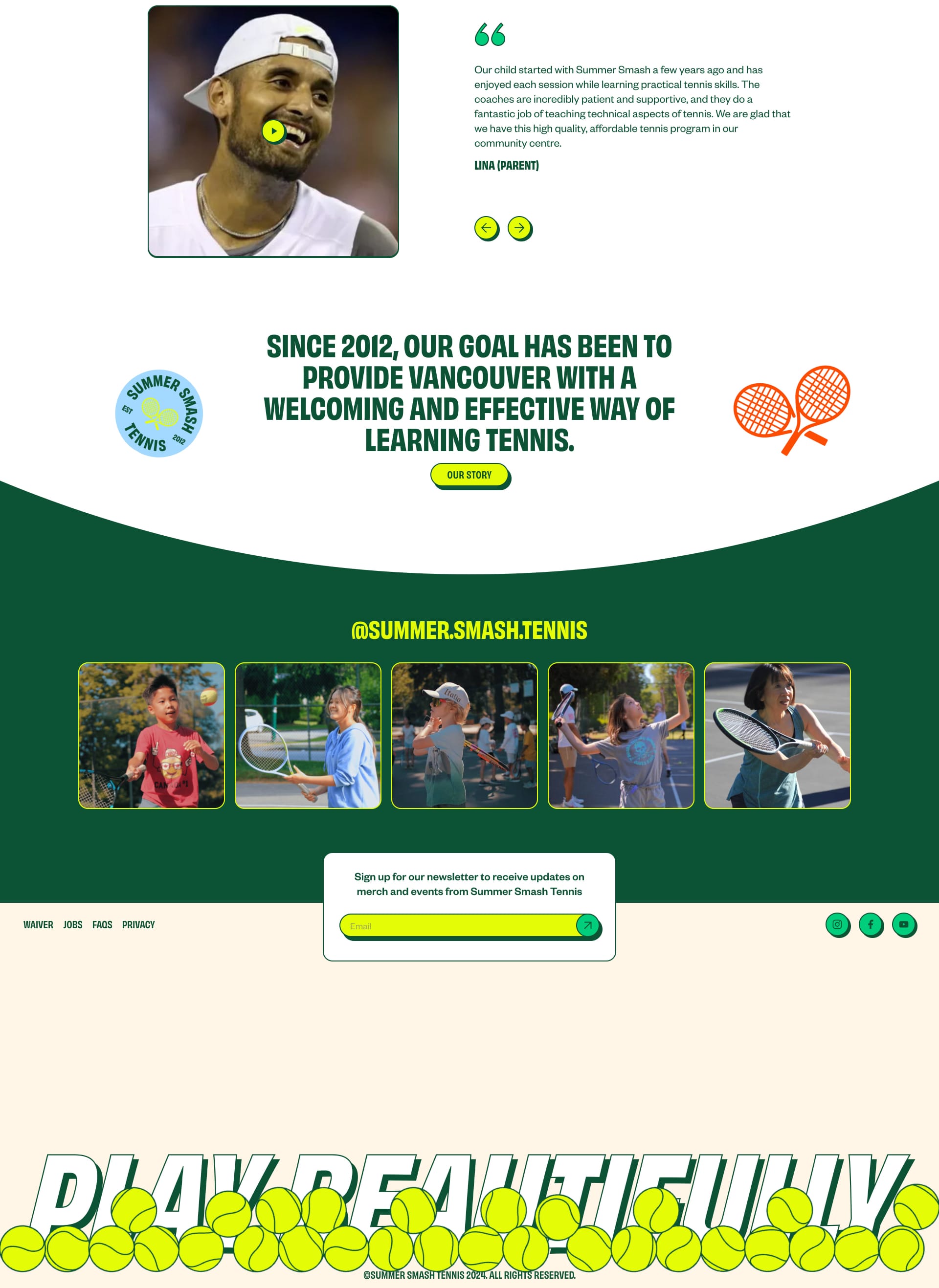
Summer Smash Tennis
Game, set, animate! 🎾 Summer Smash uses animation to create a sense of movement and excitement. The tennis ball bouncing across the screen? Genius! It perfectly captures the energy of the brand. Who's ready for a match? 🙋♀️
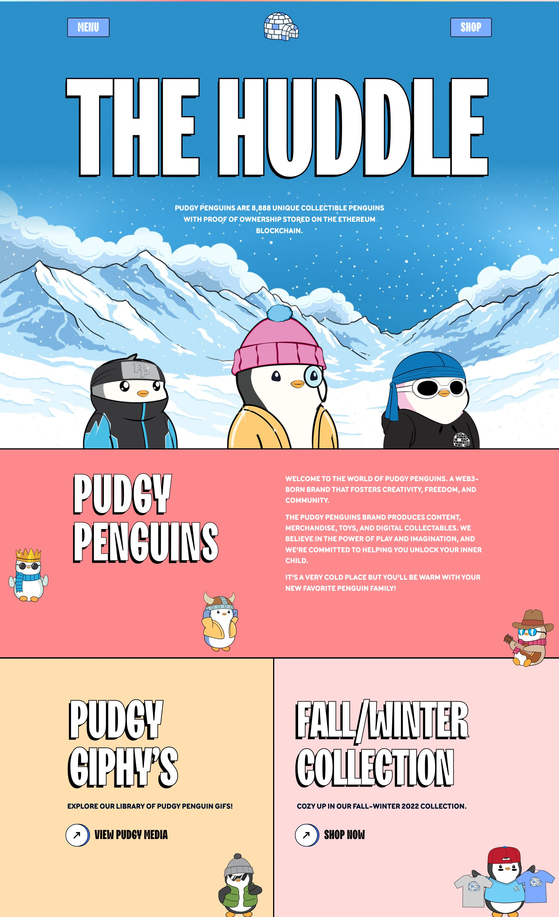
Pudgy Penguins
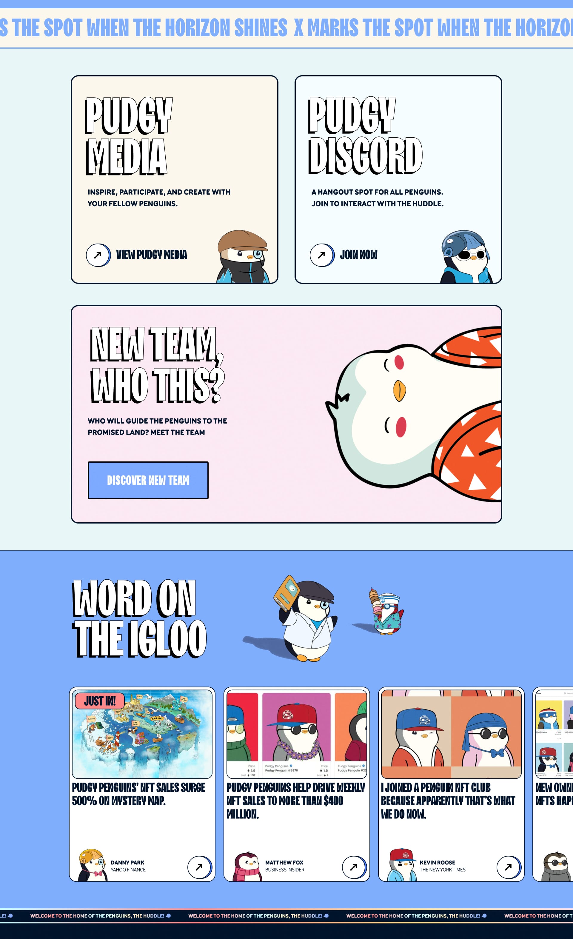
Waddle on over to this adorably animated landing page! 🐧 These chubby little guys bring a playful touch to the design. The subtle animations, like the penguins wobbling, make you want to stay and explore. It's proof that even small animations can have a big impact. So cute! 😍
Euphemia
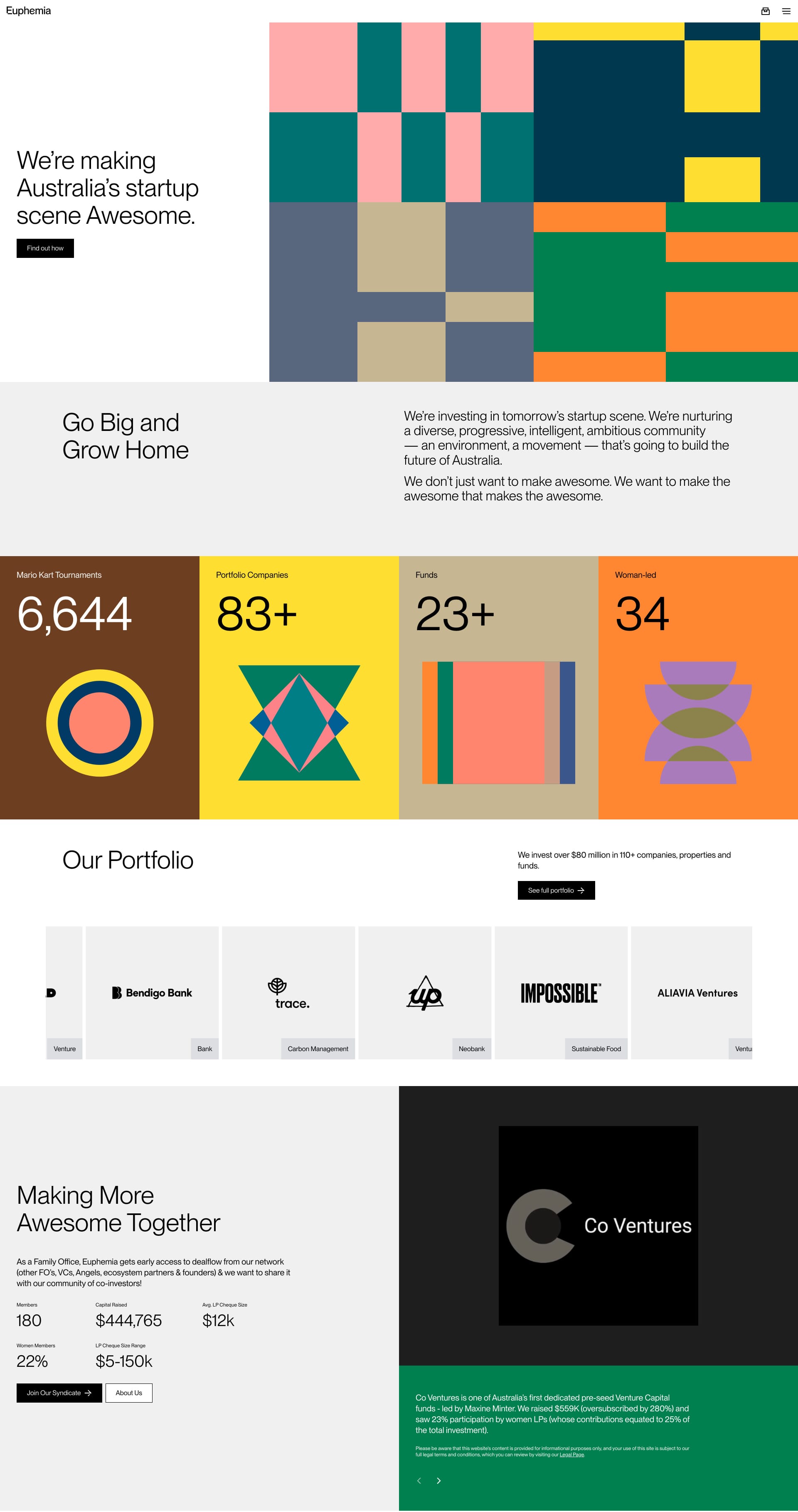
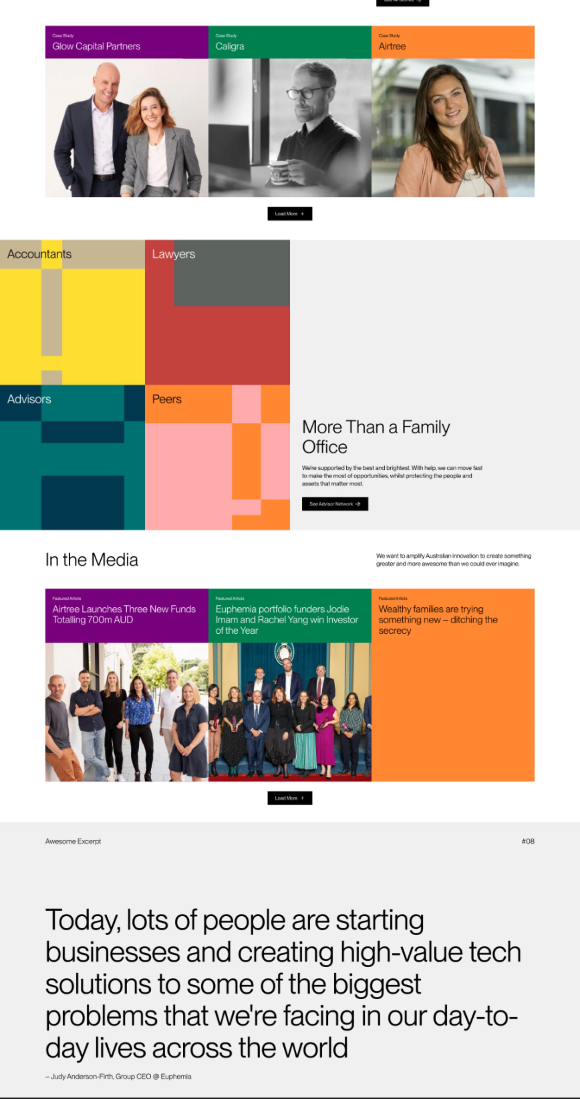
Prepare to be captivated! ✨ Euphemia uses animation to create a sophisticated and elegant experience. The subtle, precise movements and transitions give the site a premium, high-end feel. It's like watching a perfectly choreographed dance – graceful, fluid, and mesmerizing. Want to add a touch of polished elegance to your designs? Take some cues from Euphemia. ✨
Enjoyed This Issue?
Share it with a friend! Don't forget to subscribe to our Newsletter!
If you have websites that you want to appear on Lapa Ninja, do not hesitate to email the team at 💌 hi@lapa.ninja.
Stay inspired with the latest website designs by following us on X: https://x.com/lapaninja and 🦋 Bluesky https://bsky.app/profile/lapa.ninja
Stay tuned for more exciting updates in the future!
JEN from Lapa.Ninja

